Recent Animation School graduate Basil Ragavelas, collaborated with classmates to design concepts and assets for the short film "By Two," showcased on his Rookies portfolio, offering inspiration and tips for creating a short film entry for Rookie Awards 2024.
In collaboration with a group of classmates, recent graduate of The Animation School, Basil Ragavelas, contributed to the design of concepts, assets, and environments, showcased in the short film 'By Two' featured on his Rookies portfolio. If you are looking to create a short film for your Rookie Awards 2024 entry, this article might give you the inspiration and tips you need, to execute such a project.
Hey, I'm Basil, a recent graduate of The Animation School based in Cape Town, South Africa. I've been given the opportunity to break down my process of conceptualizing and creating environments for my third-year film, "By Two". Environment work is what speaks to me the most; there's just something about crafting a believable and lived-in set that resonates deeply with me. My responsibilities were concept artist, asset lead, Animation and layout artist.
Contributors to my final portfolio renders: Pre-production designer & compositing ~ Ruby Reim Lighting artist ~ Wiam Botman
Pre-production
We considered various aesthetics for the world's look and feel. Working closely with my production designer (Ruby Reim), we had a lot of discussions as to what we wanted the style to be influenced by. However, when we started, it wasn't exactly clear what we wanted, only that we wanted it to be striking.
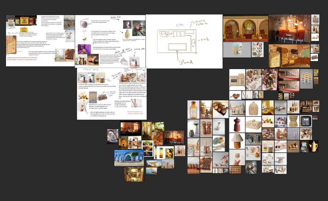
It feels like we cycled through a million different ideas and got far into R&D with some of them. After lots of late nights scrolling Pinterest, ArtStation, and various other corners of the internet, we found some images of a child’s dollhouse.
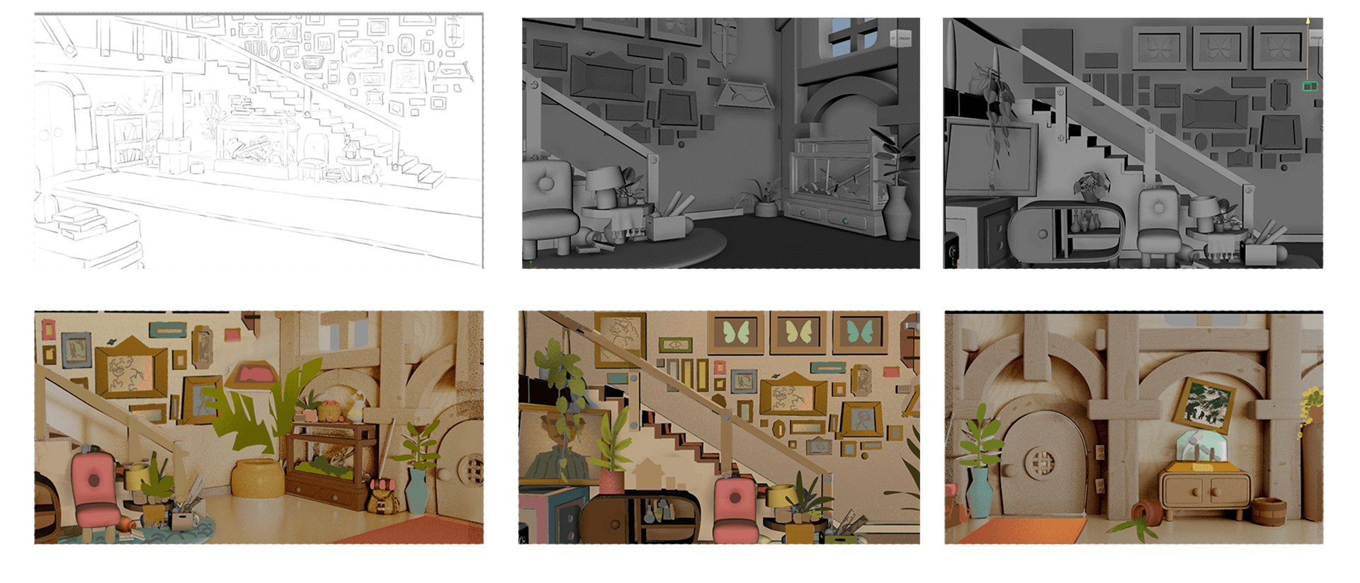
I got to work modeling some props in the style of little wooden toys to see if I could boil down the look into recognisable modeling techniques for our other asset developments. This choice perfectly matched the lighthearted and cozy atmosphere of our story. My aim was to evoke a warm, inviting sensation that felt tactile and almost interactive, as if one could reach out and play with it.
I cannot understate the importance of gathering reference. This was some of the most valuable advice I received at the start of the year. This stage of the process is where all my ideas are every where, and gathering reference helps start to solidify those ideas. It's a great jumping-off point that also breeds creativity. Being able to quickly put together a reference board makes it easier to convey ideas to fellow concept artists. Going past preproduction, having lots of reference in one place is still super important. In my case, as the lead asset dev on my film, I had to work with a team of asset devs to create a unified look throughout our props. Having a reference with annotations and guides just helps that process go smoother.
early pure ref boards
There was a fair bit of administration and organization tasks that I had to do. To be completely honest, this was probably the most challenging part of the process. It was all very new to me, having to organize references for the asset devs, review models and textures, giving corrections, and creating brief style guides was more challenging than I would have thought. I had to go through every prop in the film, assign it to an asset dev, find reference, and create a concept. I used Microsoft Lists to do this. However, if I had known about something like Kitsu, it would have made the process a lot smoother. Either way, Ms. Lists got the job done and allowed me to keep track of assets and get results on time.
Modelling
At the project's outset, I prefer to create a rough blockout before diving into any detailed concepts. This initial stage feels less definitive, which I find beneficial. Having the flexibility to quickly adjust the blockout allows for interactive feedback sessions with my team. I have to keep reminding myself that nothing is set in stone at this stage, and there will be multiple iterations between the animation lead and the concept lead before finalizing ideas.
Once I had a rough concept, I transitioned to Photoshop for a more refined version. However, I intentionally avoided finalizing colors at this stage. Instead, I prefer to experiment with different color palettes directly in Maya. This approach allows me to identify which areas require vibrant colors to stand out and which areas might need toning down.
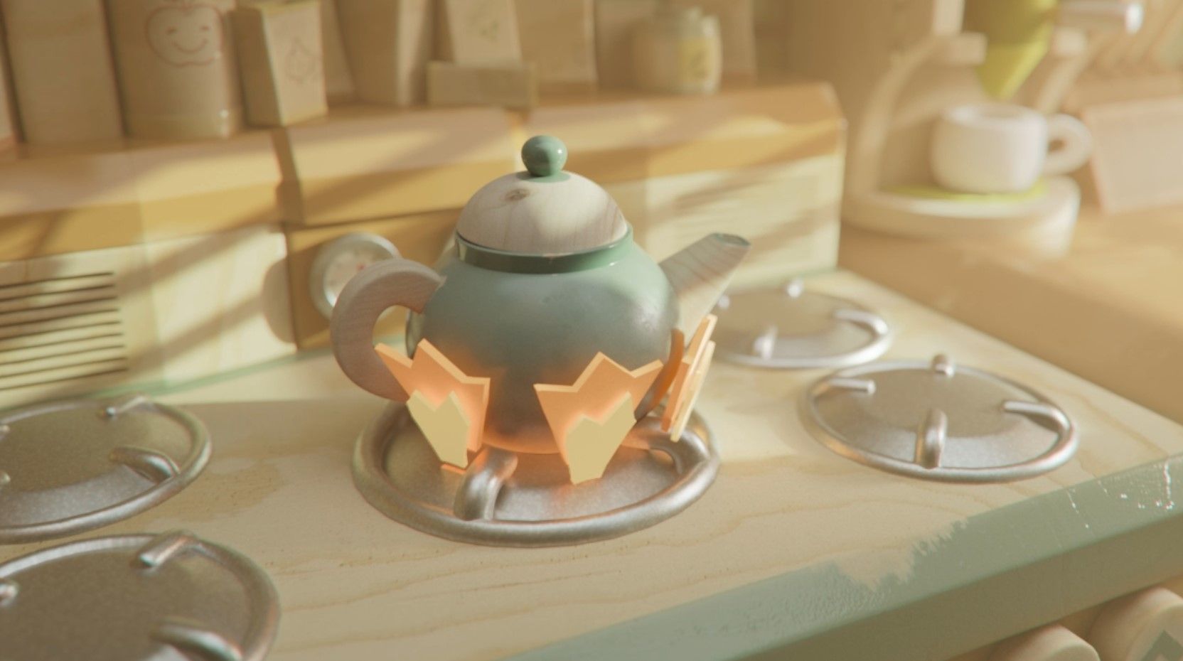
I was told that texturing is where I would really get the chance to show off the miniature aesthetic. However, I felt it was just as important to model chunky and thick. I simplified complex objects into their simplest shapes in order to make them feel like they were made at a small scale. Even though I used simple and geometric shapes, it was very important not to keep everything feeling super precise. It's easy to fall into the habit of keeping all your lines straight, especially when doing simplified objects. This can often make it feel very computer-generated.
So, every opportunity I got, I misaligned certain things or misshaped other things to make it feel hand made, cause even though we were going for a machine-cut minimalist toy aesthetic, it still had to feel real and human-constructed. I modelled predominantly everything using Autodesk Maya and then for details when needed in ZBrush.
Texturing
Once I had the block out at a point I was happy with, I’d send it to head concept for a paint-over so we could start deciding on colors.
my concept and block out with Ruby Reims color overlay
Once she sent me something, I’d go into Maya and experiment with palettes, tweaking what I needed to here and there. By assigning basic flat colors to the geometry so I could see somewhat how the scene would look. After a final discussion with my team, I’d export everything as FBX's and open up Substance 3D Painter for final texturing.
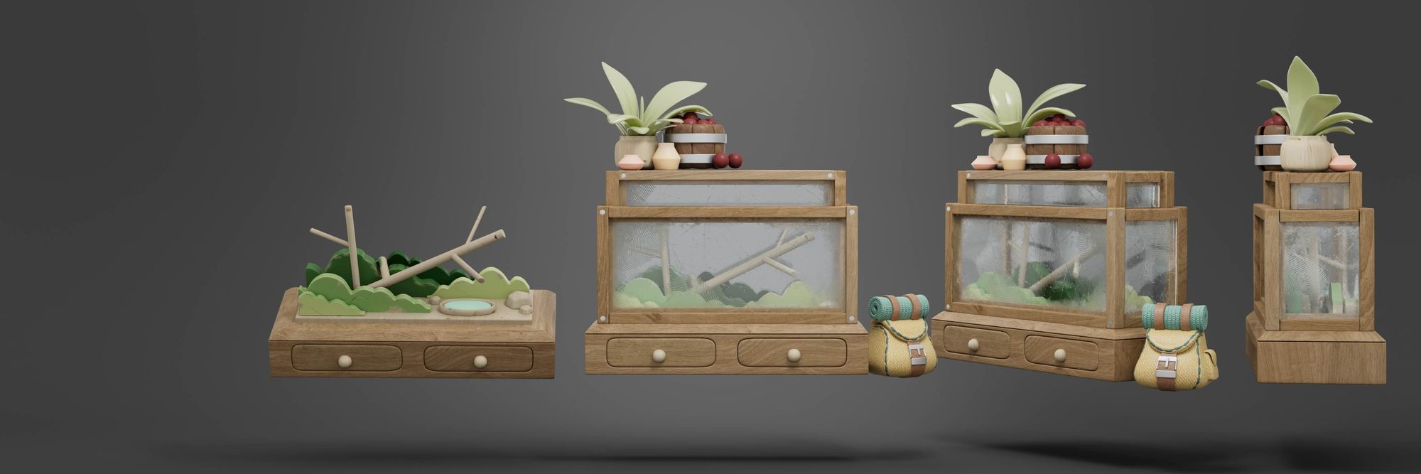
Working at a small scale presented its challenges. To market this as a miniature, I needed to ensure consistency with scale in elements like damage, dirt, and wood grains. However, it was incredibly enjoyable to experiment with. I relished the opportunity to explore different approaches, whether it was incorporating subtle details like a thumbprint in the specular or using things like modelling clay and popsicle sticks to builds structures.
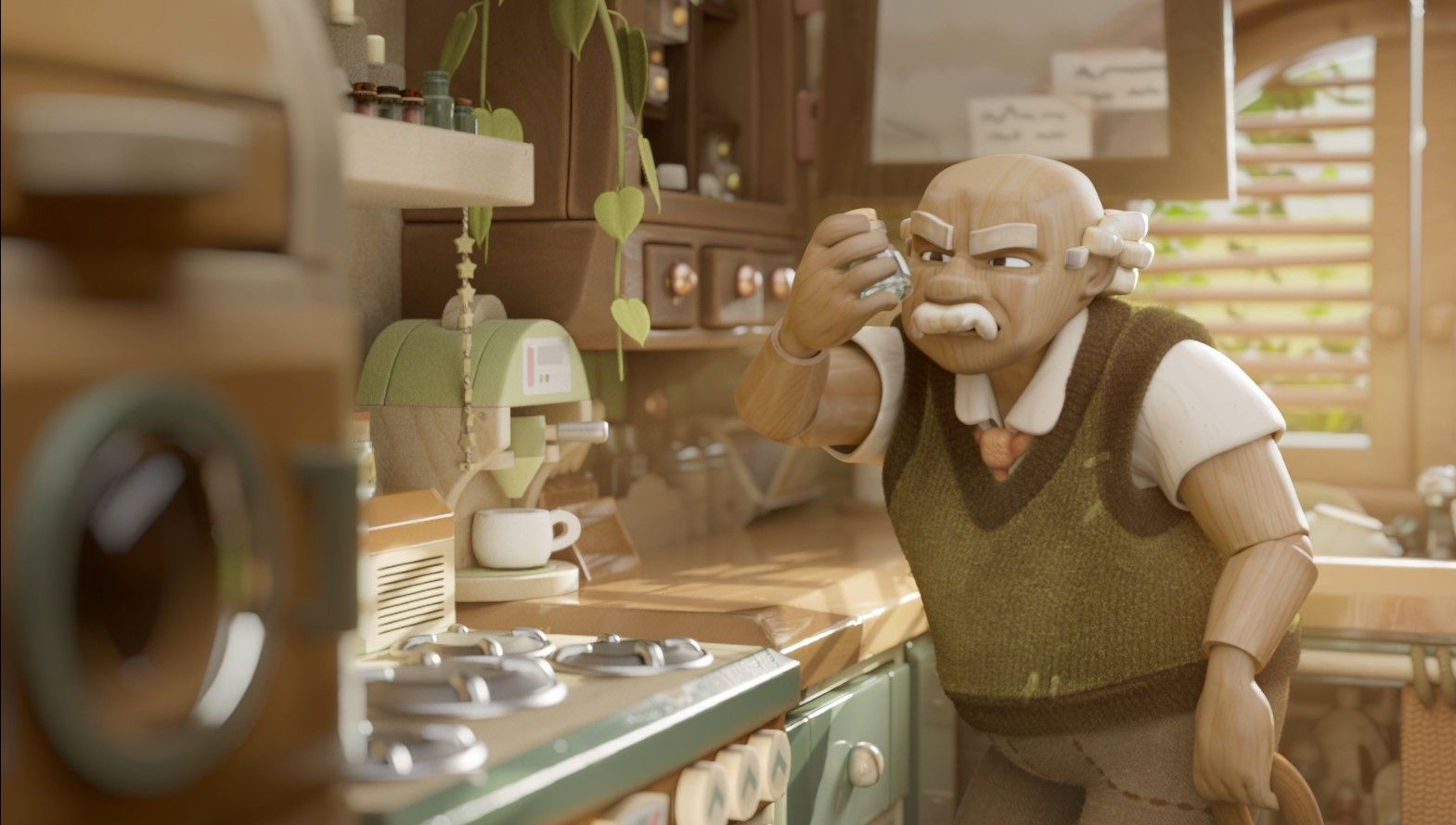
For continuity throughout the environments, I selected four to five wood grain types and values. This decision aimed to maintain a cohesive feel, akin to a unified toy set. It was crucial to avoid using identical values and grains as the characters to prevent them from blending into the background, which was predominantly made of wood. Therefore, I made a concerted effort to differentiate the character from the surroundings.
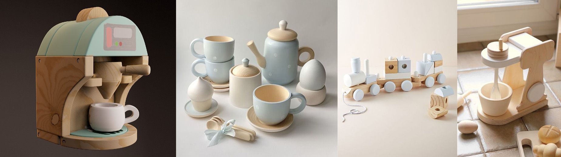
test prop (left) reference (right)
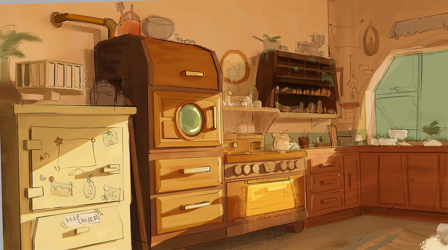
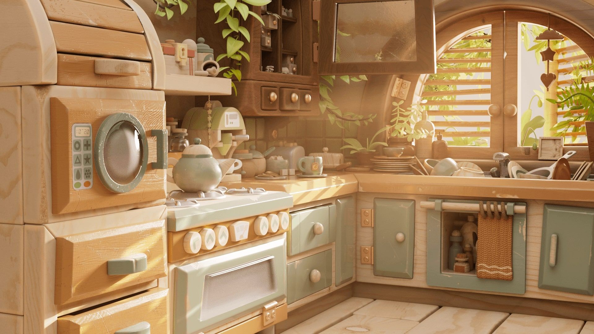
This coffee machine was the final in a series of very simple test props I did. I felt it conveyed the feel I was going for to my team. The aesthetic I was going for was more manufactured than a traditional wood carved aesthetic. I wanted it to feel a bit more like factory minimalist toys rather than hand-carved whittled wood. Once the tests felt good, I started on my first big asset so I could better convey the style before the other asset devs started. This was the kitchen unit seen below. I tried to employ most of the qualities I wanted into this asset: the types of paint and brushstroke detail, the level of grunge and wear and tear, the way dials and buttons have been simplified into stickers.
One significant challenge was finding wood grains that could be scaled appropriately without sacrificing quality. Consequently, I focused on identifying woods with large prominent features such as fibers and grains couldn't scale a low resolution image to the scale we wanted. Plywood textures were frequently employed due to their naturally large grains in order to trick the brain. When combined with other design elements like shape language, they effectively conveyed the impression of wood at a small scale.
Layout, lighting and comp
When setting up the scene, I've come to realize that having a packed set isn't necessarily a problem. Sometimes, there's a tendency to strip away assets to reduce the visual noise and shift the focus onto the characters. However, I've discovered various techniques during this project to maintain balance without removing objects. It's all about considering color schemes and compositions that draw attention to the characters while still keeping the set rich and lively.
Grouping similar props together and using similar color schemes creates a pleasing visual clutter that doesn't overwhelm. Leaving some areas open and uncluttered is essential for giving the eyes a break. Layout for me was my favourite part. Laying out all the sets was challenging the file management and structuring, material file paths and scene organization can be tedious however nothing compares to having all the pieces and and watching your environment come to life.
a display of all my kitchen assets
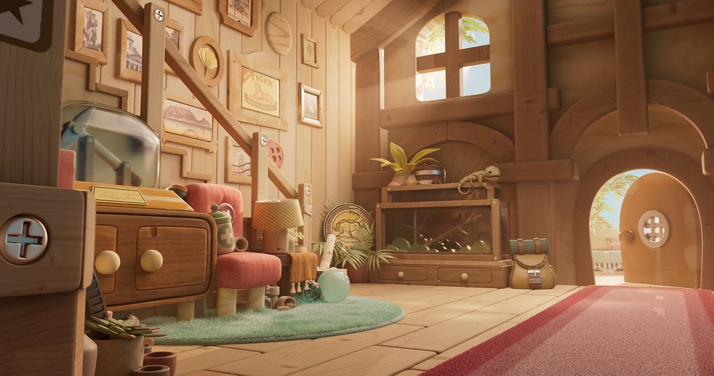
Lighting and rendering were handled in Maya with Arnold. Achieving the right lighting was paramount for both Ruby and me. We brainstormed numerous ideas, but ultimately, I was drawn to the idea of capturing a fresh morning vibe to complement our existing color scheme, so we gathered reference and wrote down a brief and compiled it into a lighting script for the lighting artist Wiam Botman; I put all my trust in him and tried to explain as best as I could what my vision was and he nailed it without hesitation or much back and forth. I felt it elevated the set to a new level as well as help focus our attention to areas that needed it.
a final shot after comp
I feel I have grown throughout this year, not only refining my skills as an artist but also as a team member. The thought of starting this project filled me with some apprehension, not due to the workload, but because it meant collaborating within a team, which initially made me feel a bit uneasy and anxious. I wasn't entirely enthusiastic about needing to seek or give "approval" for my artwork from a group of people, and I harboured concerns about being constrained by others' ideas. However, looking back, I realize how mistaken I was.
Working in a team, exchanging ideas, and collaborating are integral parts of our industry. Finding both encouragement and inspiration from my team members was what kept me motivated throughout the year.
Though it was initially tough to relinquish my desire for full control, in the end, our film benefited greatly from the collective effort.
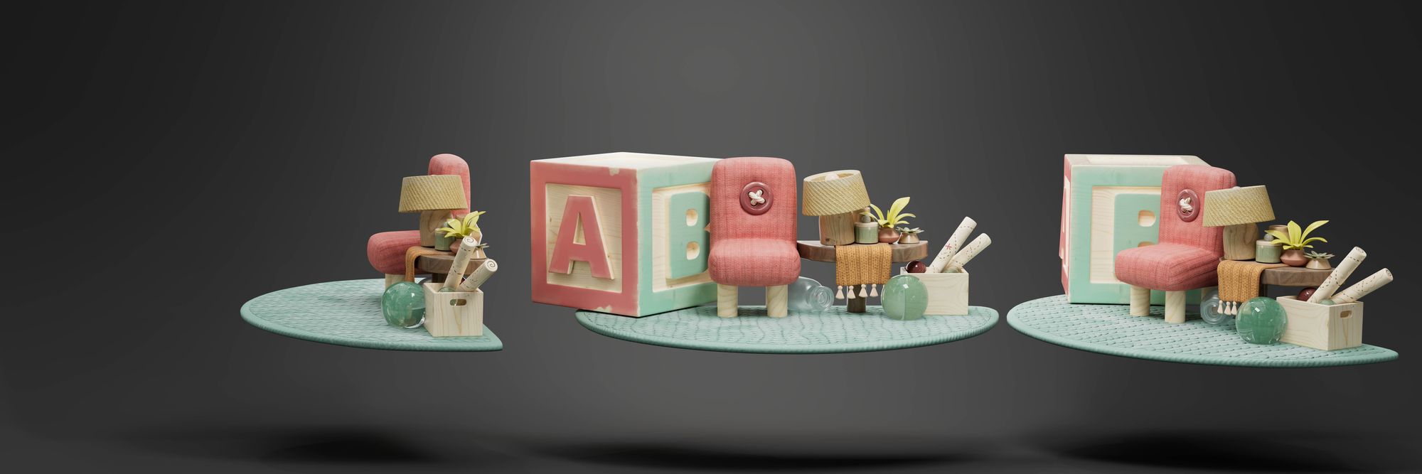
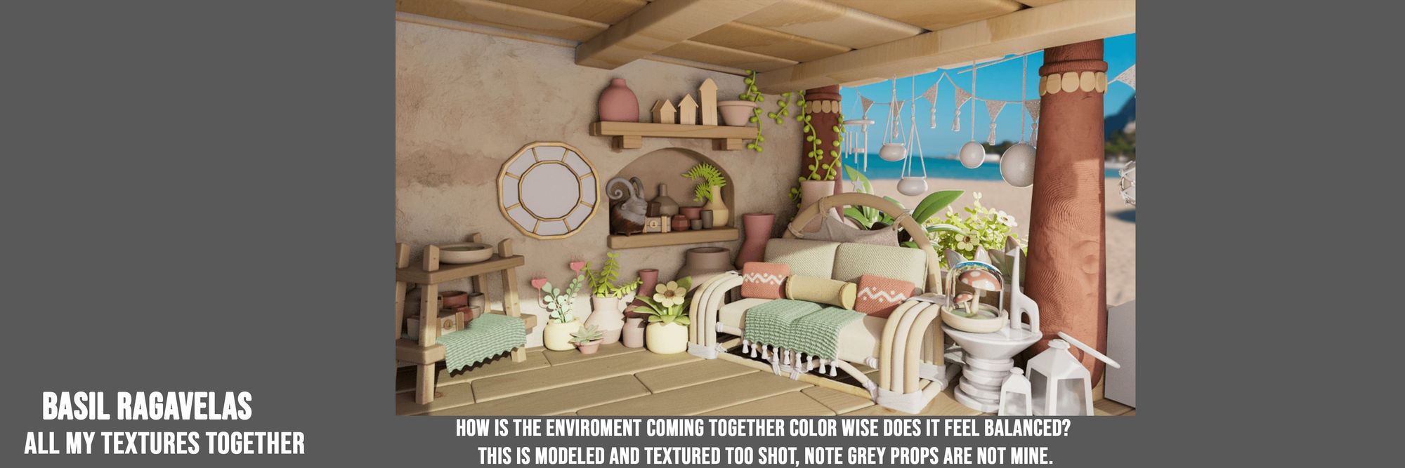
a display of all my Lounge assets
Wrapping things up, bringing "By Two" to life has been an absolute blast! From brainstorming ideas late into the night to the thrill of seeing our concepts take shape in Maya and Substance 3D Painter. It's crazy how inspiration can strike in the most unexpected places. I never knew picking out textures could be so intense! But hey, through all the chaos, we've managed to create something truly magical. The warmth and coziness of our little world feels like a big, comforting hug.
Here's a piece of advice I'd like to share: Consider collaborating with friends on projects. Your tastes and aesthetics don't necessarily have to align perfectly for you to create something truly special; in fact, it's often better if they don't. Embrace the diversity of perspectives and ideas that come from working with others—it can lead to unexpected and wonderful outcomes. So, don't hesitate to embark on creative ventures with friends; the journey itself can be just as rewarding as the end result.