Unlocking Blender: A Game-Changer for 2D Artists Venturing into Stylised Art
Jessica Chen, a 2023 Rookie Awards Winner and graduate of DigiPen Institute of Technology, shares her journey with Blender, revolutionising her approach to 2D concept art.
Jessica Chen, a 2023 Rookie Awards Winner and graduate of DigiPen Institute of Technology, shares her journey with Blender, revolutionising her approach to 2D concept art.
In this blog post, Jessica Chen, a Rookie Awards 2023 Winner of the Mighty Kingdom career opportunity and DigiPen Institute of Technology graduate, aims to share her journey of discovery with Blender and how it has revolutionised her approach to 2D concept art. Despite initial hesitations about integrating 3D tools into her 2D workflow, Jessica found Blender to be an invaluable asset, significantly enhancing her drawing and painting processes. Read on to learn more about unexpected benefits and creative possibilities that Blender has unlocked for Jessica's artistic practice.
In late July 2023, I learned that the Rookies entry of my concept art progress I had submitted a month prior had won an award. I was not just a finalist, but had won a career opportunity with the game studio Mighty Kingdom!
My entry featured several character and environment designs for an alternate world fantasy retelling of Pinocchio, in which the original themes of filial piety are flipped on its head. In my version, Pinocchio was a rogue kid who has to use the power of truth to free his city from the grips of his father, Geppetto, from turning everyone into his mind-controlled puppets. This is not to be confused with Lies of Pi, which coincidentally also features a dark retelling of the classic tale (I had began my project before knowing about the existence of Lies of Pi!).
Since my original Rookies entry, I added several more pieces to my project, which was completed as part of my MFA thesis while studying at DigiPen Institute of Technology. I wanted a project that would allow me to design stylised characters and environments and give me the space to explore new tools, such as Blender. My final deliverable was a 42-page printed art book, which you can view on my ArtStation.
Throughout the process, I learned an incredible amount from trying different approaches, and failing, failing, and failing again. I created many duds–these did not end up in the original Rookies entry that got noticed by Mighty Kingdom, but they taught me so many important lessons.
One of my biggest lessons was how much incorporating a 3D to 2D workflow, specifically using Blender, would enhance my work. Blender is a program that allows users to model, animate, texture, render, code, and so much more. Because its capabilities are so wide-ranging, at first it is not obvious in which specific ways it can aid if one wants to use it in a concept art capacity.
I wanted to write this blog post to show the ways in which I’ve found Blender to be most helpful in creating 2D concept art. It has been extremely helpful for my drawing and painting processes, despite initially feeling resistant to the idea of incorporating 3D into my 2D practice. After all, what is the point of being a 2D artist if I am using 3D anyway?
It took me a very long time to feel accustomed to the idea that 3D was in some way not “cheating” and would not be taking away opportunities for me to learn lighting, form, perspective, colour, and all of those other yummy fundamentals that artists love isolating themselves for weeks at a time to grind out. However, once I started incorporating Blender into my projects, it allowed me to make massive leaps in my art, because there are simply certain things that are easier to accomplish in Blender than in a 2D painting program.
What are these things?
For all the thousands of cubes artists practice drawing, we will never hold a flame to the mathematical precision of a computer. Which is fine, because if Blender can do the boring work of perspective, then we as 2D artists can focus more on design and composition, the things that are fun and creative.
One way I used Blender was to help with my environment drawings and layouts. Because drawing is about creating the illusion of depth with accurate perspective, forms, and measuring, having Blender take care of the accuracy aspect meant that I could focus more on designing and stylising my drawing.
I created this image using a Blender blockout as an underlying scaffold.
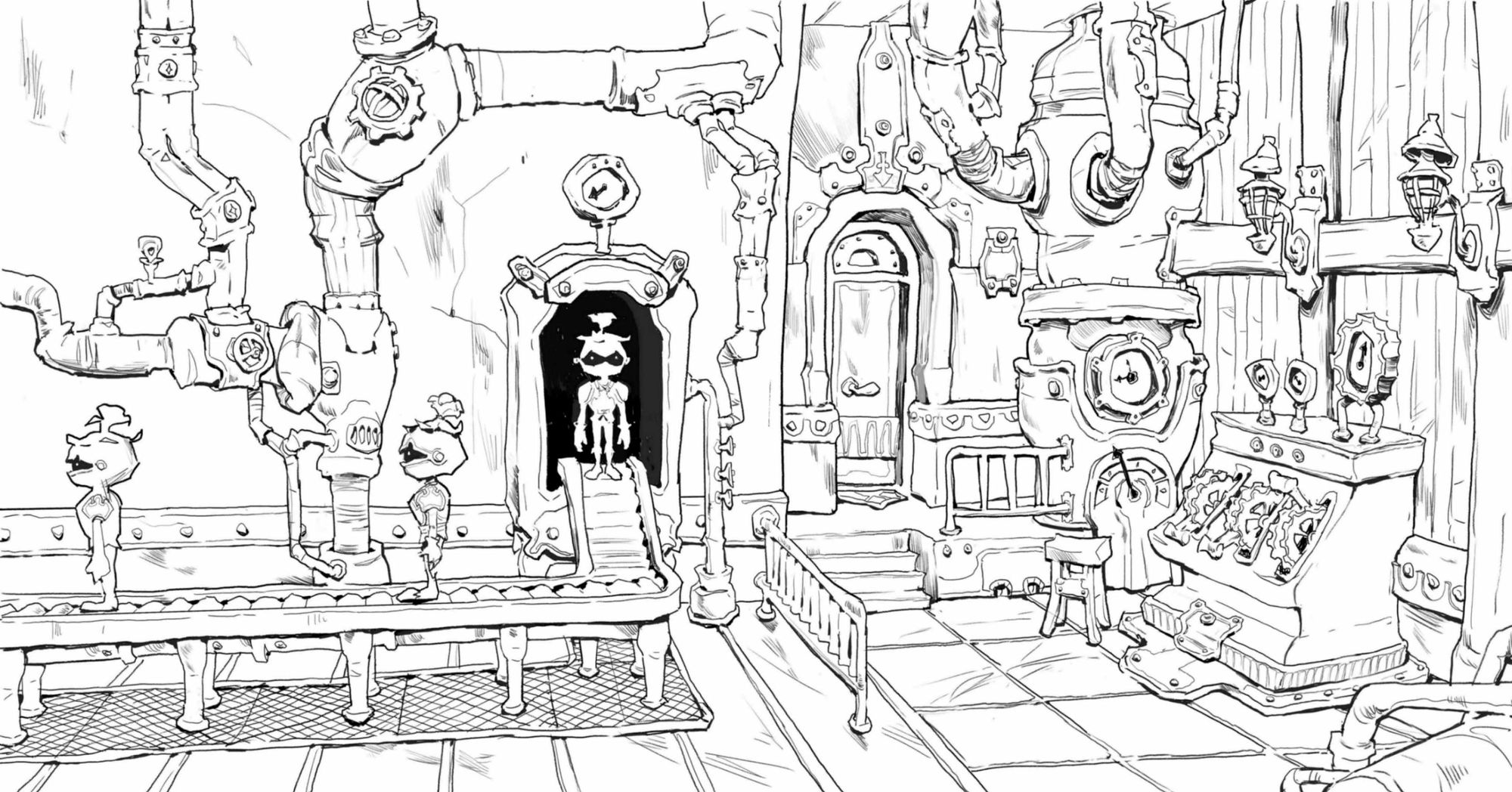
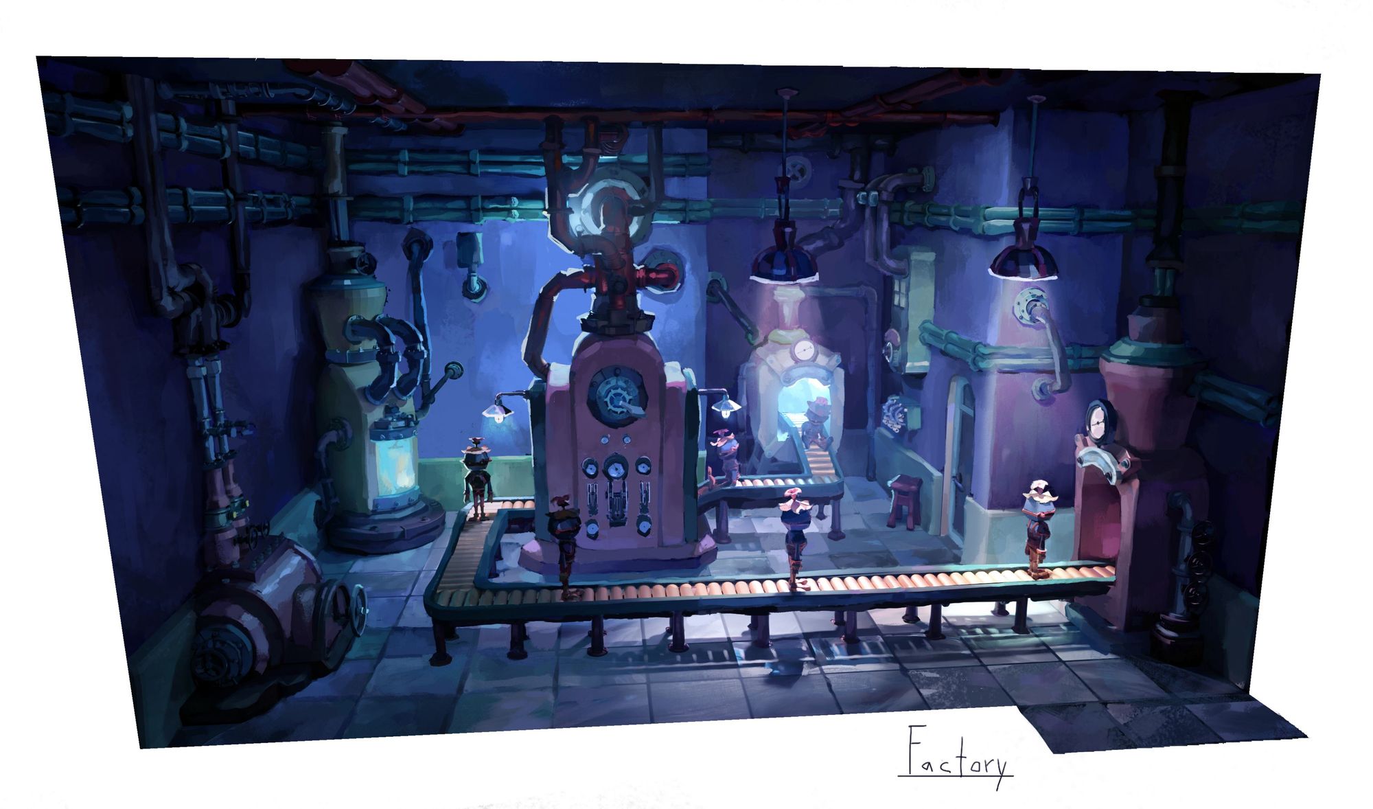
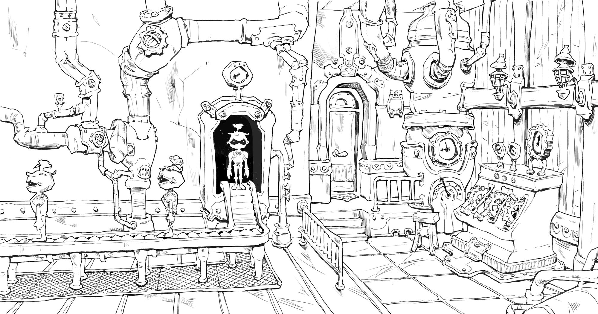
The drawing was created as an additional piece to accompany the factory painting below that also used a Blender-to-2D workflow.
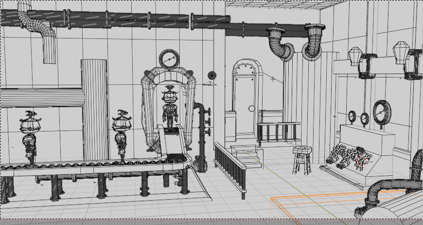
This was a very fast Blender blockout. For the most part, this blockout is composed of simple shapes. Some of the pipes and gear switches were models I downloaded from someone’s kitbashing set, but everything else was hand modeled, or already modeled from the previous painting I made (I will talk more about using Blender for environment paintings in the next section of this blogpost).
The most important things to model out are overall big shapes and anything that repeats in perspective, such as the dividing rail coming toward the viewer in the factory scene drawing, the repeating floor panel lines in perspective (drawn on top of a subdivided flat plane), the repeating support pillars underneath the conveyor belt, and the two repeating wall support beams and accompanying wall lamps. This also includes repeating objects oriented at difficult angles, such as the two large pipes on the right side of the image rotated 45 degrees from each other. Anything that is easier to figure out in 3D than 2D is a good candidate to model.
Things that are less important to model include anything that can be more easily drawn by hand than modeled—in general, this includes any unique items that face the viewer head-on. In the factory image scene, one such example of this includes the stylised pipes on the left side of the image. Because the wall is directly facing us, there is very little foreshortening to account for while drawing. Secondary or tertiary details can generally be left out in the blockout stage, unless these details are easier to model than to draw.
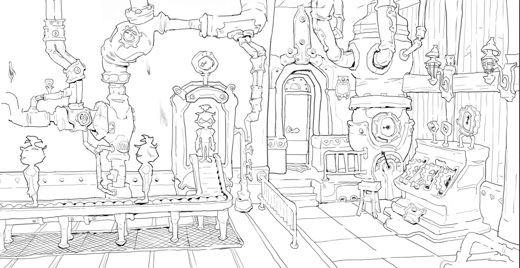
I wanted to go for a somewhat “wonky” look that included a general lack of parallel lines and “bouncy” looking corners. As long as the perspective looks believable (meaning that the distance between objects looks consistent and accurate, and the larger forms read as appropriate) then stylising the shapes will not disrupt the illusion of space created in the image.
Another thing to note is that because I was only using Blender to assist in my environment drawings, I didn’t model and texture everything in the scene like I would if I were using Blender to flesh out an environment painting, with lighting, textures, and properly modeled out forms. Blender was a tool to help me construct a scene with accurate perspective.
Once I had my basic line art drawn on top of my Blender blockout, I added in more line weight to suggest ambient occlusion and create the illusion of texture, scale, and volume.
I will show two more examples of how I used simple Blender block-ins to develop environment drawings below.
This was my first project ever in Blender. I started off with a sketch, and then built my room according to the sketch. Blender was helpful for helping me keep the relative scale of each item appropriate. When drawing in perspective, sometimes it can be difficult to feel out how the converging perspective alters size perception. In Blender, the size of various objects can be compared in orthographic perspective.
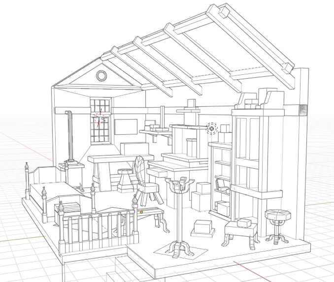
Blender was helpful for objects that do not perfectly align with the right angles on the gridspace, such as the stool near the bookshelf, or the curved legs of the coat hanger, which had a triple whammy difficult-to-draw-in-perspective combination of being an unusual shape, being a repeated form, and also facing in directions outside of the gridspace. Because of all of these difficulties, I chose to model out more specific shapes for the legs of both the coat hanger and circular stool.
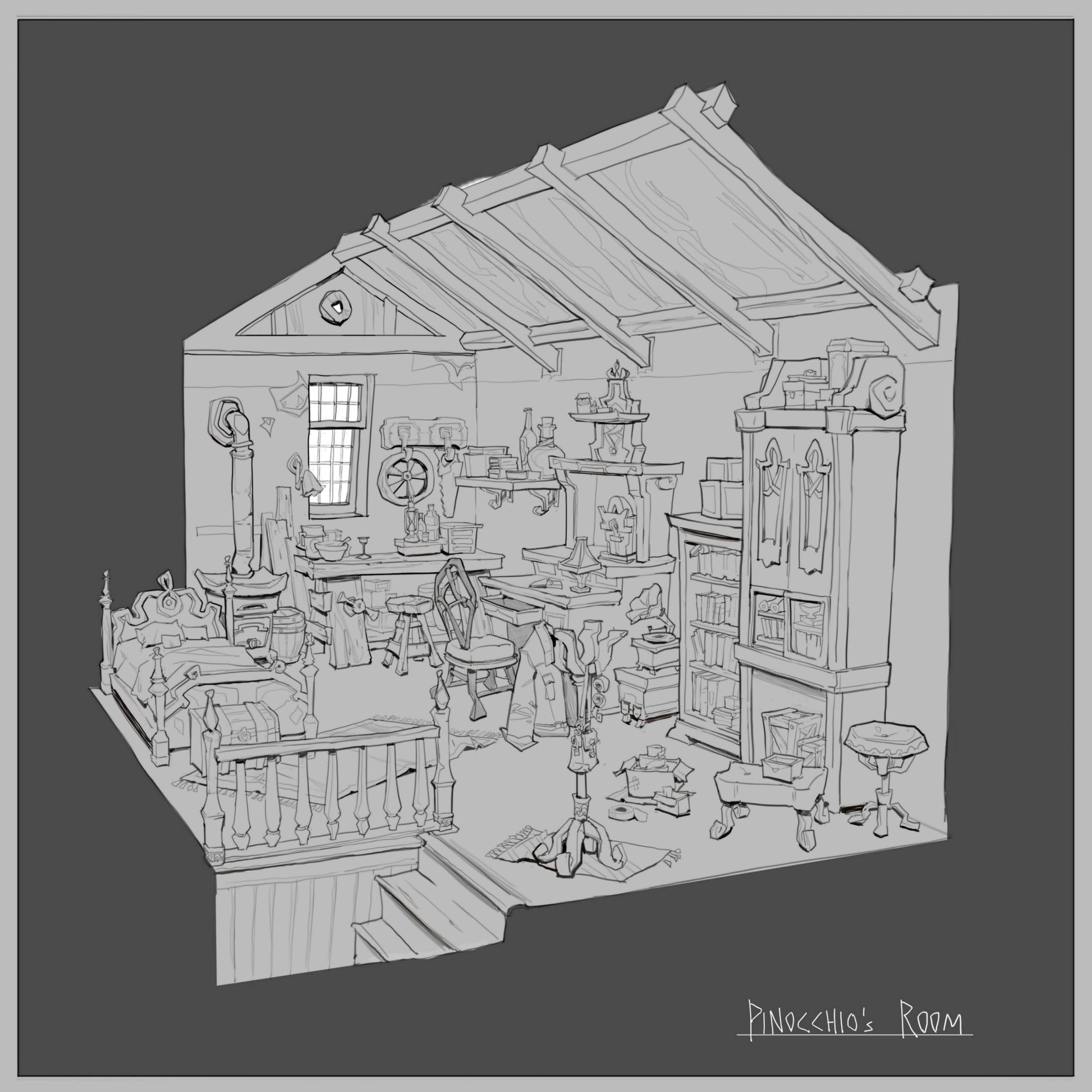
With the shapes and perspective in place, drawing over the room was a matter of adding fun storytelling details and pushing the contours of the forms.
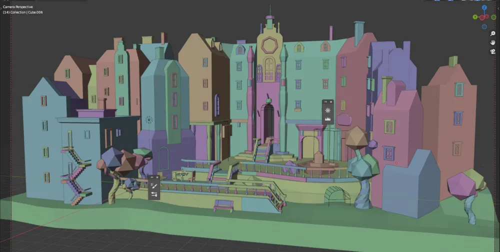
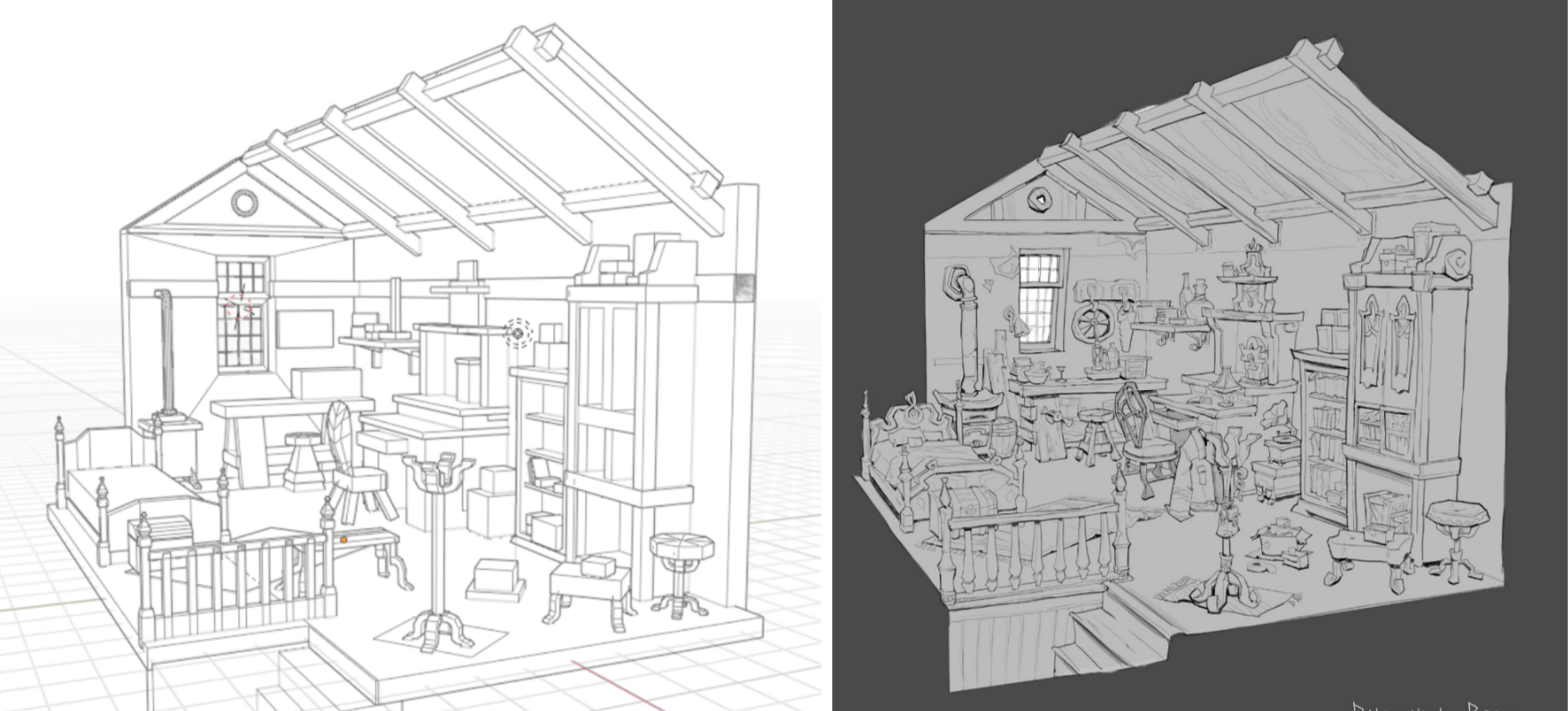
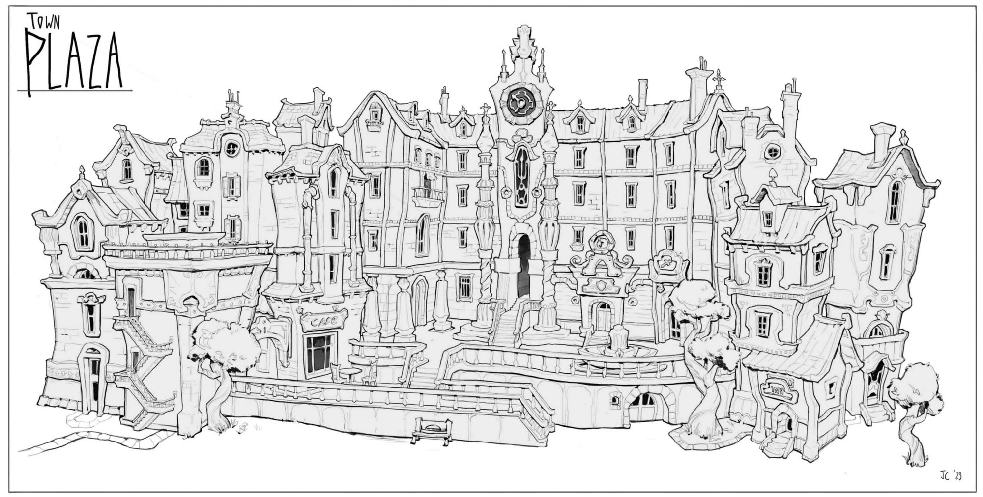
Town Plaza was an outdoor environment project I worked on that greatly benefitted from using a 3D-modeling software like Blender.

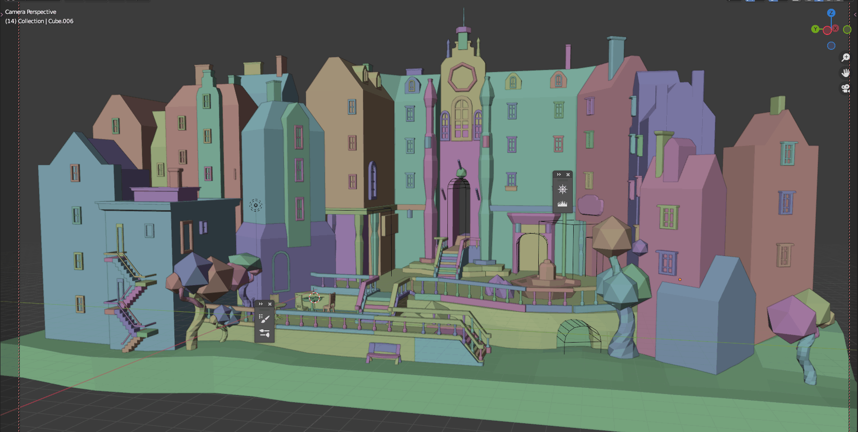
Like my previous scenes, this scene was based on a rough sketch. I modeled out the shape of major extrusions and architectural forms. The windows and some of the minor details were probably unnecessary to model, as I ended up not adhering to their specific shapes and details in my drawover anyway. Simple subdivisions on the geometry of the buildings would have sufficed to provide a scaffolding for perspective. The most difficult problem that this Blender blockout solved was the perspective of multiple objects that were not orthogonal to the picture plane. Drawing in the details was a matter of utilizing my drawing skills to fill in the blanks.
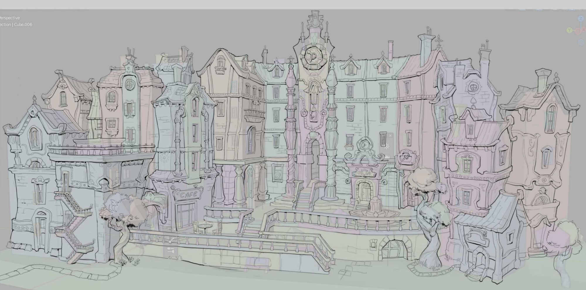
This ghost overlay of my drawing on top of the base 3D design shows how I “wonkified” some of the straight lines in the original model. The underlying structure is still visible in the final polished drawing.
Overall, using Blender for drawing is a relatively straightforward process that requires little knowledge of the program aside from how to model and arrange basic forms in a composition.
Knowing how to use cameras in Blender is useful, but not necessarily even needed, as taking a screenshot of a workspace can also suffice in providing the important perspective information necessary for making drawing easier. A camera is useful in that it “saves” certain camera views so they are retrievable.
Like perspective, lighting can be calculated with math. Blender can do the difficult work of figuring out cast shadow shapes, which is an extension of its ability to perfectly figure out perspective and form.
Because Blender is able to calculate lighting perfectly, it is possible try out dozens of lighting schemes in the time it might take an artist working in 2D to inaccurately figure out one lighting scheme. The ability of Blender to perfectly calculate lighting makes it so much more simple to try out many different lighting schemes.
Although I originally only thought of Blender’s use as extending only as far as environment drawing and painting, I found it very useful in helping me render my character, the Blue Fairy.
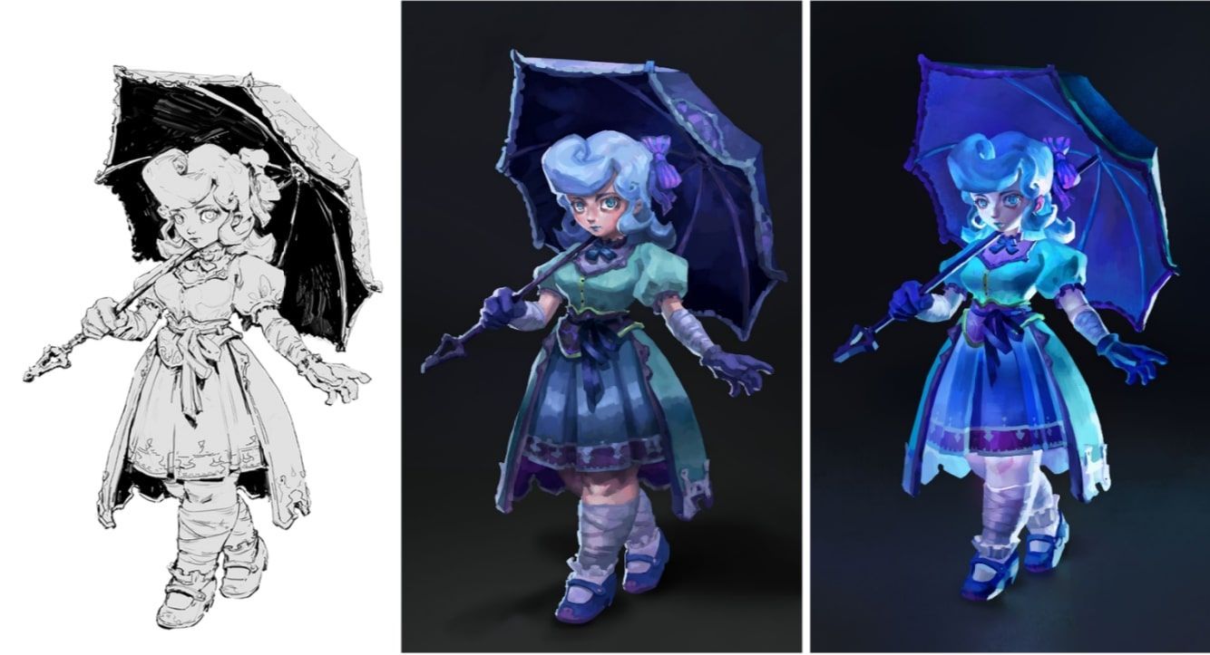
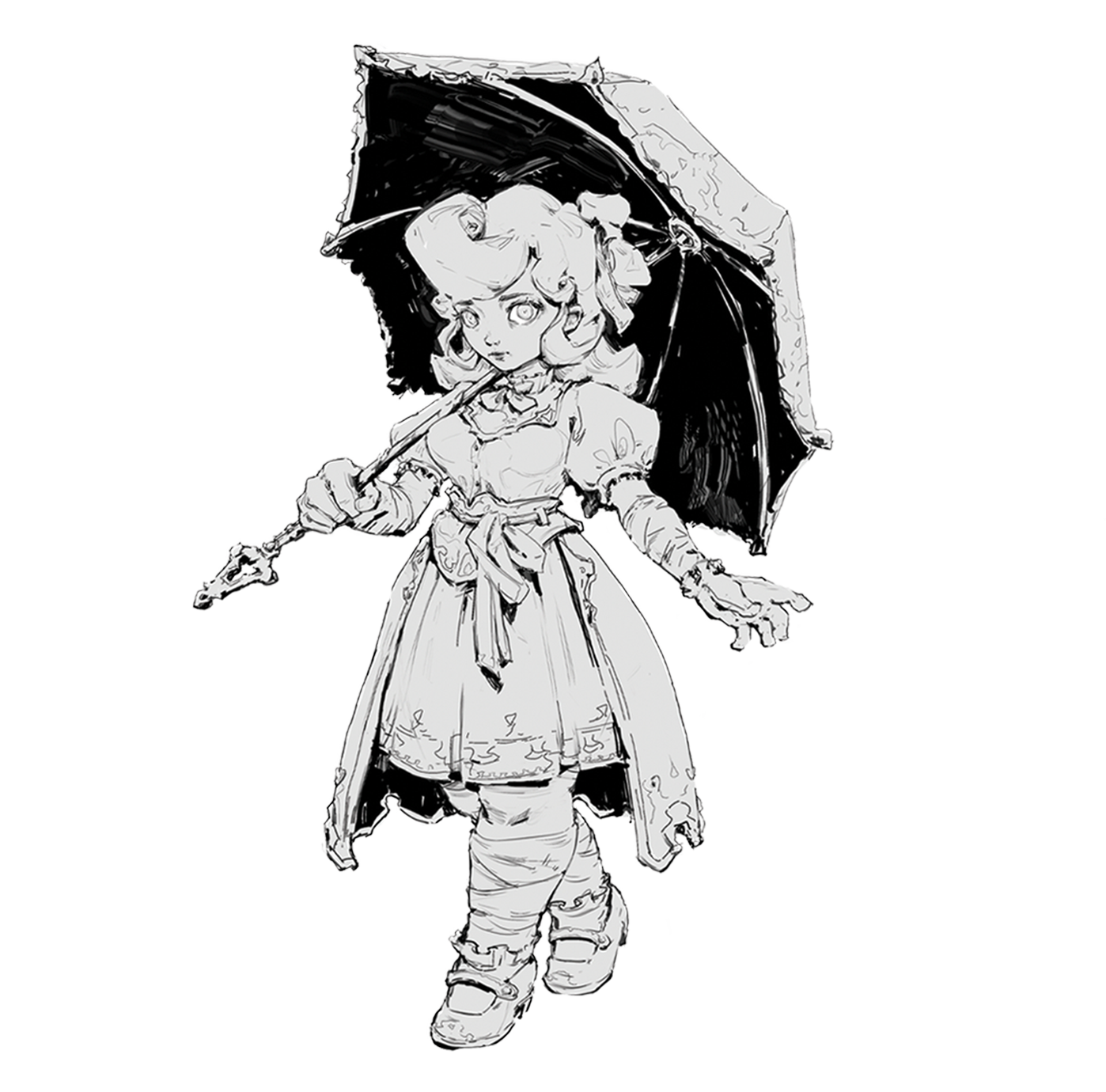
I first began with a line drawing of my Blue Fairy character, and subsequently painted her against a contrasting dark background.
I didn’t feel completely satisfied with the painted version. None of my little tweaks and making the painting more detailed did anything to improve the overall feeling of the image. I partially felt as if the lighting and colours were partially taking away from the charm of the original design, and I also was unsure of how the umbrella would cast a shadow on the complicated forms of her hair.
This is where Blender came in.
Blockout and Lighting Process
Originally, I was only going to model her head, hair, and umbrella, but I got wrapped up in the image and blocked out her entire body, adding basic colours to my primitive shapes. I tried to only model what would be difficult to find a solution for in 2D painting.
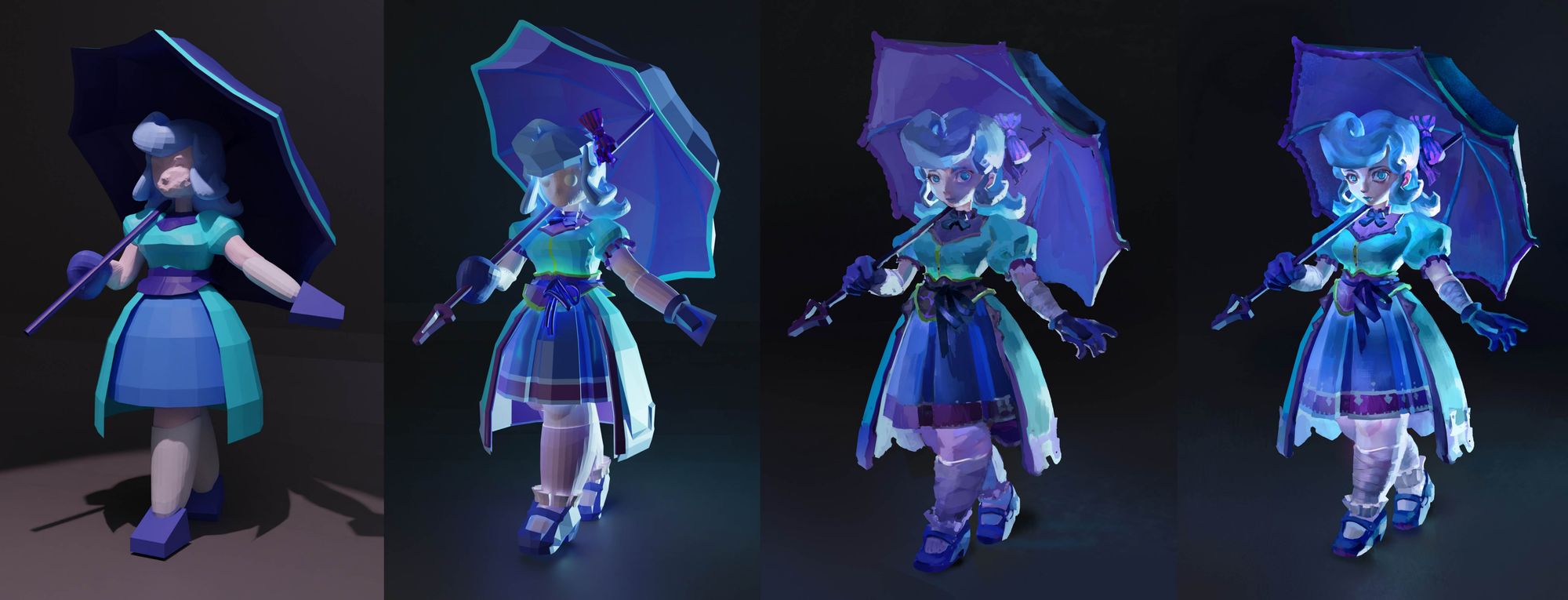
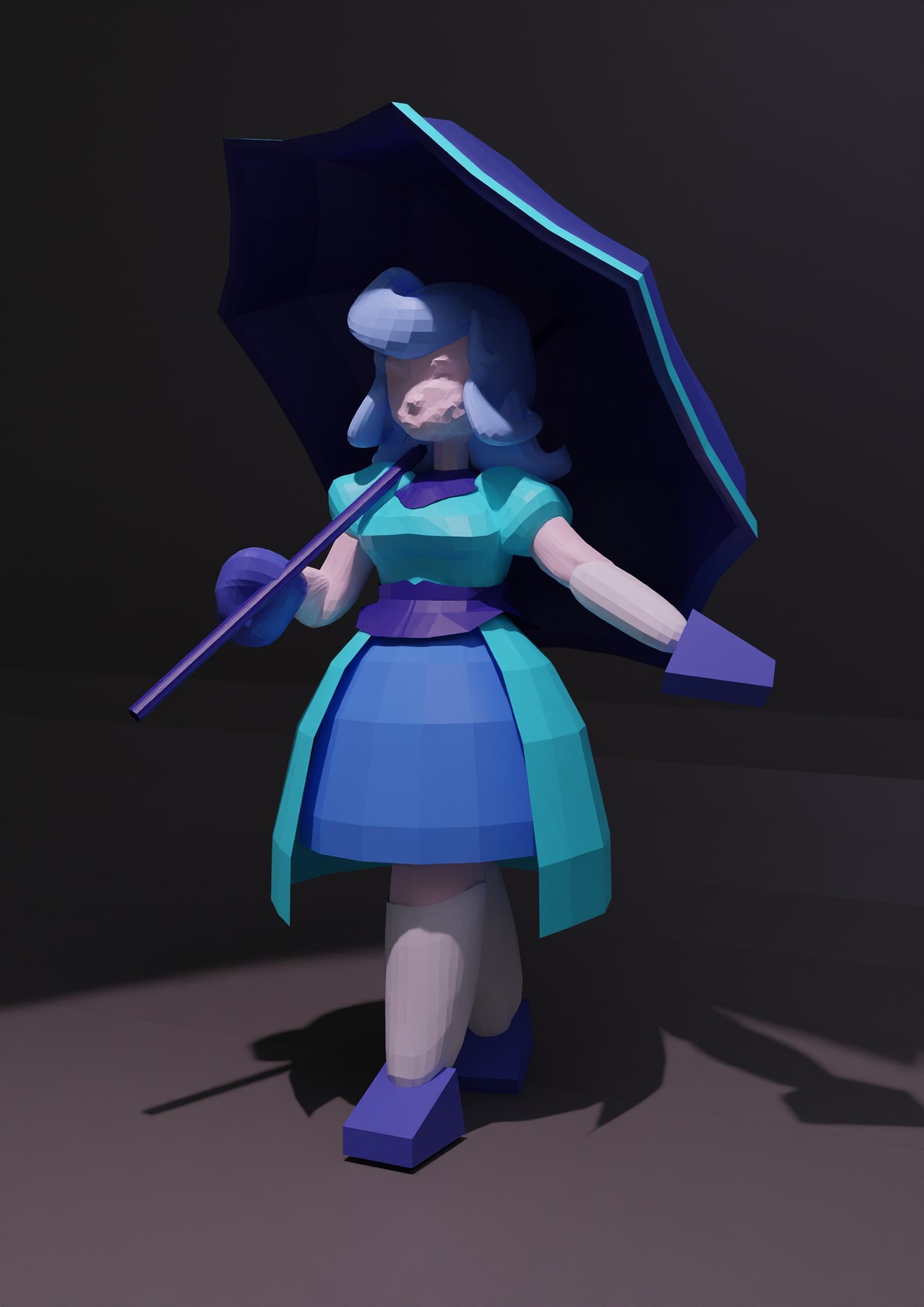
This is what I got after modeling her basic forms and placing an area light to create the general cast shadow shape that was in my original painting. I used Cycles to render, which produces more accurate results than Eevee.
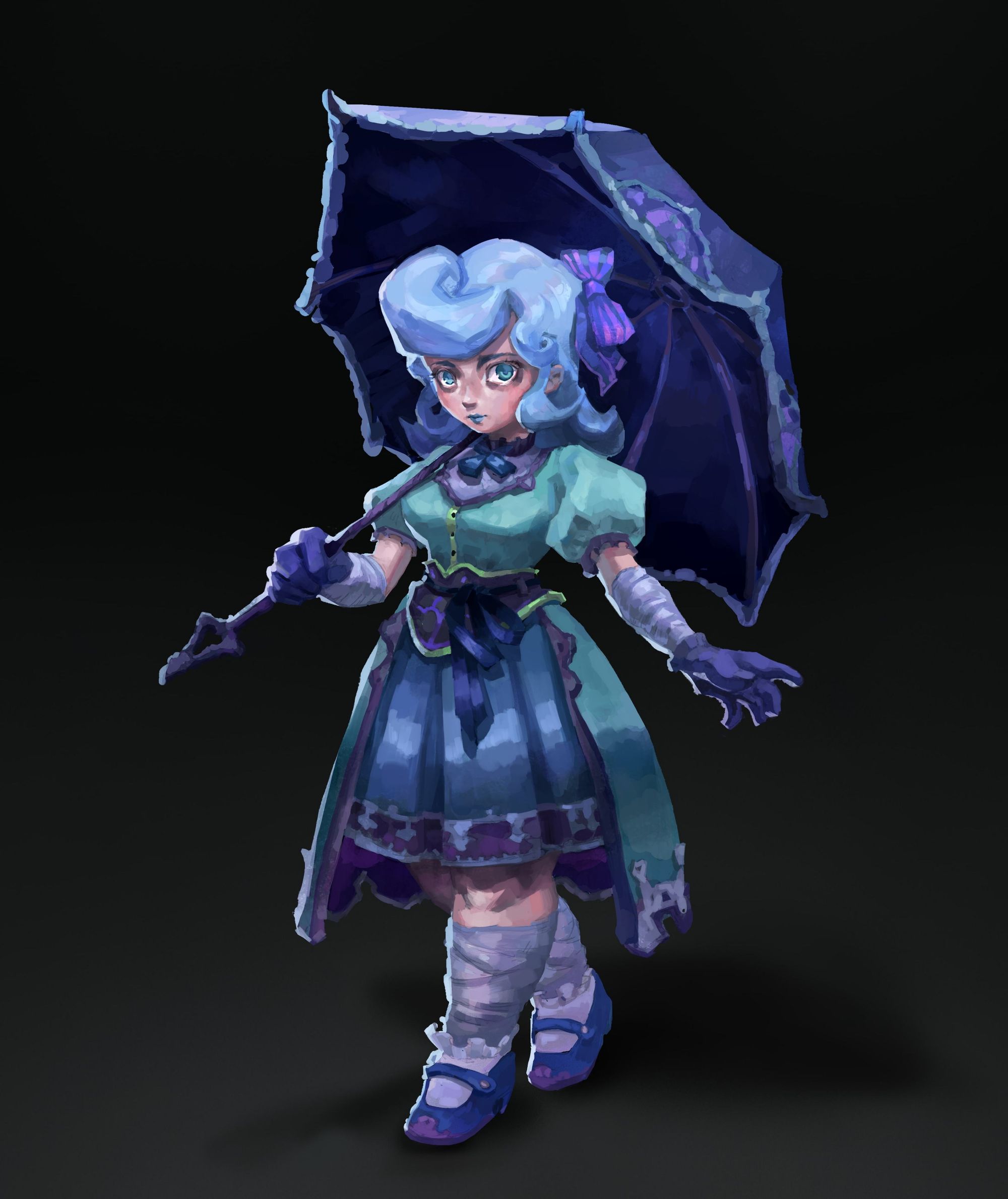
Because trying out different lighting is so easy in Blender, I ended up playing around with some more setups, and found a very interesting one that played up her ethereal and magical nature.
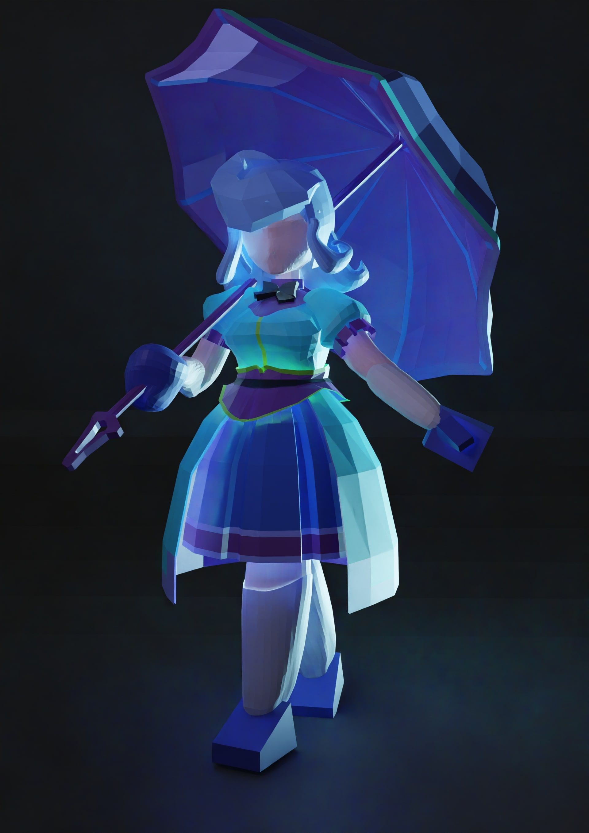
I really loved this setup, because she looks like she is glowing from the inside. I highly doubt I would have been able to come up with this sort of creative and unpredictable lighting had I only stayed in Photoshop and not ventured out into the Blender wilderness.
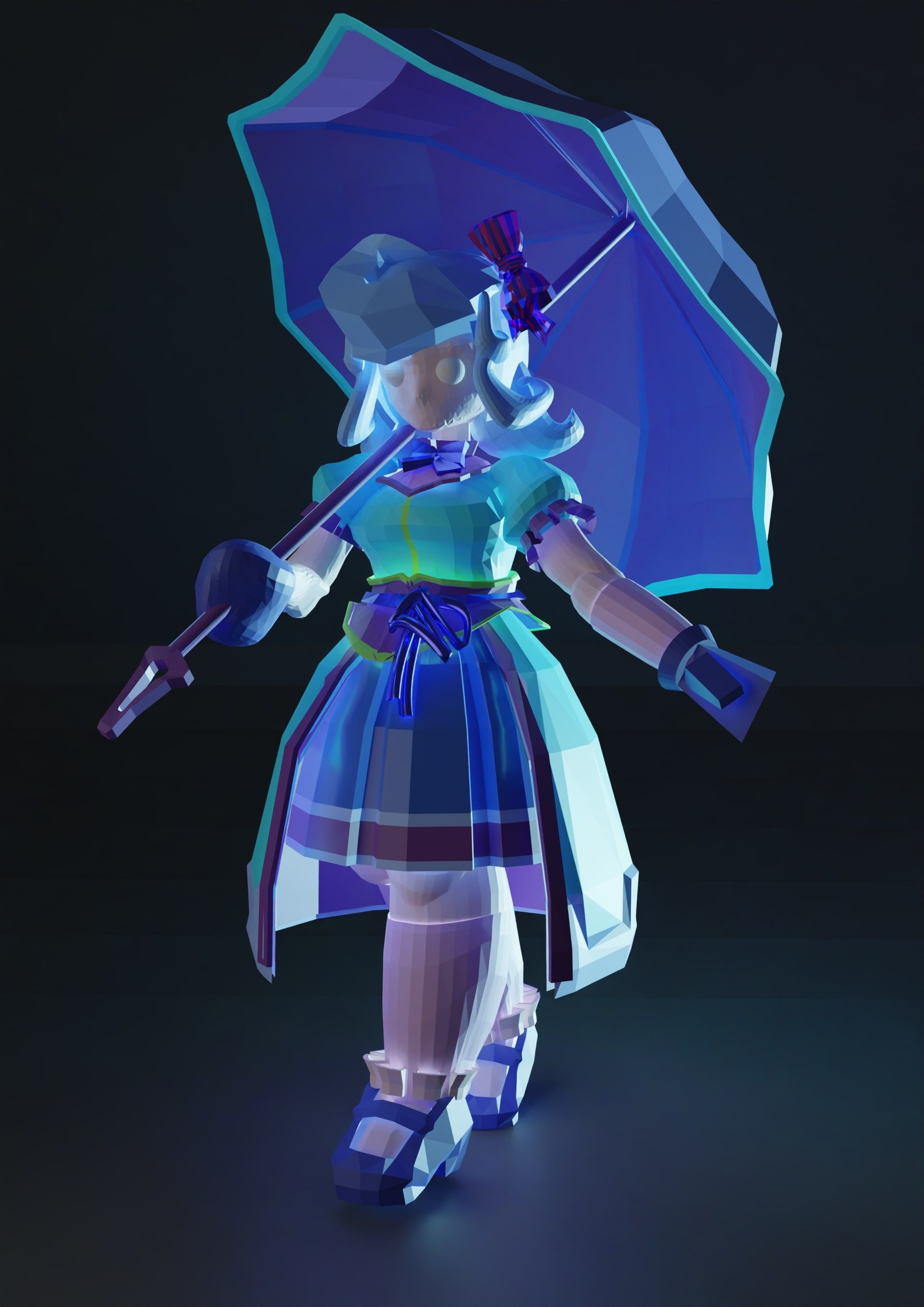
From there, I used the Blender lighting blockout as a reference for how to render my character. As I was repainting my fairy character (I started painting from the original drawing again), new questions emerged as to how light would interact with certain aspects of her character design. For instance, the foot region was stumping me as to how the light might wrap around such a subtly complicated form, and how the complicated shape of the ruffles would interact with the lighting that seemed to come from below. I modeled some of these other features in, and resumed my painting.
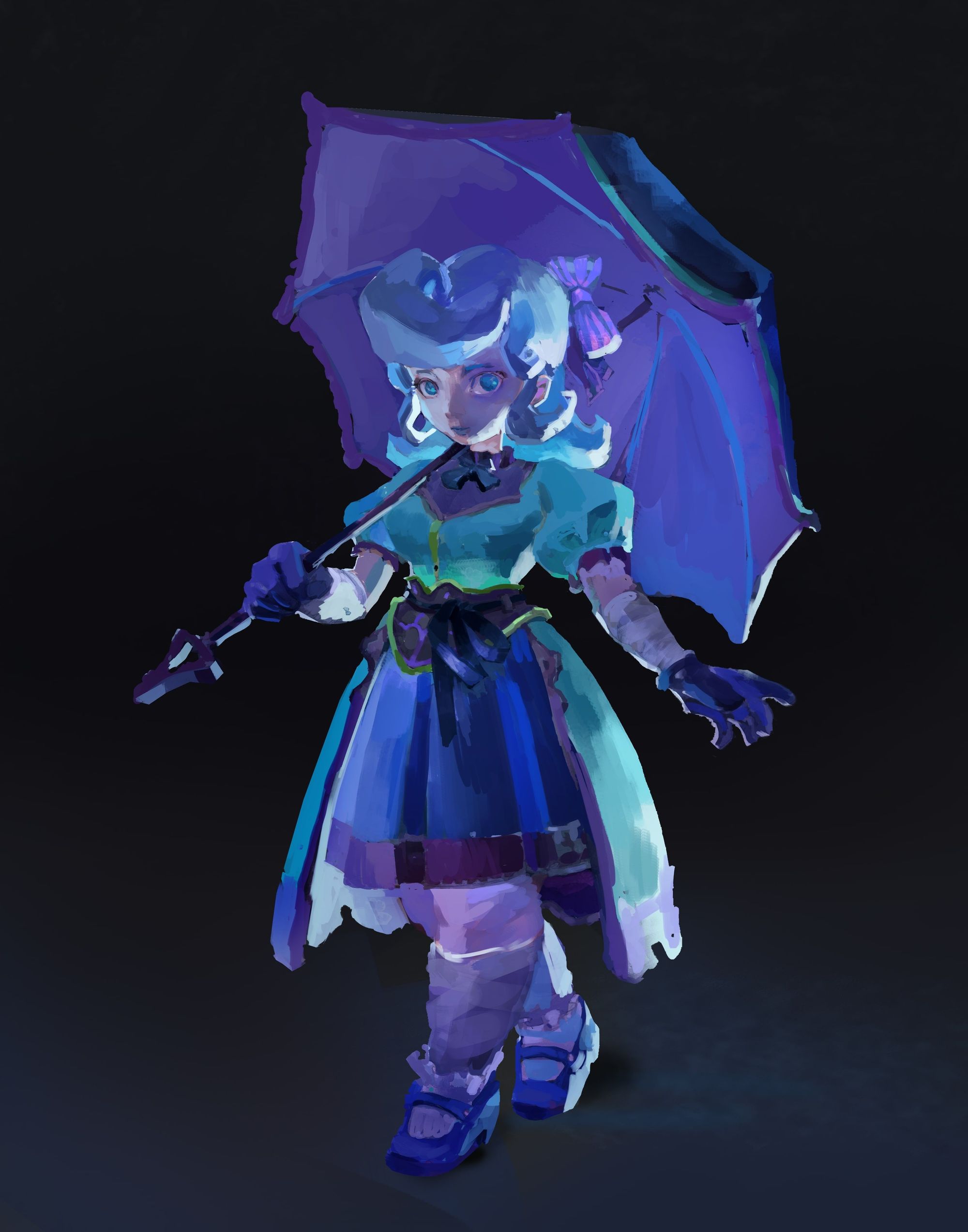
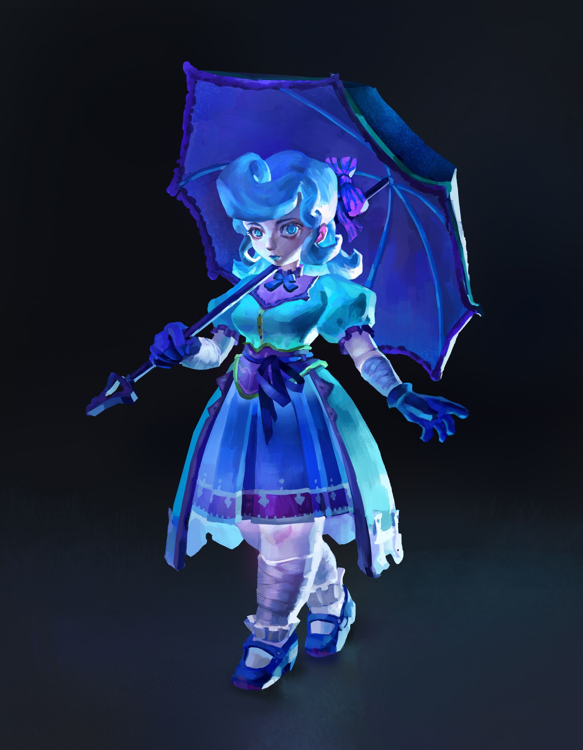
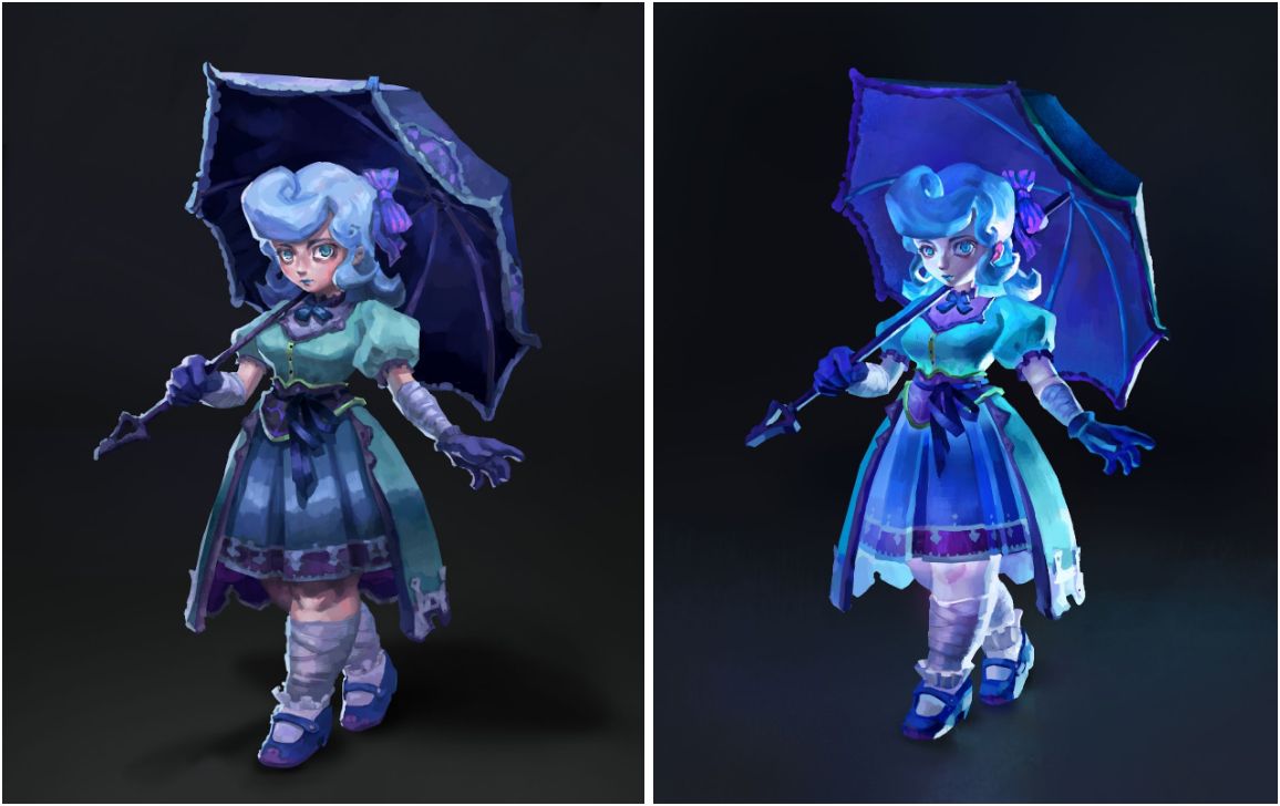
The final result had a lighting and colour scheme that was far more eye-catching, dynamic, and appropriate for a mystical character such as the fairy.
This was a project in which I used Blender specifically for its capacity to try out many different and interesting lighting scenarios. It is a great tool to use for any artist who is unsure how light and shadow might interact with certain forms, and wants more ideas.
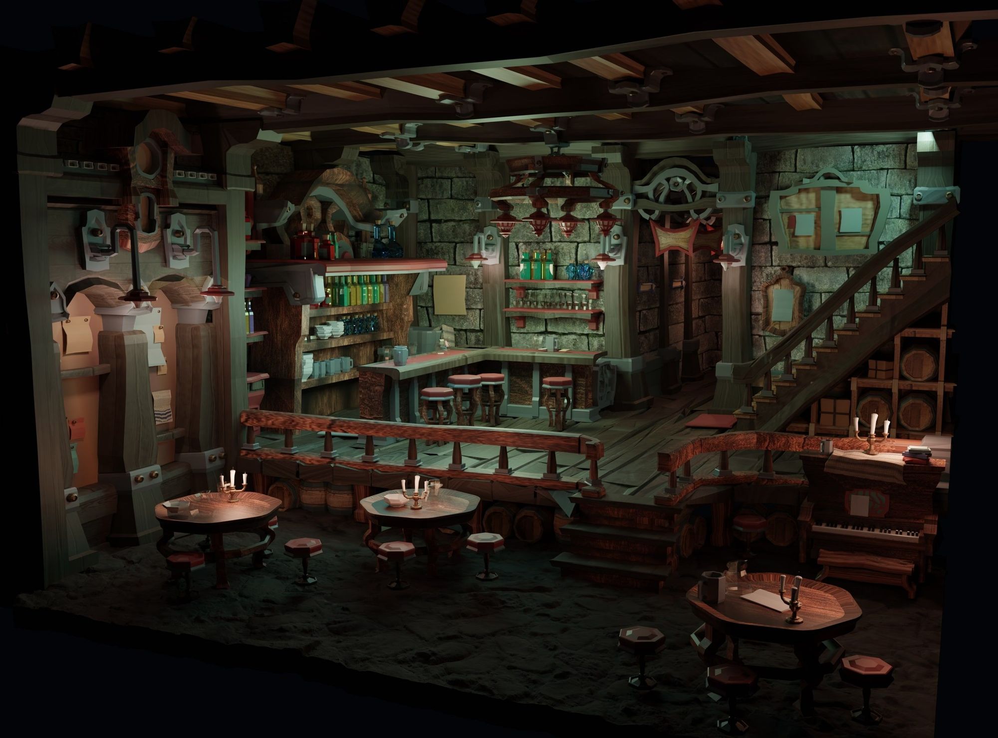
In the rest of my images, I will go through my process for how I approached creating a full environment painting in Blender. I will run through modeling, texturing, and lighting, but will focus more heavily on lighting. I believe lighting is where Blender truly shines when it comes to making difficult tasks in 2D more manageable.
In my perspective section I described strategies to employ for using Blender to draw environment layouts, which usually only requires blocking in of simple primitive shapes, and no texturing or lighting work. For creating environment paintings, there is a lot more work on the 3D side, but the payoff is worth it, in my opinion.
In a general workflow sense, my usual process is to start by modeling the scene, followed by texturing, lighting, and then rendering. Between the texturing and lighting phase I try to decide upon a camera angle. Because the deliverable I am going for is a 2D painted-over image, the lighting does not need to work for every angle like a game-ready environment. Thus, I have found it more efficient to first choose a camera angle before working through my lighting.
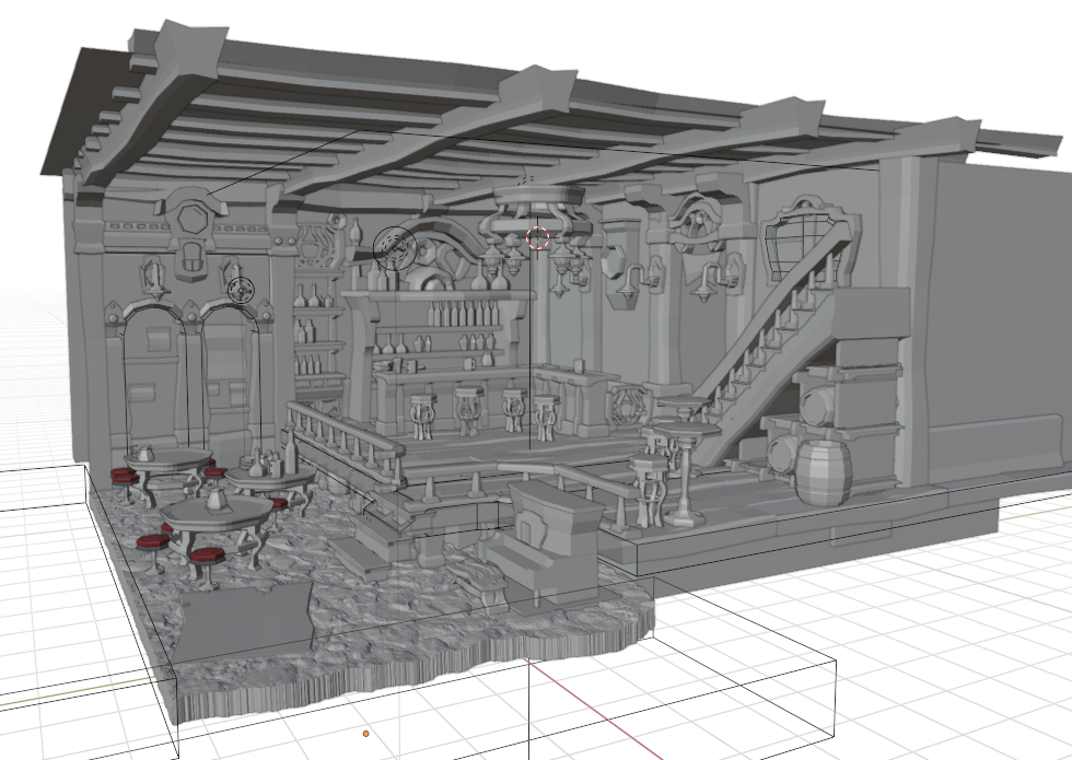
I try to do as much modeling work in Blender as I can instead of leaving things for the 2D painting stage. I found this strategy to be helpful for this particular scene, as it has very specific stylisation cues that are easier to model than to paint, and because it contains many repeating elements and objects that would be difficult to fully paint believably from an overly basic starting block–in. In general, front-loading the work in the 3D stage to create more precise looking models drastically improves the tangibility of your forms, instead of leaving the work for later, and will actually save you time from having to rework every minor detail in the painting stage.
Texturing: Texturing is important to capture certain essential material qualities of the various surfaces in a scene, so that any lighting you add will interact appropriately. Just adding local colour, adjusting roughness, and specifying whether the material is metallic or not will already take you very far.
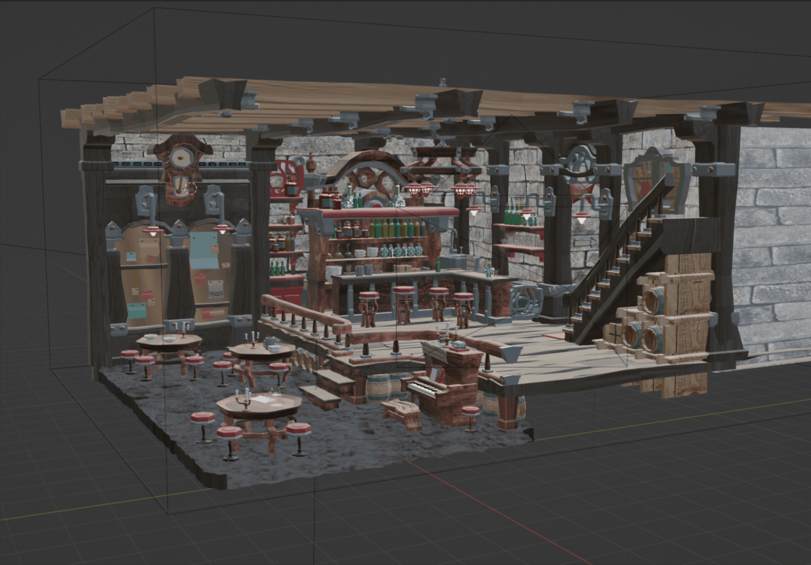
In my scene, I wanted to create more of a sense of tangibility, so I added basic textures such as a stone wall, a rocky floor, and basic wood texturing. These textures added smaller scale details to my image.
In addition to adding a wood texture to the floor boards, I also opted to model them out by hand, because I wanted to have control over the subtle ways in which each floor board was bent. I could have done a similar thing with the walls, or found an online texture with a displacement map that could make the flat wall plane look as if its geometry was jutting out of the surface, but in the interest of time, I used a JPG, because I knew that painting more of a three-dimensional sense to the stones would be relatively straightforward. For the rocky ground, I pulled a rocky ground model from Sketchfab (approved for commercial and personal use) and booleaned it to fit my scene.
My textures were generally somewhat slapped-on, which was more of a personal preference.
Texturing is one of those aspects of Blender that can be both an unnecessary time-sink, or a fundamental aspect of one’s workflow, depending on one’s goals as an artist.
Realistic textures become much more important if there is not a huge paintover component, or if one is going for a more realistic, less stylised end product. Handmade-looking textures can be painted directly in Blender using vertex painting or texture painting, but if the end deliverable is a 2D image anyway, it seems easier to paint on those textures in a painting program after the fact.
With that said, Blender’s node-based shader system is extremely fun to play around with. I have generally just found that if an artist wants to create more painterly, hand-made images, extremely specific textures are not the most important part of building a scene, and carry far less mileage to producing the type of image I like.
Lighting: In terms of the ratio of effort in Blender to its effects on an image’s appeal, good lighting (in my opinion) gives artists the most bang for their buck. It is so easy to move lights around, and to change their intensities and colour temperatures.
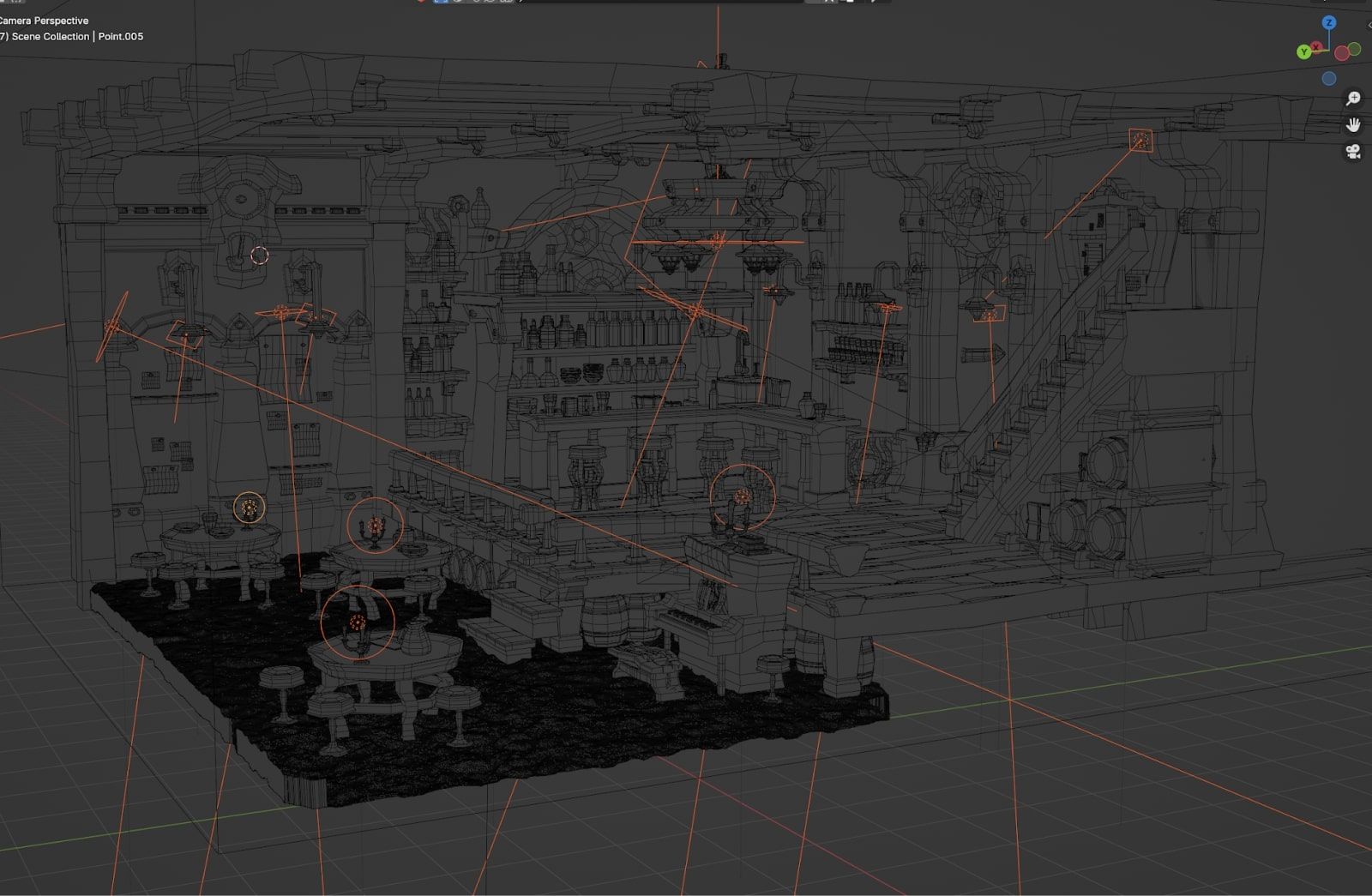
These were the lights that I included in my scene. Although it looks complicated, the ideas behind the lighting decisions were pretty simple.
I found it helpful to think of lighting the same way I think of painting. In any composition, there will be areas of interest and areas with less interest, and images tend to look the most intentional when there is a hierarchy of where to look. Areas of high contrast will generate interest, and stronger lights will usually create more contrast. Therefore, the strongest lights in a scene are best reserved for focal points.
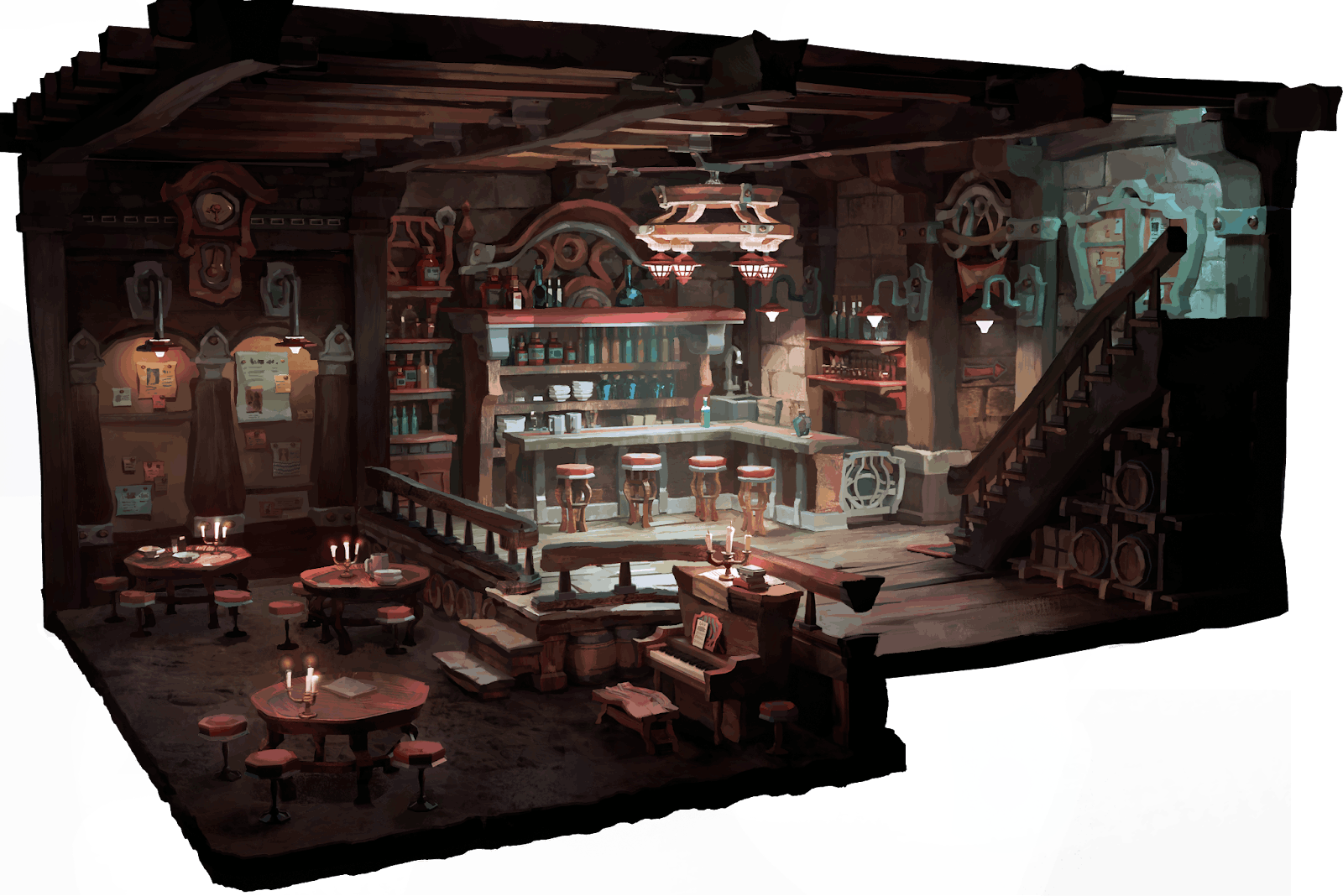
Thus, when lighting a Blender scene, it is important to figure out where the main area of focus will be. In this scene, I chose the central bar area, which has the most interesting variety of forms in my opinion. It was also easy to justify the lighting given the location of the chandelier.
One important lesson I learned in lighting my Blender scene is that the actual placement of lighting does not need to be in the literal locations of the light sources in the image. As long as the lighting believably looks as if it is motivated by the practical lights (the identifiable sources of light) in the scene, then any number of lights can be placed anywhere. Lighting does not need to be literal, only believable.
I included small point lights for the candles on the tables and piano, small area lights for any wall lamps, and a circular area light pointing upward to make the silhouette of the chandelier stand out against the background. I added additional area lights to highlight any areas that were fading into the dark too much, like the piano or the upper part of the bar shelf. Fill lights are great for adding more depth and colour temperature variety in non-key light areas. I liked the idea of light coming from the top of the staircase to suggest the presence of a world beyond this environment. I made this lighting effect less intense so as not to compete with the main focal point, with lighting motivated by the chandelier.
I also added a volumetrics (Blender fog, essentially) encompassing the entire scene to create a sense of depth and atmosphere. The slight fogginess makes the lighting look slightly more “opaque”, creating a sense of space in the image.
Playing with the colour temperature of the lights was a fun way to adjust the atmosphere of the different areas of my environment. The key lights in the upper section of the tavern I made cooler, and the fill lights in the lower section of the tavern and in the rest of the scene I made warmer. I wanted to have some level of contrast that would draw the eye more to the keylighting, as the overall local colours of the scene skew very warm.
Although I had already settled on a camera angle early on in the process while I was still modeling, I enjoyed playing around with potentially other good camera orientations once I had finished lighting the scene. This was one that I enjoyed, and I adjusted the lighting to try out a spookier atmosphere. I decided to stick with my original angle, but it was fun to experiment!
In my opinion, it is worth spending a bit of extra time finagling the lighting in 3D if your end deliverable is a painting. Lighting is extremely powerful–it can make amazing modeling and a great environment design/layout look stale and uninspired, and it can make very simple modeling look fantastic. Because I spent a while making sure my models had the right level of “wonk” that I had intended, I wanted to make sure that my lighting scheme would at least not take away from the hard work I put in.

Another thing to note is that in my lighting stage in Blender, I did not use any extremely strong lights that would overexpose my image and kill any subtle changes in values, because it is a simple task to push dark values darker and lighter values lighter (creating more contrast) in the painting stage.
Paintover Stage: Masking Seperate Objects
Once my lighting was figured out, I rendered out my image. I knew that my paintover would involve making the silhouettes of various objects more clear against their respective backgrounds. In preparation for this, I separately rendered out objects (against a transparent background) that I thought would pose a challenge in creating clean edges. These objects included anything that had difficult or repeating shapes that created strong silhouettes.
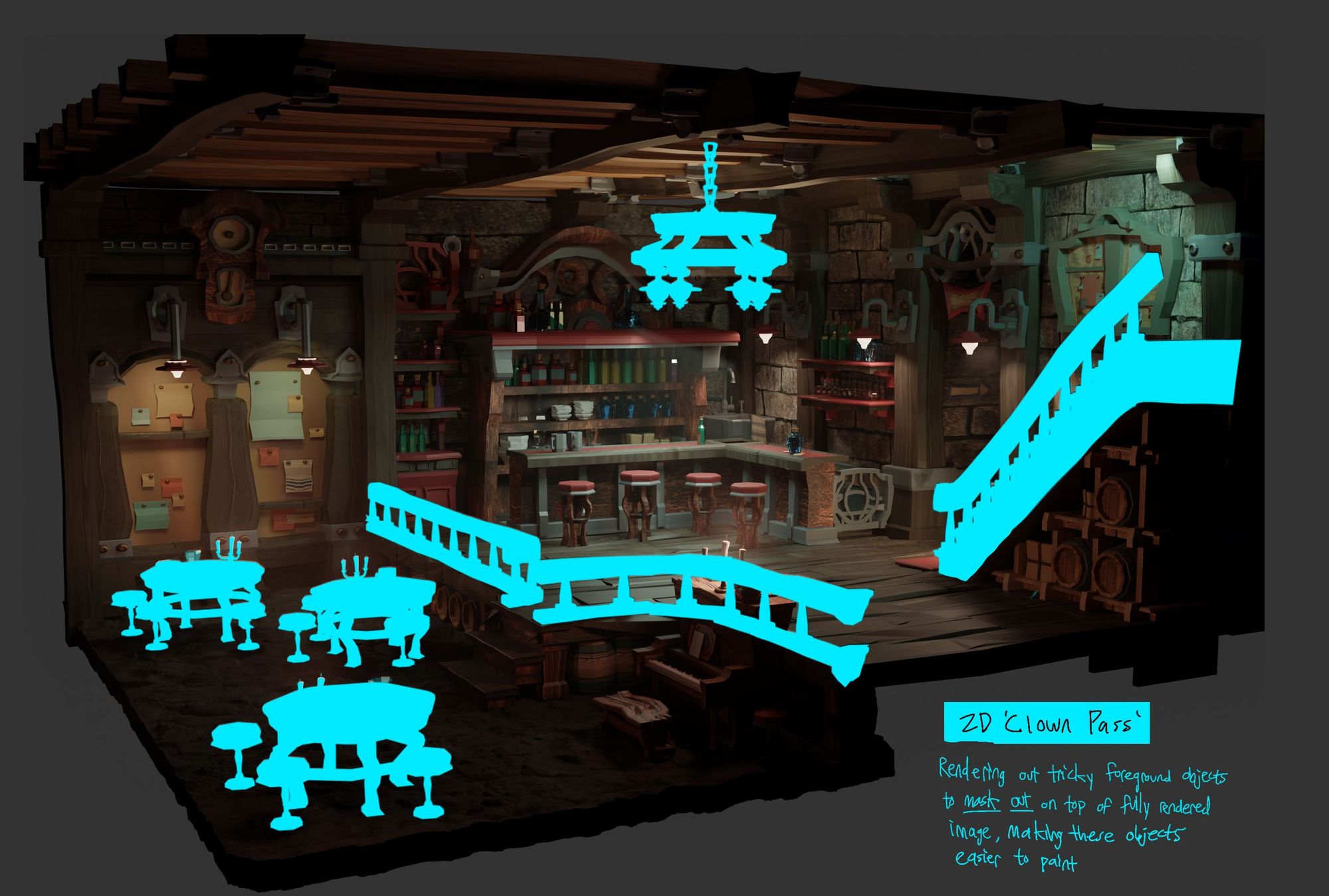
In Photoshop, I layered the .png export of my base render below the render of the separated objects. With transparency locked, I filled in the separately rendered layer with a flat colour that contrasted strongly against the image. Note that the lighting of these separately rendered objects is irrelevant, because I am using them for their silhouettes. Having this highly contrasting, masked-out layer allowed me to use my magic wand tool to select the exact shape of any of these contiguous silhouettes, hide the individual masked object layer, and then paint either within or outside of the selected shape.
Being able to render out the shapes of individual objects to use as a mask was extremely helpful in keeping the edges of difficult silhouettes tight and clean.
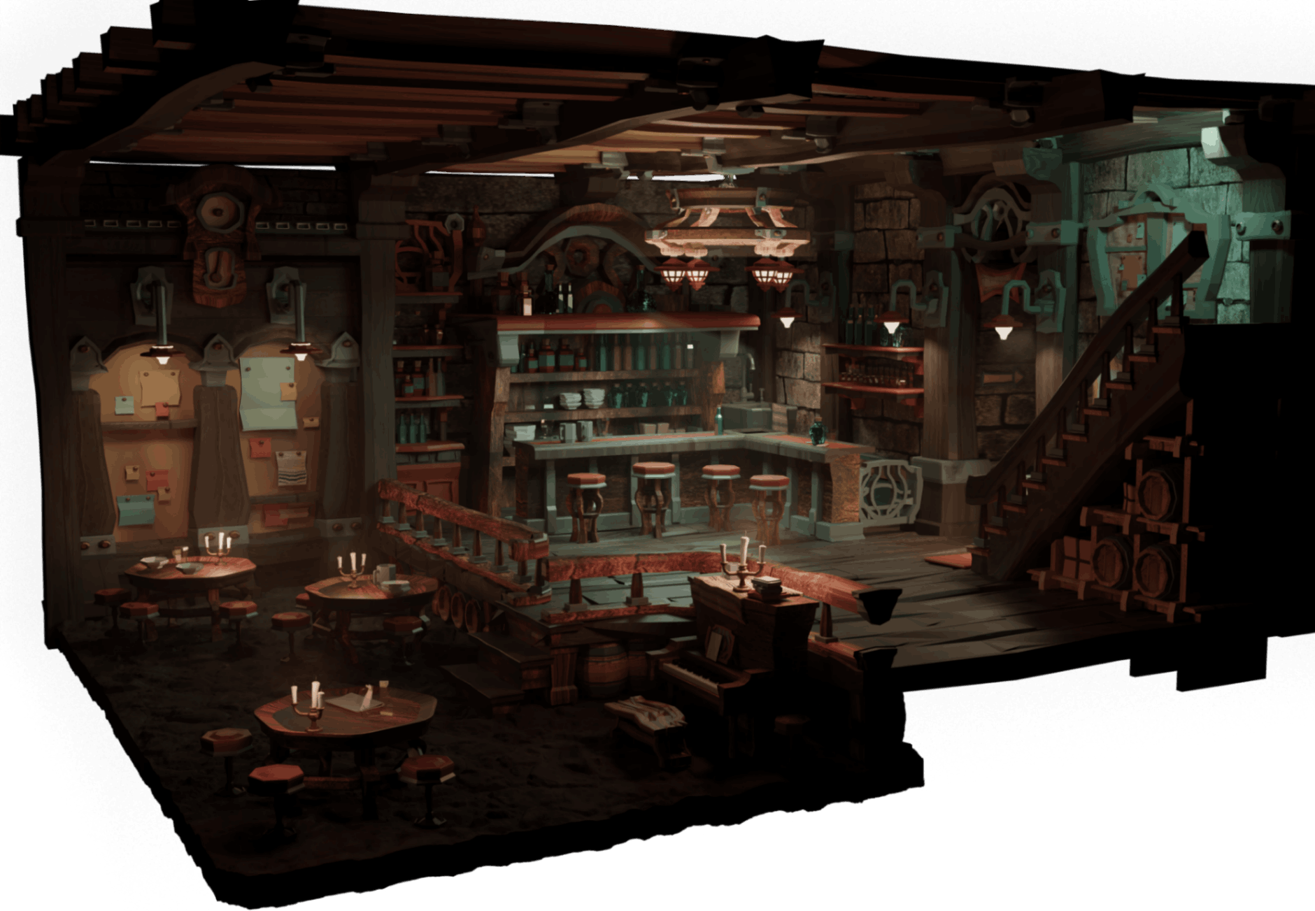
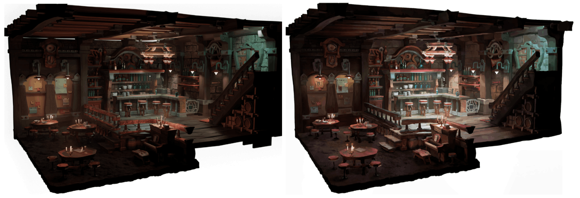
A side-by-side comparison of the base render and paintover makes it easier to see the overall changes I made to my image. I bumped up the lightness of the values in the bar area of the image, to make it the first place the eye would go. I also brought more light to places that did not catch much light, such as the piano and the steps leading into the lower area of the tavern. In my rendering, I made sure to make plane changes in geometry clear, to create a sense of form and three-dimensionality. I also used my paint strokes to create the sense that the environment was hand-made, and to details that would add a human touch to the whole image.
Essentially, the paintover was mostly cosmetic. I pushed darks and lights, and had fun adding a more faceted, painterly look. However, I did not have to entirely repaint objects, or synethesise completely new lighting, as I had invested enough in my Blender modeling, texturing, and lighting that I was already very satisfied with the major aspects of my image. Throughout my entire process of learning Blender for concepting, I learned that it is far more time and energy efficient to problem solve big issues (composition, design, lighting) sooner in Blender, rather than leaving them for later in the paintover stage.
Blender is a deep program that has so many applications for artists that it can be overwhelming to know where to start. I wanted to share my experience using the program as a beginner to share the most salient aspects of how Blender can be a powerful tool for 2D concepting, instead of getting bogged down in the parts of the program that may be less useful for concepting.
To summarise, two of my favorite reasons to use Blender as a tool for making stylised 2D art are to outsource the stress of drawing accurate perspective and rendering accurate lighting. Both of these tasks are so much harder in 2D than 3D.
Of course, this does not mean that having an understanding of perspective or how light works is no longer important, just that there is so much more brain space to be creative when a computer figures out the boring math stuff. Instead of feeling as if Blender would restrict me as an artist, which was my initial reaction, I have found that Blender has given me so much more room to be creative.
Thank you so much for reading, and I hope this post encourages artists to also try Blender!
Reach out to Jessica via her Rookies profile here.