Creating a Stylised Feng Zhu Design Environment
In this article, Carlos Garcia, an ESCENA Escuela de Animación student, shares his process for creating a stylised Feng Zhu design environment, along with feedback from instructors.
In this article, Carlos Garcia, an ESCENA Escuela de Animación student, shares his process for creating a stylised Feng Zhu design environment, along with feedback from instructors.
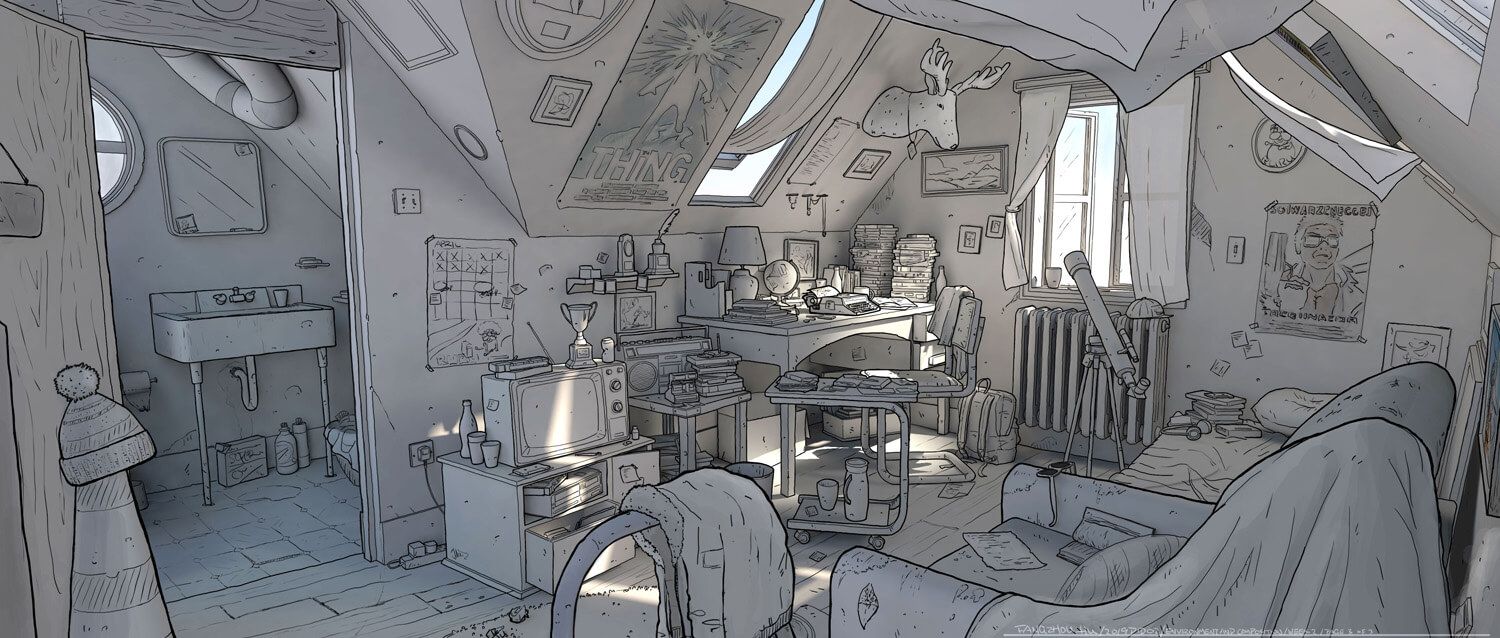
In this article, Carlos Garcia, a student at ESCENA Escuela de Animación, shares his development process and techniques behind his latest project: the creation of a stylised Feng Zhu design environment. Additionally, valuable feedback received from instructors at school will be shared. Read on for some inspiration for your own projects!
Hello everyone, my name is Carlos Garcia, and I'm currently a student at ESCENA Escuela de Animación, and Illustration and Concept Art. In this article, I'm excited to delve into the development process and techniques behind my latest project: the creation of a stylized Feng Zhu design environment. Additionally, I'll be sharing valuable feedback I received from my instructors at school.
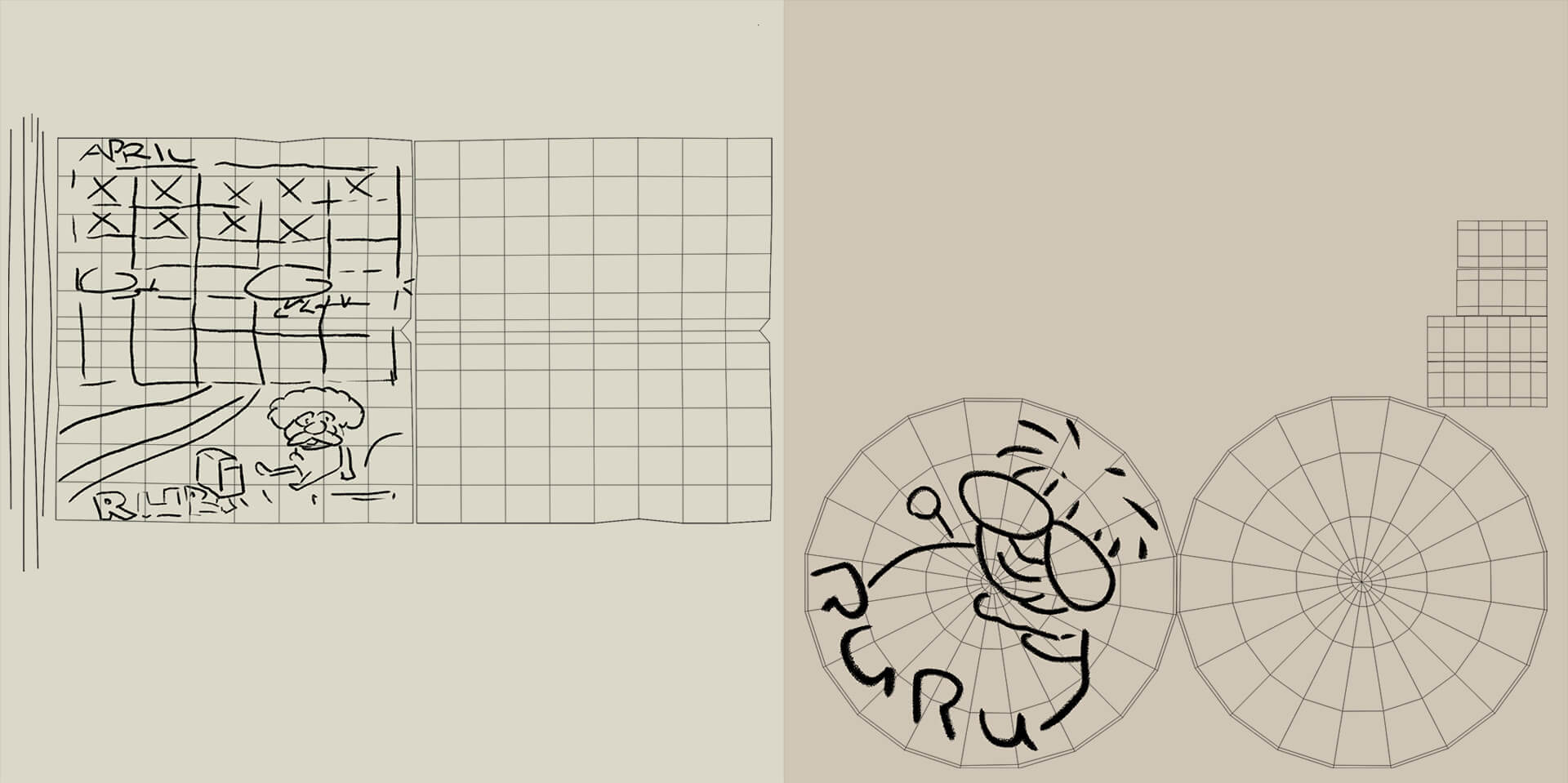
The first step was to set up a camera so that the grid aligned with the concept's floor. This was crucial because it involved a room with a perspective camera angle. Initially, I configured the scene in Maya using meters and a camera rig to import the concept. Due to resolution discrepancies, I adjusted it to 1920x860 for consistency. I then fine-tuned the camera's position, rotation, and focal length until the floor and grid aligned. While this process can be somewhat tedious, ensuring proper alignment between the camera and the floor facilitates easier modeling placement.
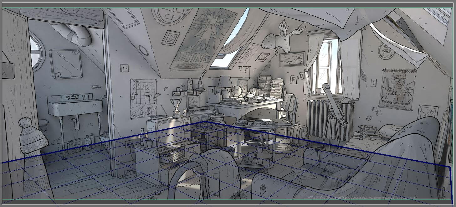
The next important thing to do was to define where the walls and floor should be, especially because of the irregular shape of the attic ceiling. You can check that everything is aligned with the concept using X-Ray.
I then made the general shapes of the assets of the scene, and in some cases I just left cubes.
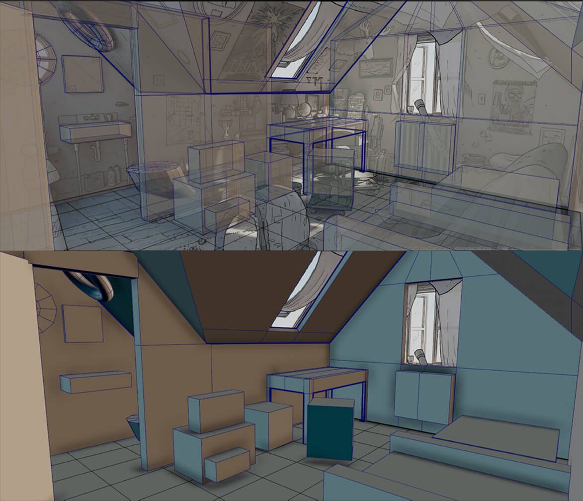
Here, I realised that some things had the wrong scale. For example: the bed was too low, so I put dummies of 1.75 m high to define the scale of things.
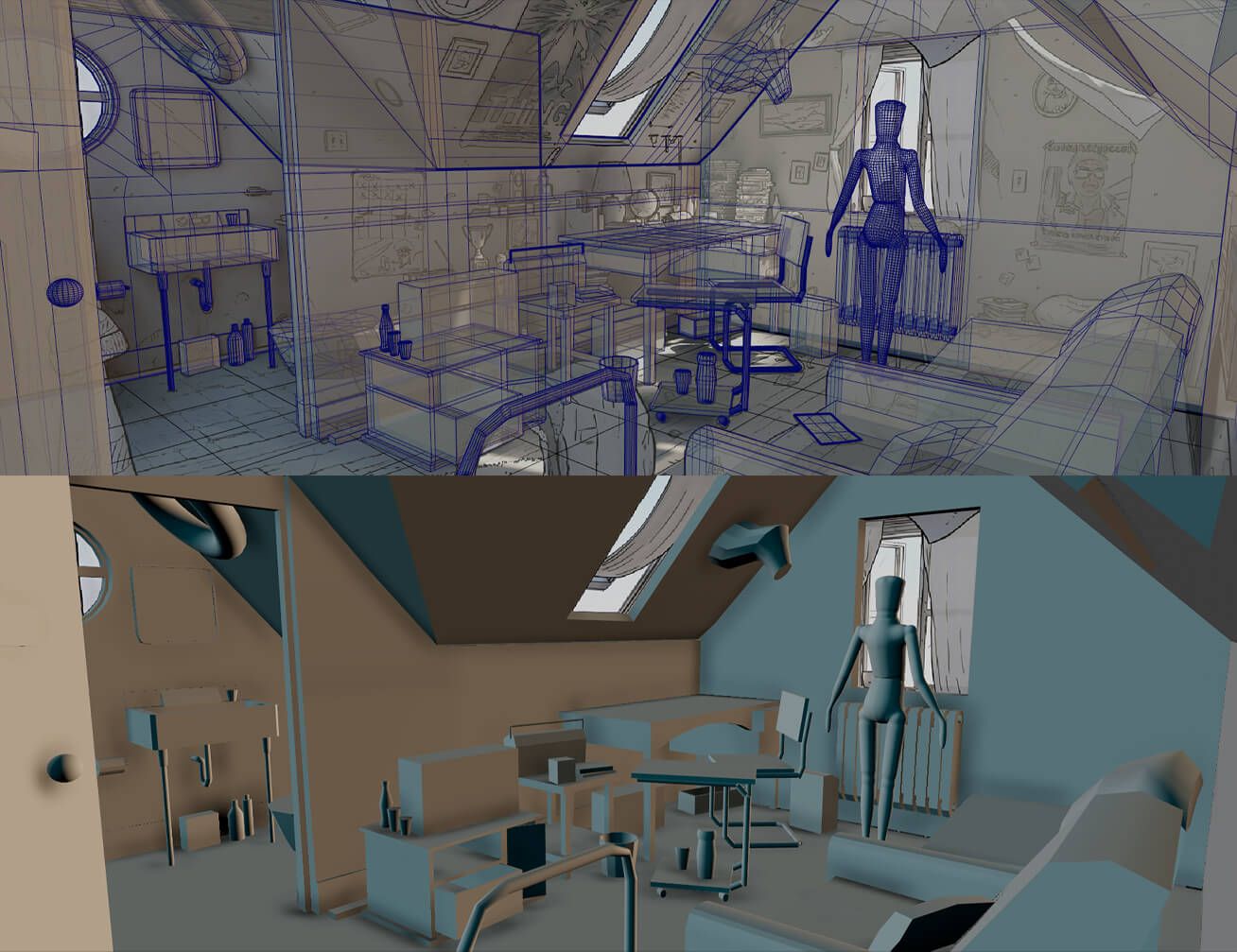
My teacher recommended considering whether the dummy could realistically inhabit the space, prompting me to ensure that the scale of objects was suitable for him. The key in this phase is to precisely define the position and scale of the objects. Simple assets were modeled based on the shapes established during blocking, with some utilising the blocking as a reference box to maintain scale consistency. Additionally, more complex assets such as the curtains were reserved for later stages.
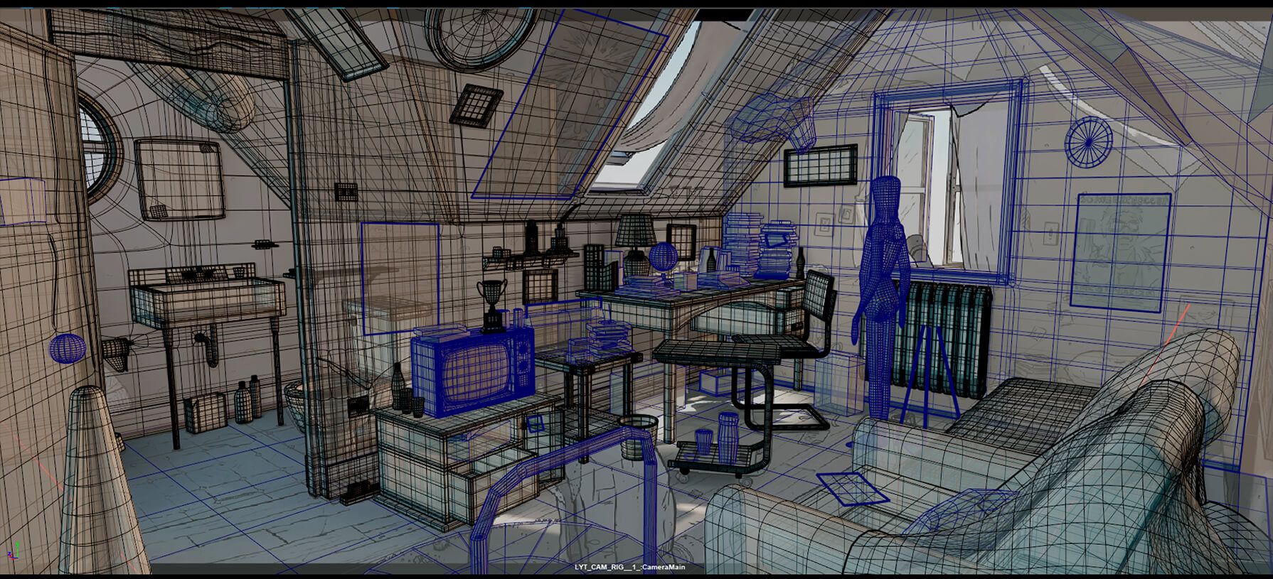
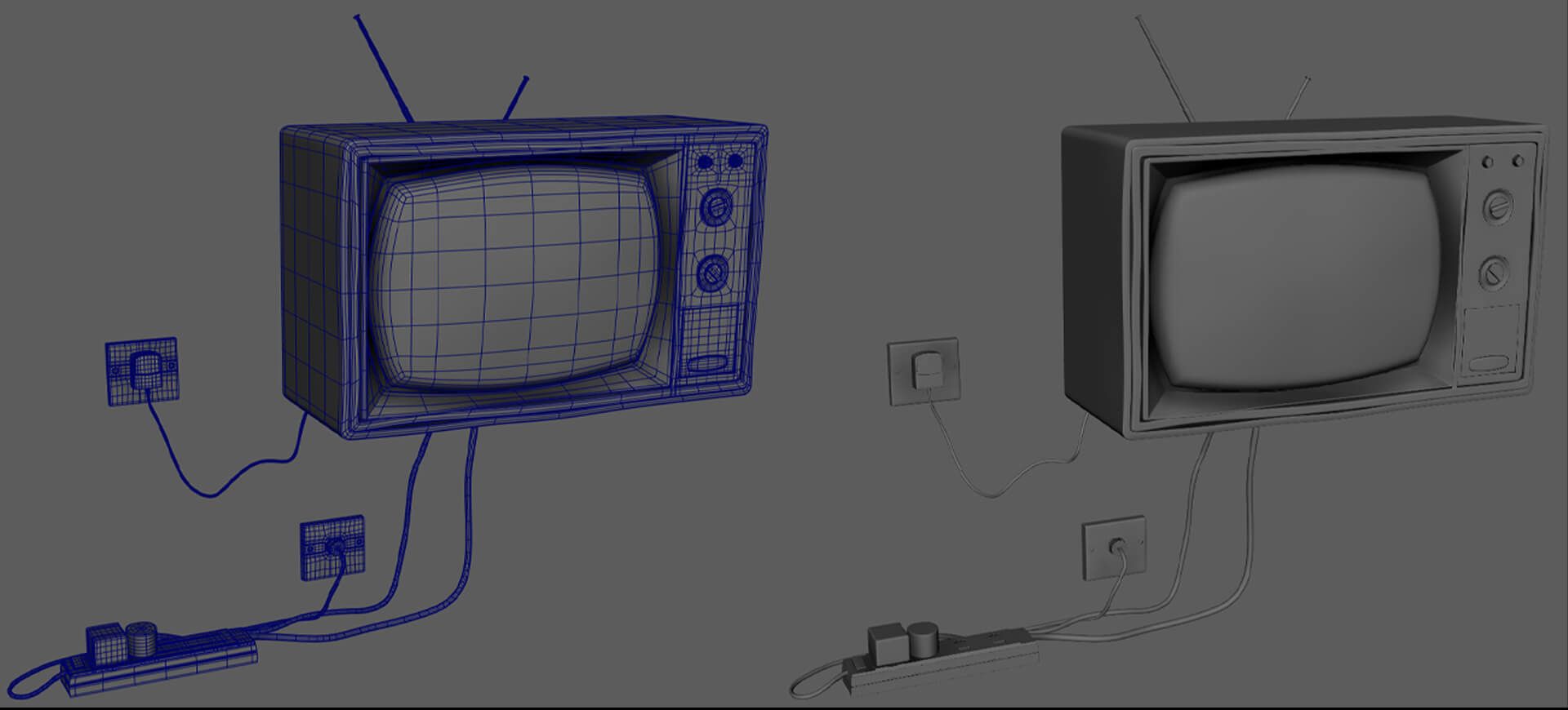
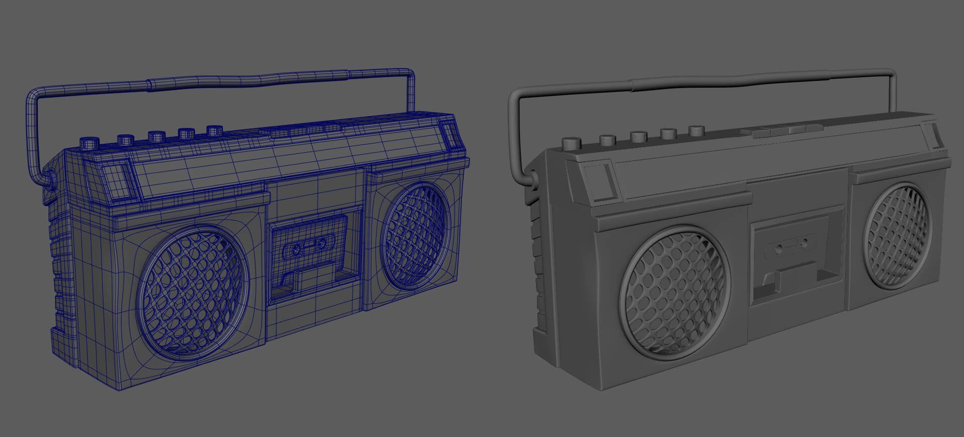
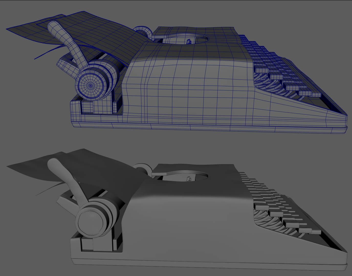
Once the blocking phase was complete, I proceeded to modeling. Modeling Home Appliances posed the greatest challenge. I looked for real-life references to capture intricate details. Maintaining quad-based topology was important, avoiding triangles where possible. When I finished each asset, I organised it into a designated group within a layer, marking its readiness by rendering the mesh black.
To create the wood grain effect for the flooring, I utilised a technique I learned. First, I formed a diamond shape spanning from one end of the board to the other, adjusting its length according to the desired grain length. Then, I lowered the central edge of the diamond to achieve the desired depth. Additionally, I utilised sculpting tools to introduce subtle variations in the gap between individual boards.
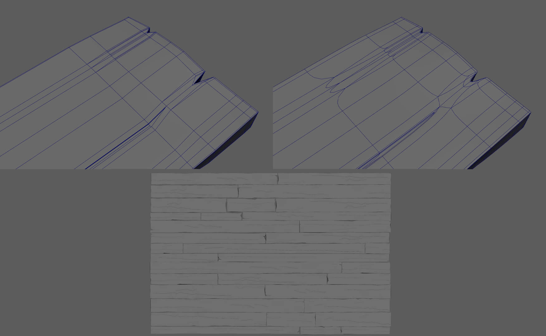
Finally, I placed a plane underneath the boards to fill any empty spaces, allowing for low-poly stylised wooden boards.
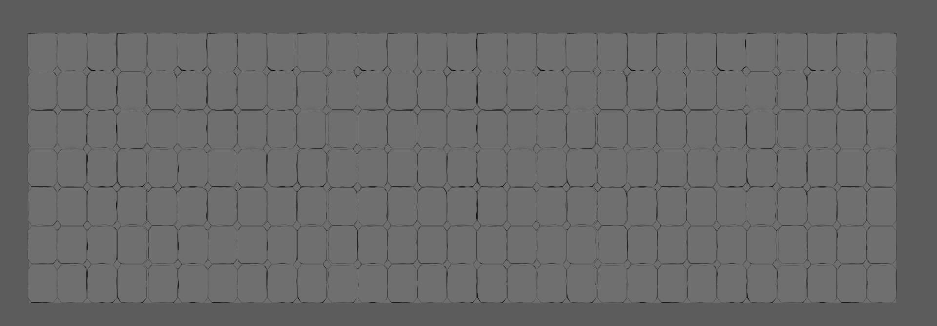
For the bathroom floor, I created a square pattern with slight variations. After duplicating and scaling it to fit the bathroom area, I achieved the desired effect.
I made the cables, tubes and collars using sweep mesh. With this tool it’s easier to give direction to very long assets.
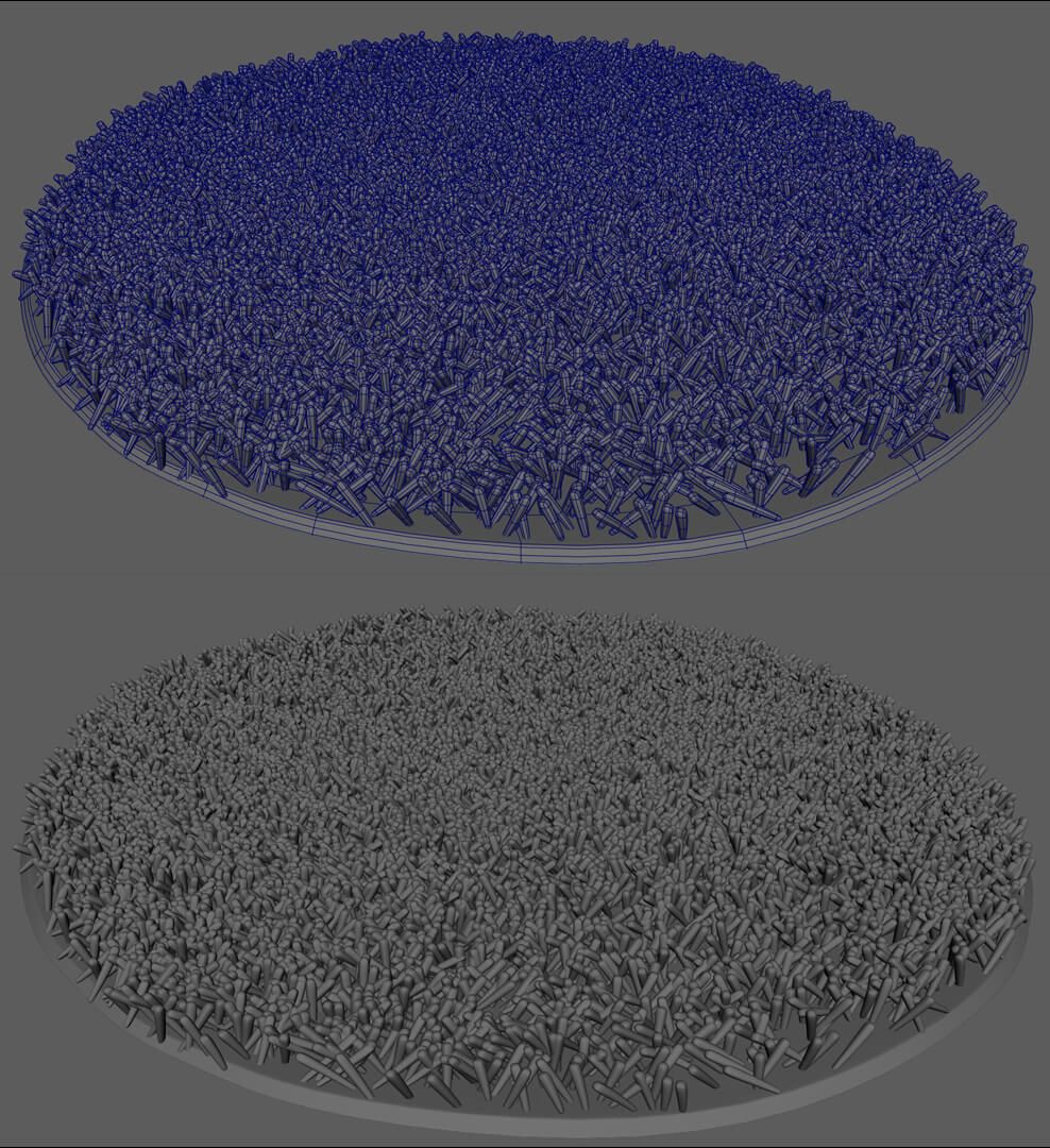
I wanted the rug to still look stylised, so I decided to use MASH in Maya. First I modeled a simple polygon and replicated it three times and gave each copy a little variation. I put a cylindrical base to delimit how far the rug goes.
I would like to highlight two things I learned from this stage:
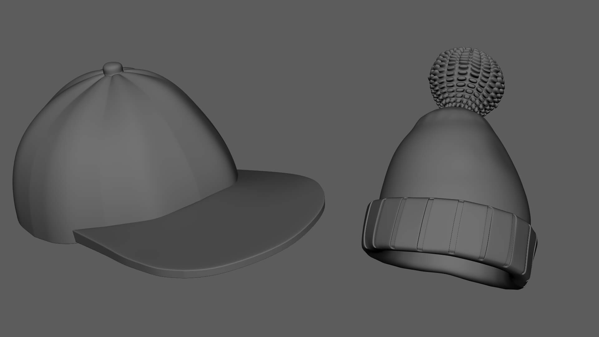
For this step, I used Marvelous Designer and ZBrush. Except for the beanie and the window cap, for those I modeled them in Maya. I also used the sculpting tools to give them a more organic finish.
For the blankets, I first exported the furniture in its original position. This way they came out how I needed them when I imported them into Marvelous. This part was easy because I only made rectangles and simulated their fall.
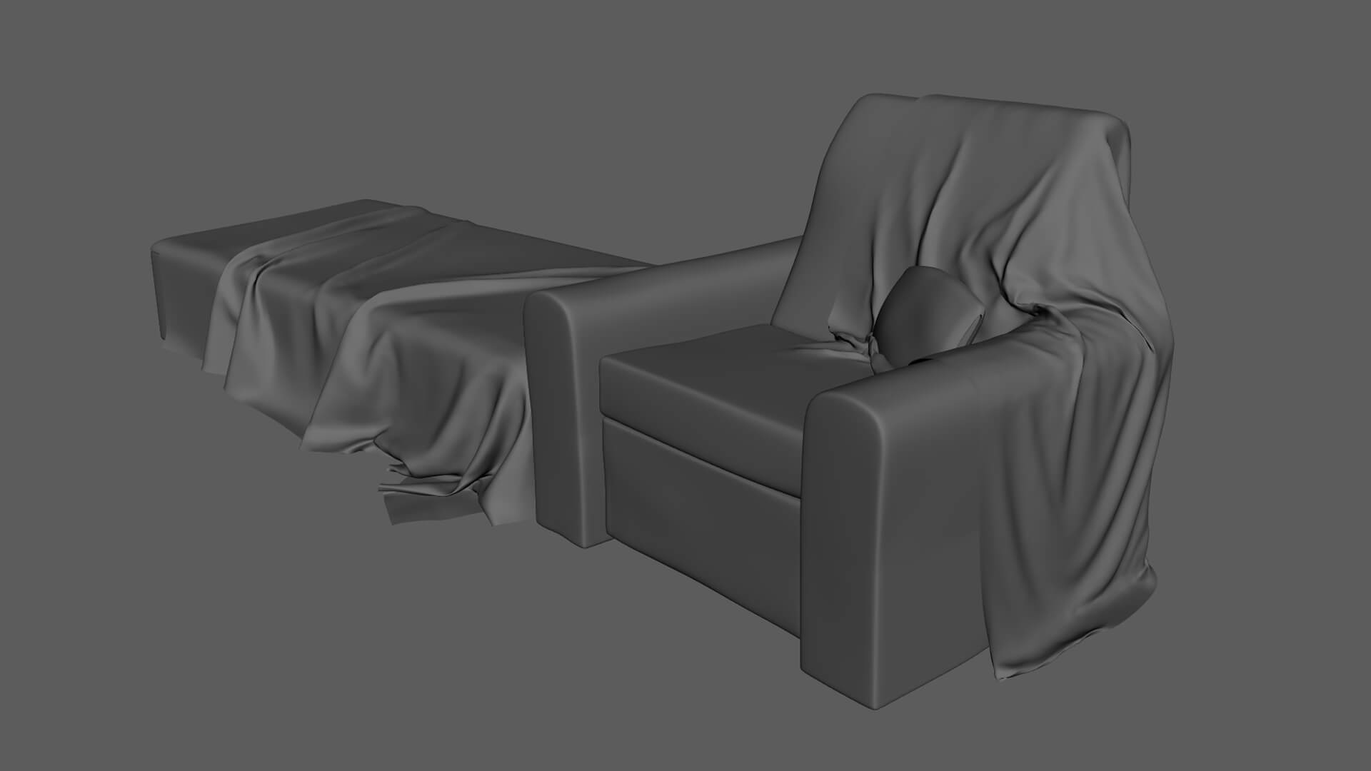
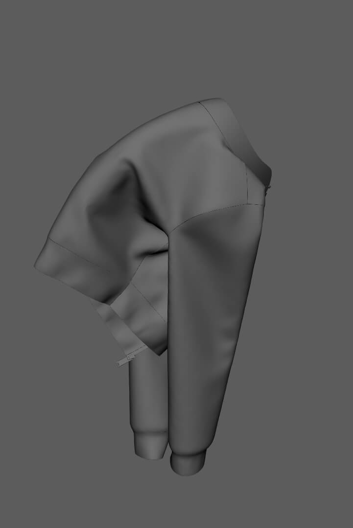
For the jacket, I used a pattern from the default blocks folder in Marvelous. Then I modified some patterns to make it look like the one in the concept and simulated it on the chair.
The curtains at the top, I simulated them using the pin tool to hold them to a base. For the curtain that is tied, I used a rectangle as a knot, I activated the bond attribute to make it press.
In this part, I was simulating and exporting to Maya. This way, I was seeing how much the shape of the cloth resembled the shape of the concept. If it didn't resemble it, I froze parts of the fabric to try to make it look the same.
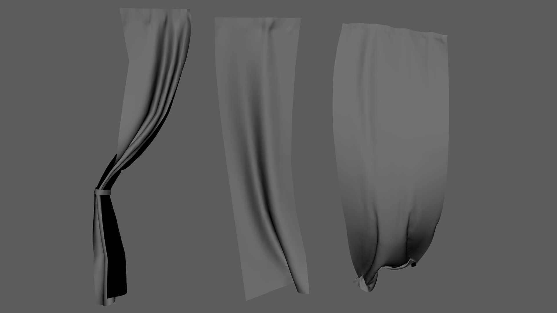
When it looked like the concept, I exported the garments to ZBrush and used zremesher to remove the triangles and moved it back to maya.
In the end, I noticed that some parts of the curtains and blankets were going penetrating things in the room. In this case, I used the sculpting tools and moved them around a bit to fix it.
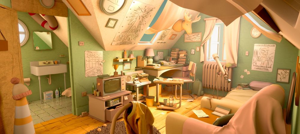
Since the concept is monochromatic, I took the liberty of choosing the colours. I went for a warm palette between greens, yellows, and oranges.
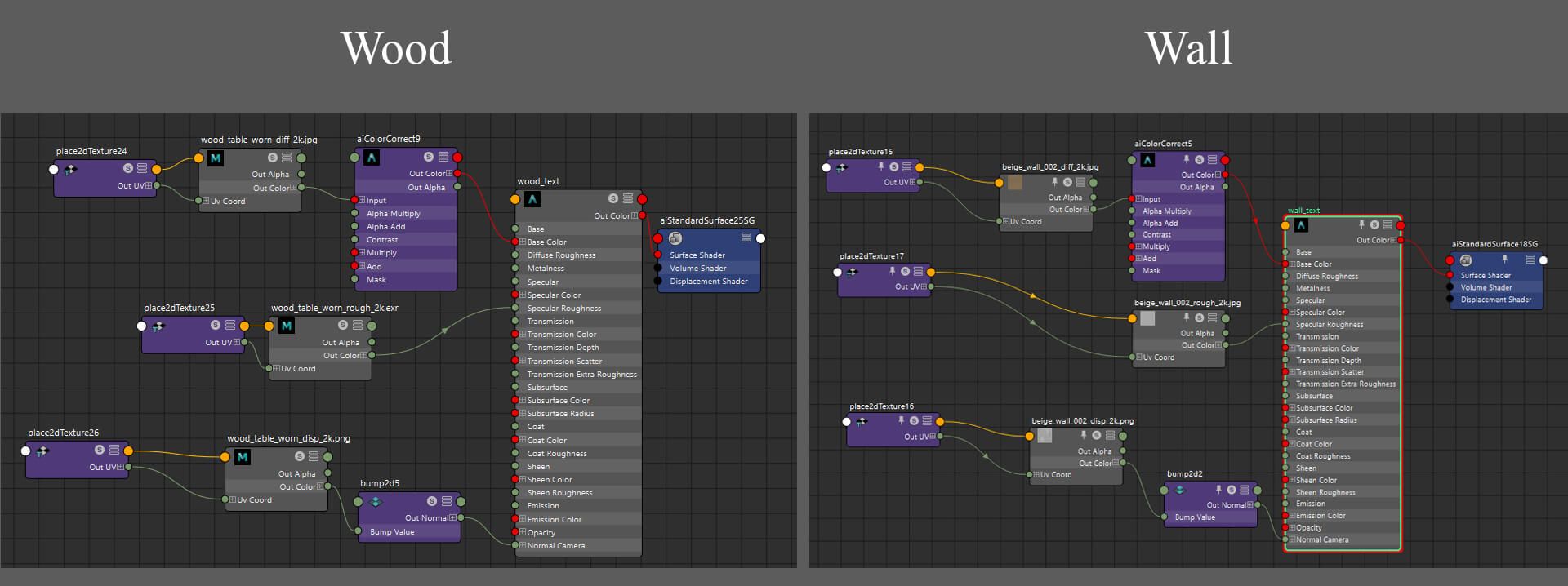
For most of the assets I only used an aiStandardSurface, and I put a base colour that matched the palette and played a little with specularity.
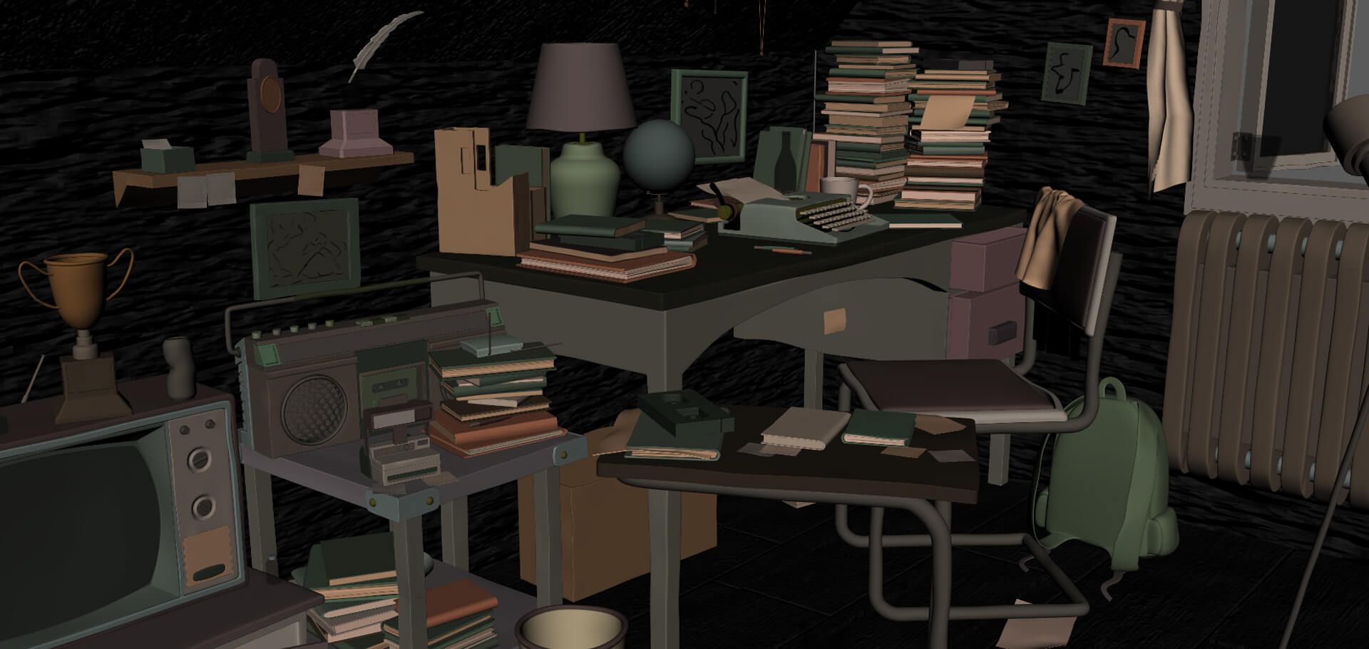
In other assets, I used procedural materials from Poly Haven, a site that offers free to use resources. Mainly for the wood of the floor and walls. For this, I searched for textures and connected the maps in the aiStandardSurface. I also added a little colour correction with aiColorCorrect.
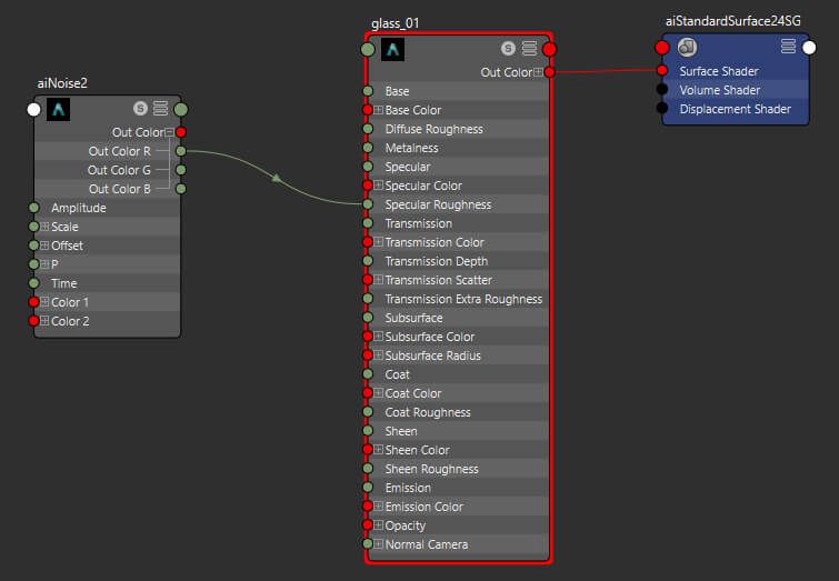
For the transparent materials I used the aiStandardSurface presets, and then added a base colour to them. I also put an aiNoise node in the specular roughness to give it some variety.
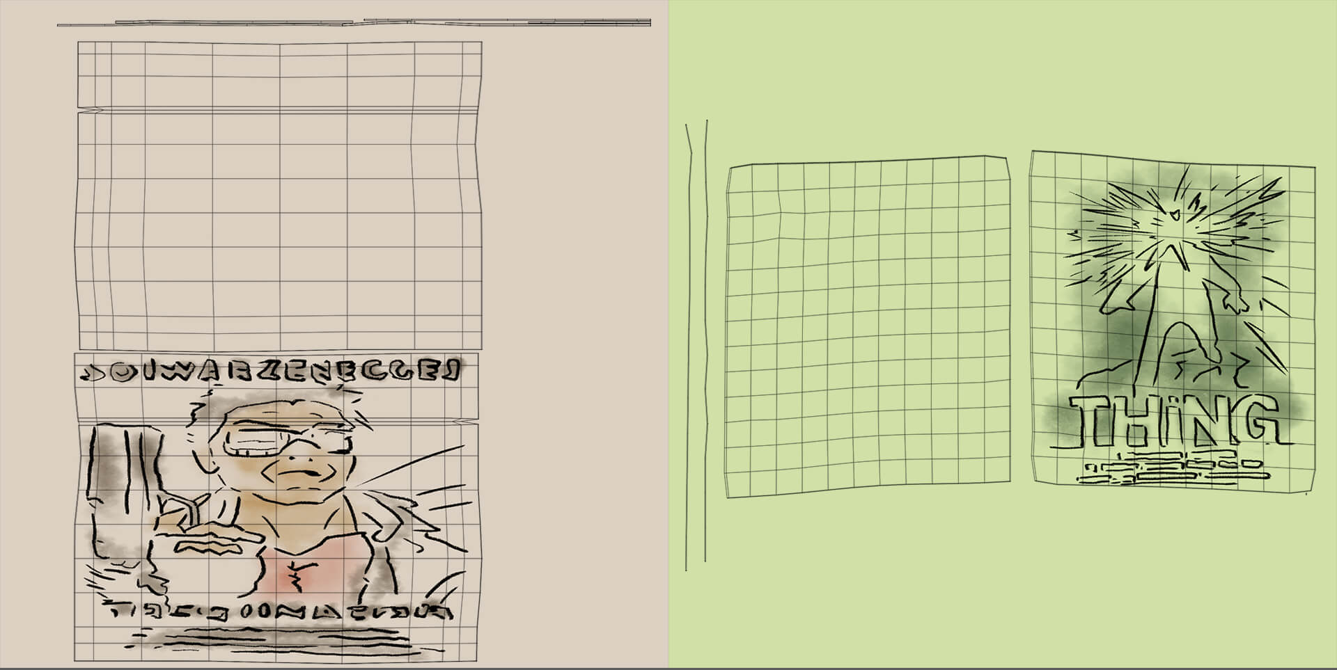
I hand-drew the pictures and post-it notes in Photoshop. Initially, I created UV maps for the pictures, took snapshots, and exported them as PNG files for editing in Photoshop. Subsequently, I connected the drawings to an aiStandardSurface for each frame. While I initially considered using original movie posters, they appeared out of place, so I aimed to replicate the concept's drawings instead.
When it came to the curtains, I used a yellow lambert and put some transparency on it.
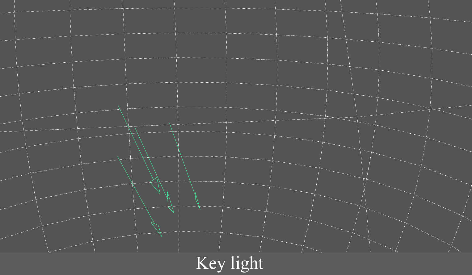
For this part, I used warm lighting similar to that in the concept.
I used an HDRI to fill the background with a warm hue. The primary illumination stemmed from a directional light, which I adjusted by rotation until achieving the desired direction.
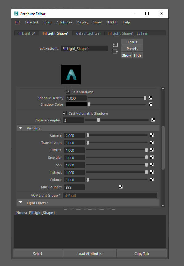
With the keylight the scene already looked illuminated, but some areas lacked light, so I used area lights to fill those areas and for the windows.
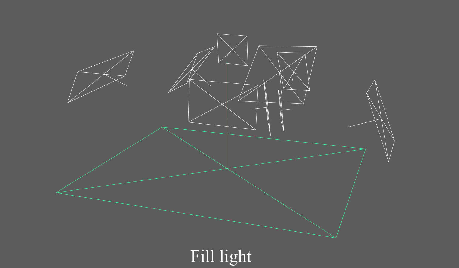
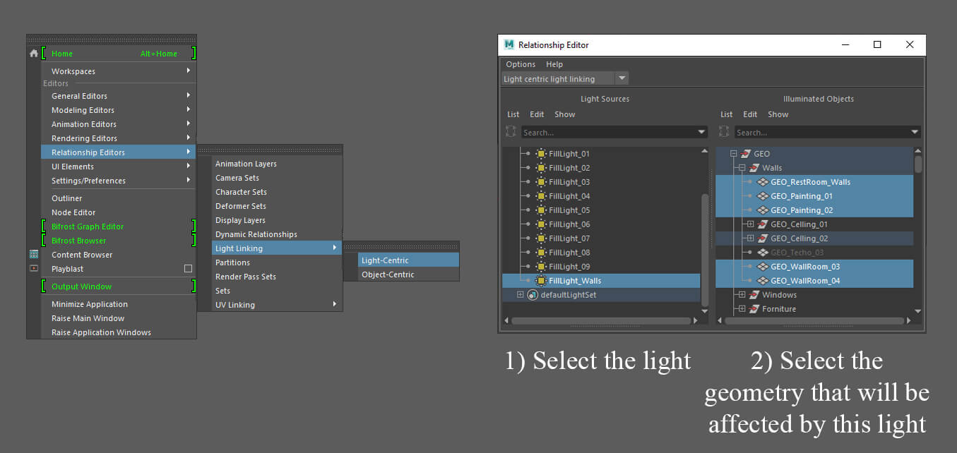
I then realised that the parts with a lot of furniture piled up looked too dark. To fix this, I put a big area light under the stage. Then I made that light affect only the walls with the relationship editor. This way, I managed to remove those dark areas with a very dim light. To get to this menu, go to the windows tab and choose relationship editor.
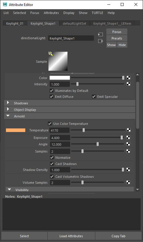
For all the lights I worked on, I used a warm temperature. You can activate this option in the attribute editor when selecting a light. In the shape tab in the Arnold tab.
At the end of the lighting phase, I added some volume to the directional light to give more depth to the room. For this, go to the renderer settings, to the Arnold renderer tab. In the environment tab, click the checker on the atmosphere option. Then select aiAtmosphereVolume.
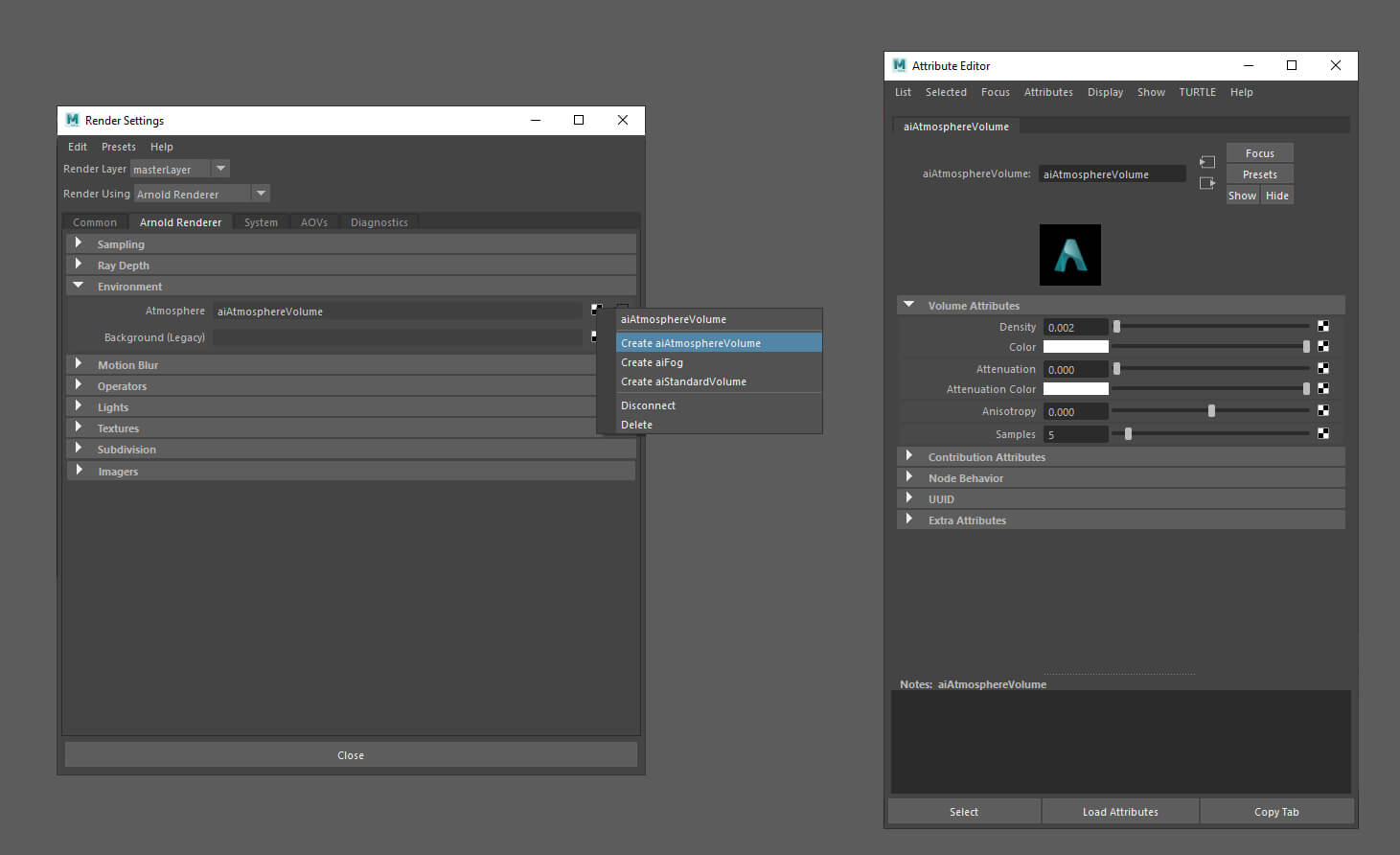
It is also important to set to zero the volume attribute of the lights that you don't want to have. In my case, I only left it to the directional light. To do this, you go to the properties of each light and in the Arnold tab visibility appears in this slider.
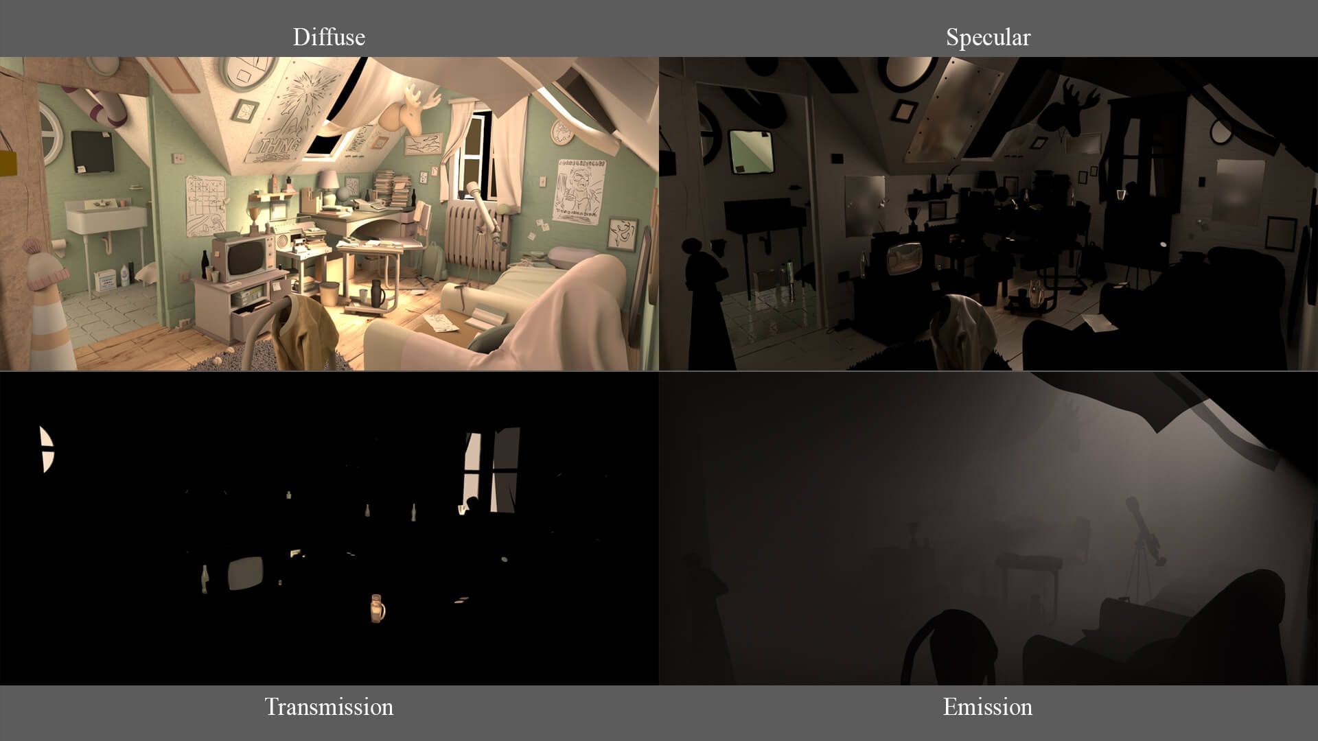
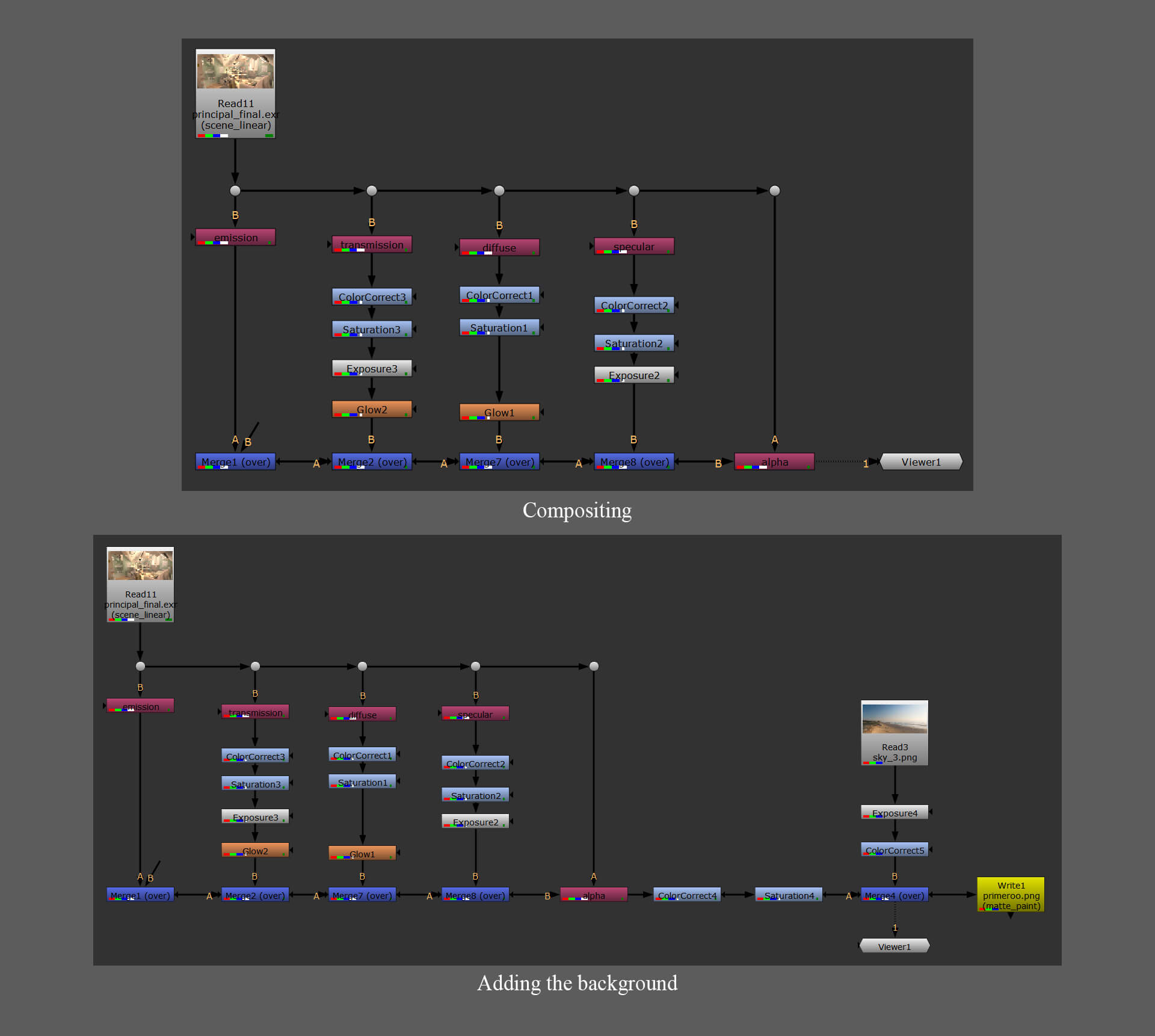
I decided to take out AOVs. AOVs are useful to separate the render information in passes to be able to do compositing. In my case, I used them to edit the final result in Nuke.
To get them, you have to go to the render settings, to the AOVs tab and choose the ones you need on the left side. Then click on the arrow below this list to move it to the right side. The AOVs you have on this side are the ones that will come out with the render.
In my case, I took these AOVS:
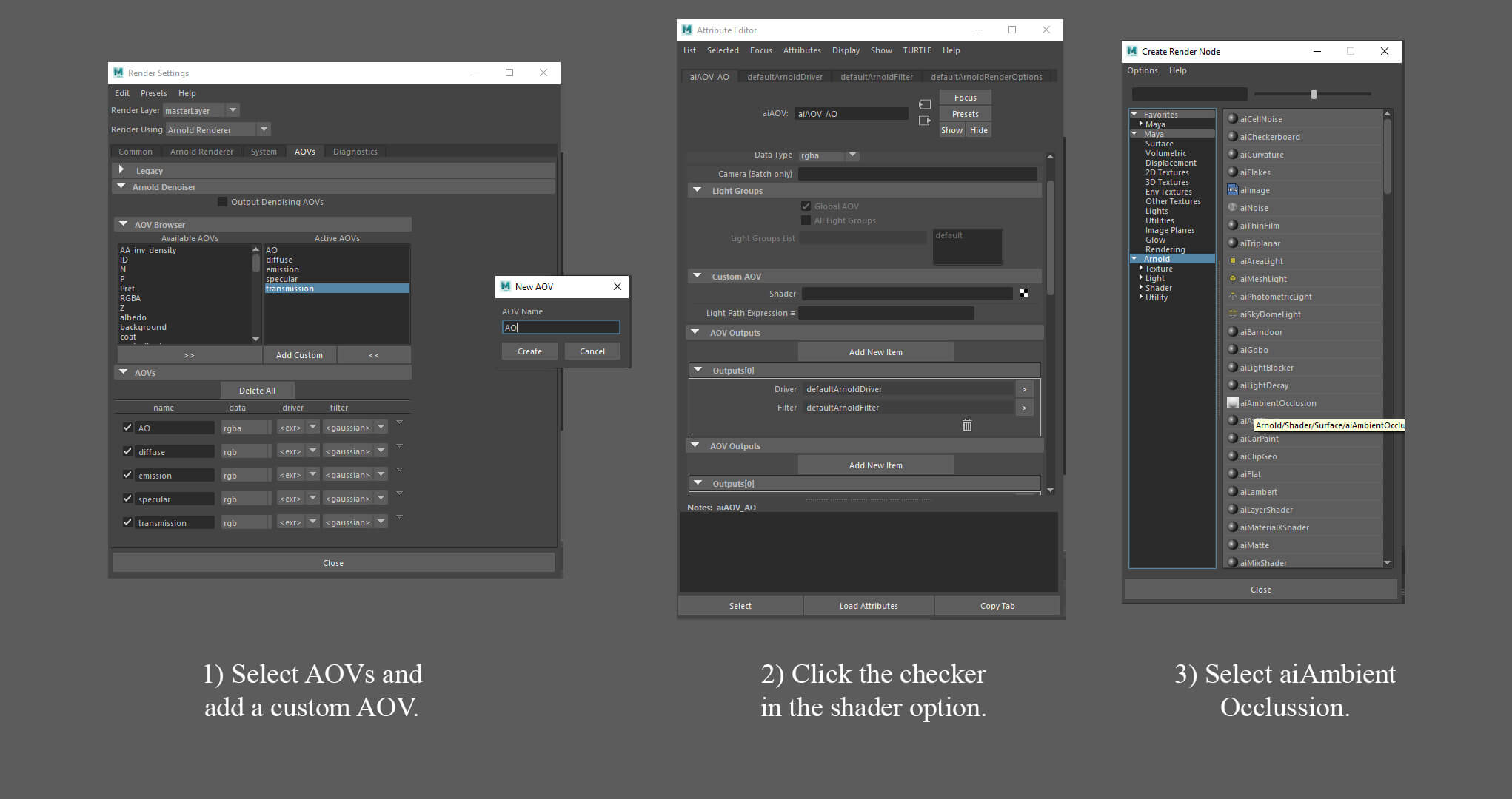
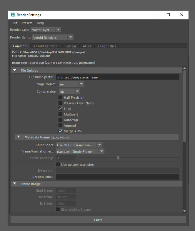
It is also important that before rendering you activate the AOVS merge option. It is in the rendering setting in the common tab. This way the renders are going to come out with the information of all the passes in a single image. In my case, I rendered in EXR.
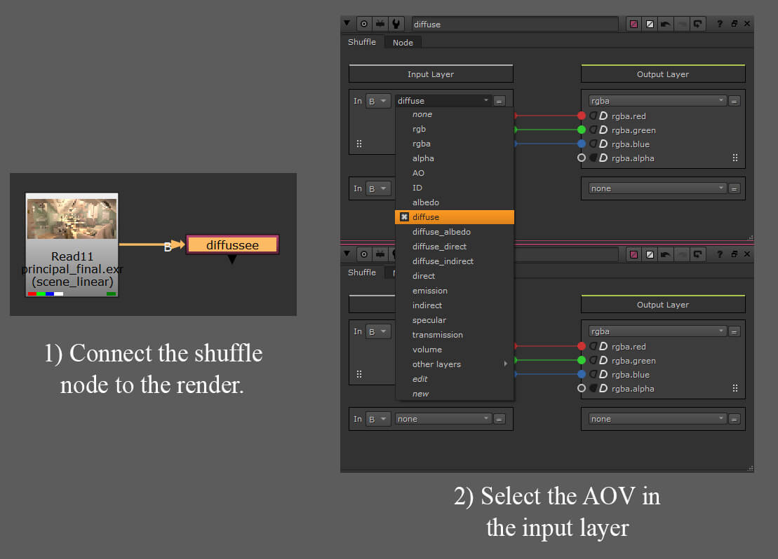
I dragged my EXR files into Nuke and used shuffle nodes to separate each AOV and edit the render. To choose which AOV you are going to use you have to connect the node to the render. Then you double click on the node and in its properties you have to choose an AOV in the input layer option.
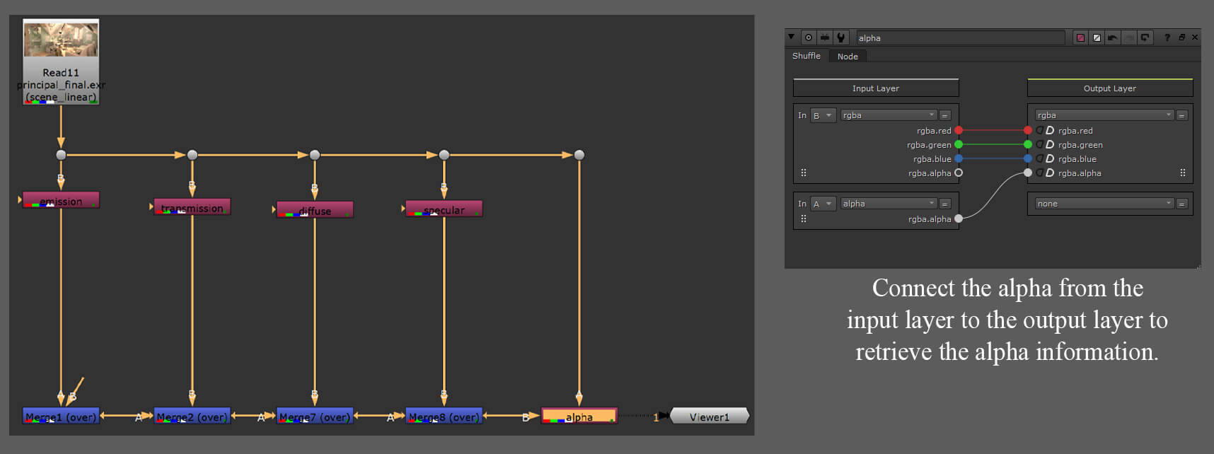
Next, I combined all the AOVs using merge nodes, ensuring the result matched the original render precisely. Additionally, I inserted an extra shuffle node at the end to restore the alpha information. This enabled me to place a sky behind the windows. To be better organised, you can add dots by pressing the dot key.
Next, I proceeded to edit the render using various nodes such as colour correction, saturation, exposure, and glow nodes. These nodes allow for adjusting parameters by double-clicking on their properties. Additionally, I incorporated a background image from Pexels, a free stock page, to serve as the sky behind the windows. After applying some colour editing to this image, I exported the final images in PNG format using a write node.

I had a lot of fun experimenting with this project, especially in the compositing part. The modeling took more time because of the amount of assets, and the amount of detail in some of them.
The most important thing I learned is that sometimes less is more. An environment doesn't need to look super realistic to look good. Things look more organic if you add irregularities to it.
Thanks for reading. I hope the information is helpful if you're thinking of making a stylised environment. I'm open to comments so please reach out to me via my Rookies profile here.