Concept Art Survival Guide: A Step by Step Approach to Designing Architecture for Video Games
In this article, join Antoine Decamps, a talented student at New3dge, as he shares his insights and practical guide on approaching concept and architectural design for video games.
From a deep-rooted passion for designing immersive environments and creating captivating worlds, Antoine Decamps' ultimate goal is to carve a path in the video games and film industry.
In this article, New3dge student Antoine, shares his guide for approaching the concept and design for architecture in video games.
Picture this: it’s your first day on the job as a concept artist in a video game company. You arrive breathless, sweaty, and barely on time since you missed your bus. But you made it. You’re on time and you’re excited to finally work in the industry.
Yet, before you can even take a breath, your art director arrives at your desk with an urgent assignment. All the other concept artists are working on other projects and you’re the one who will have to deliver.
Okay, that might seem like a stressful situation. But take a deep breath, we’re going to work through this together. Let’s start by looking at the brief.
The Brief
Upon careful examination of the brief, we have identified several key elements. We will need to consider them to deliver our final design. First, here is the main concept idea that our client needs us to work with:
We want to show the bakery of Victor who is famous for making the best macarons around this town. He started from his cozy little hut on a platform which is hard to reach. Yet people are still willing to take on the journey.
This is the core idea, and this the most important element that we will need to focus on during the whole process.
In addition to this core idea, we also identified key facts about the game. These will become our constraints. We now know that the game we’re concepting for is:
A third person RPG (“Zelda like”)
Appropriate for all ages
Singleplayer
We will need to respect these constraints to make sure our design is useful for the game. Otherwise it’ll get rejected and we’ll have to start again.
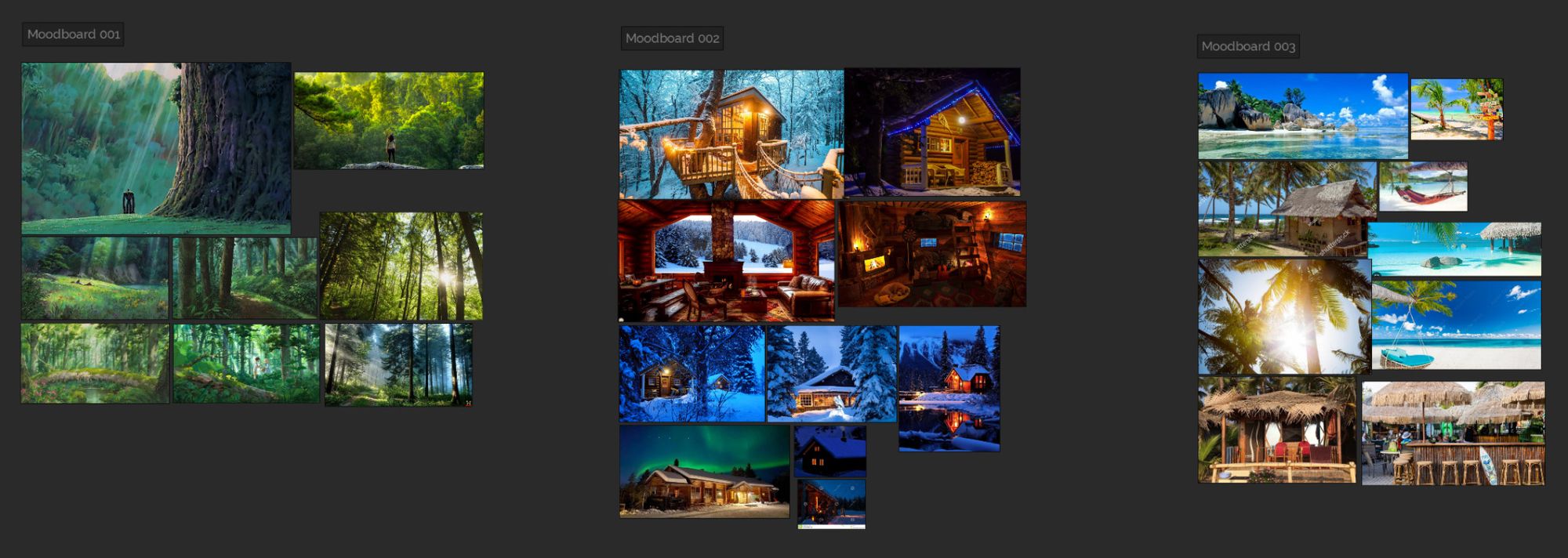
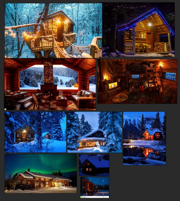
For the setting of our bakery we also found constraints in the brief, but we have a little more choice. Our art director gave us three different moodboards and we have to pick one and make sure to stick to it.
Moodboards with the three different settings
Finally, we also identified what our deliverables are, and this is what we need to deliver:
1 or 2 key images of the bakery
a clear design of the bakery
Alright, we have everything we need to start. It might seem overwhelming. But by breaking down our assignment into smaller steps everything should be fine. While doing a rendered image may seem like a daunting task, remember that good design skills are more important than being an incredible painter.
References
When I said we have everything we need, did you think I forgot about references? It's pretty widespread in the art community that the use of references is essential. Especially when designing something more fantasy-like.
Having a strong understanding of our references will help us create stronger designs. They will be based in reality, and thus are more relatable and able to connect with our audience.
So let’s start to hunt for some references. But before going to google images, pinterest or your search engine of choice. Let’s pause for a little bit and think about what we actually need to search for.
We already have quite a few constraints from the brief, but we still have some holes that we need to fill. And the most crucial one is: what’s the civilisation/culture of the people that live in this part of our world?
Since I chose the second mood board, our setting will be in the mountains. We have two directions from here. Either we take as a base a culture that lives in this kind of cold climate, like Vikings.
Or we can take a civilisation that has never lived in this type of climate, like Egyptians for instance. It could be very interesting to imagine how an Egyptian civilisation would thrive in a climate that’s very different from their homeland. And that’s a design exercise I recommend.
However, here we’re going to take the other route and choose to go for a Nordic/Viking basis.
We’re almost there, but before searching for images lets select a few keywords. That will help us focus our research even more. Here are a few that I have chosen based on my understanding of the brief and the mood board:
Viking
Rounded
Hard to reach
Cliffs
Snowy
Cozy
And now we’re finally ready to go search for references, we’re looking for four different types of images:
Main shape of our building: this doesn’t have to be Viking buildings, it can be any building that you find interesting and meet our keywords.
Details: images that will show what kind of ornaments, windows, stairs and roofs we will have in our design. This will be more Viking inspired.
Materials: images to show what kind of materials will be used in our building.
Finishing quality/Style: paintings that give you an idea of what your final image should look like. There’s no mention of style in our brief, so let’s go for our style.
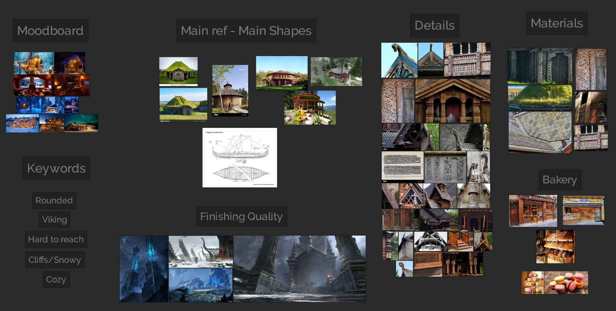
After some research this is what we got:
Reference Sheet
I don't think we need more. As a Frenchman, I have a good idea of what a bakery and macarons look like. However, I included some additional references to make sure I was on the right track.
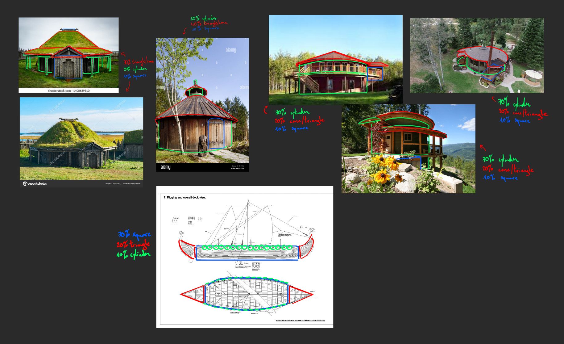
It’s almost time to start designing. But before putting lines on paper or primitives in 3D space, lets analyse our references to make sure we understand them.
Quick Reference Analysis
Let’s draw over our main references. This will let us understand what are the major shapes and Big, Medium, Small breakdowns. The goal is to find rules or principles that we’ll be able to reuse in our design phases later. It’ll help us have a clear focus and not rely on randomness.
Now that we have all the references we need and that we understand them better. It’s time to finally start designing.
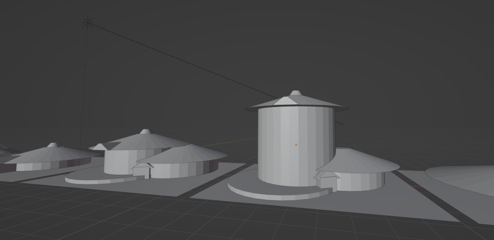
Design Phase 1: Quick 3D Blockouts
It might seem weird to go into 3D that early in the process. But that will actually help us focus on designing our building. Line sketches are great, and we’ll sketch later. However, when you do them you have to think about perspective and form, or you have to stick to a front view of your design. In this first step we want to make sure we have a solid and simple base to go off of, so let’s work with some primitives.
We’ll launch Blender and create a blank file, we don’t need much for this first step. I won’t explain how Blender works since there are a lot of great tutorials online. However, if there’s a specific trick or feature that we need to use I’ll make sure to explain it.
We want to stick to primitives or slightly modified primitives only. Our goal is to think about the shapes and the Big, Medium, Small distribution we analysed in the references phase. So let’s combine these primitives and see what buildings we can come up with.
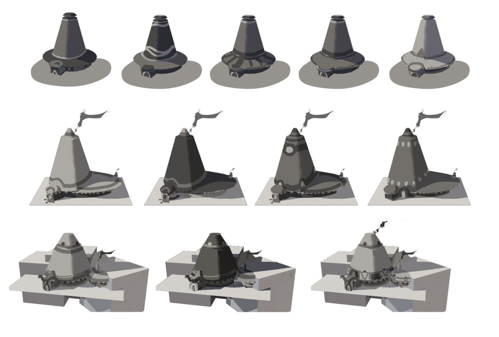
Something as simple as these is already a good start.
Quick 3D Blockouts using Primitives
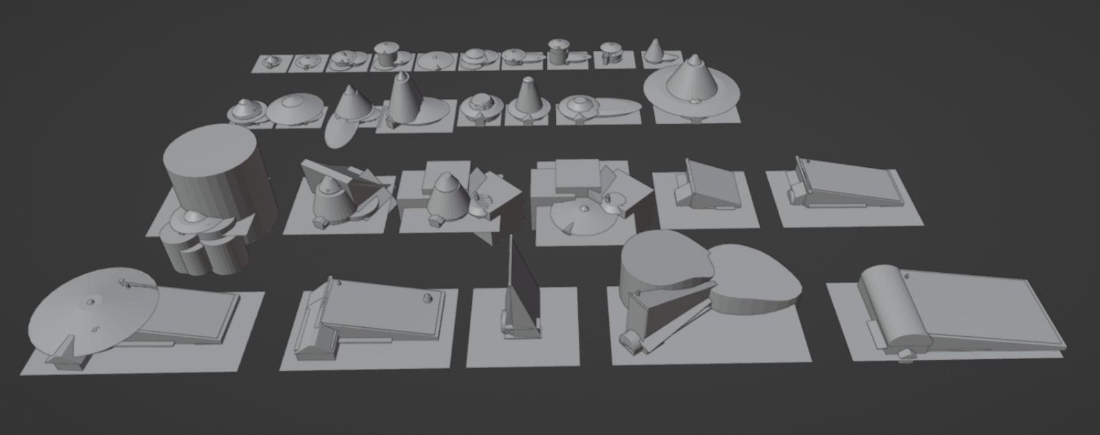
It’s a good idea to start very simple and close to our main references. Then we can start duplicating and combining them to come up with more complex stuff. You can also show a bit of the environment surrounding it like rocks or cliffs if it’s relevant.
Continually think about the shape distributions from the references phase. And don’t be afraid to switch it up and try things when you run out of ideas. This process should be fairly quick, we want to focus on proportions. Don’t spend more than a few minutes on each, and you should have quite a lot of iterations pretty quickly.
Final set of 3D Iterations
However, being quick doesn’t mean you have to do it mindlessly or rely on randomness. We have our rules and principles we can follow. And we should always be thinking about the functionality of our building (e.g. is it actually buildable, where do people enter, etc). Of course some iterations will be complete failures as you can see above.
Even if you have something that doesn’t work, keep it and just go to the next. Knowing what you don’t want is sometimes as much if not more helpful than knowing what you want.
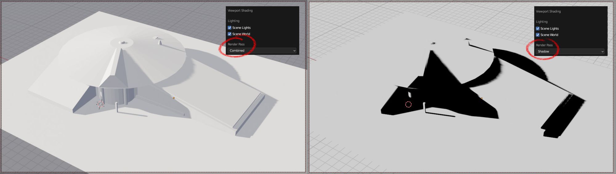
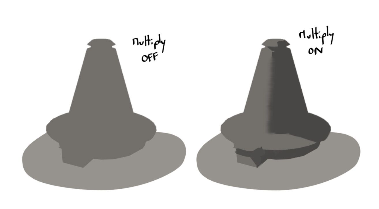
Once we have a few iterations we are happy with, it’s time to take some screenshots and go to Photoshop. Let’s just create a sun and a camera and start taking screenshots of 3 to 5 iterations we like.
We want to have the regular Eevee render (Combined), and a shadow pass (Shadow) so we can add it to a multiply layer later.
Combined and Shadow Passes
Let’s now open Photoshop and start designing with values.
Design Phase 2 - Value Explorations
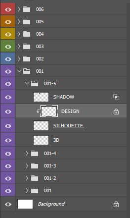
It’s finally time to do some painting. However before doing anything, let’s set up our file so it’s easier to work with. It’ll also be greatly appreciated if you ever need to send it to a colleague.
Let’s put each screenshot and respective shadow pass in its own group. Fill the 3D with a simple gray value to have a silhouette you’ll be able to design over. And the shadow pass in a multiply layer with the right amount of blend if.
Layer Setup for the Value DesignsEffect of the Shadow Pass with the Multiply Layer
Once this is done you can duplicate it in multiple subfolders for each value iterations you want to make. And now we can start designing with values. Let’s take 3 values and use them to design the value relationships of our buildings.
The designs must be readable in only 3 values, so don’t forget to check for hierarchy (80:20) and major shapes. Exactly like we mentioned in the blockout and reference stages. Also let’s not forget to take into account the materials we have in our references. Each material has its own local value and we need to be mindful of that when designing.
Like the previous step this part should be fairly quick but deliberate. We’re looking for big shapes and the major relationships between values. It’s fine if some aren’t good, we can just start a new iteration and improve. For each iteration, think about which of the 3 values is going to be the most prominent, and try to have a clear hierarchy.
We can also toggle on and off our multiply layer and see how the design works with and without shadow. It’s important that it’s working in both cases. Since in a video game your building will be seen at different times of day and during different seasons.
Some Examples of Value Designs
These first sketches are in a good place in terms of detailing, we don’t need to go too far for now. However, I feel like they're too vertical and kinda look like hats. So let’s go back to something a bit more conventional.
Another Example of Value Design
It’s important that we stay in this stage as long as we don’t have our big value shapes down. Our design also needs to stay readable in 3 values with a clear hierarchy. Before moving on, let’s also check that our scale elements (like windows and doors) are at the right size and make sense.
Since we have a value design we’re happy with, we can push it a bit further. Let's add some material indications before going into 3D to build the final design.
Design Phase 3 - Refining, Adding Details and Materials Indication
Before showing our sketch to our art director or going into 3D, we still need to push it a bit. That will help us make sure we understand how our building is built, and with which materials.
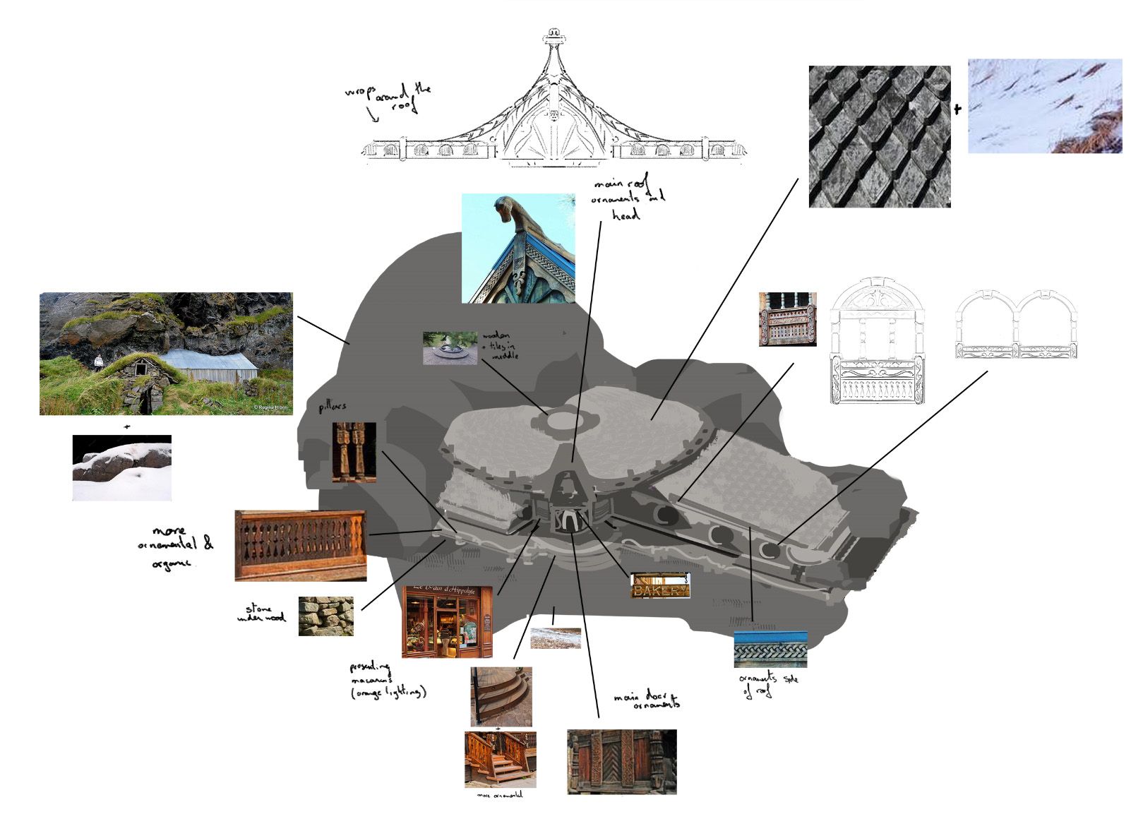
It’s time to add some functional details to break up our big shapes. However, we need to make sure we stick to our established value structure. It is this structure that made our sketch work so we need to preserve it as much as possible. To add these details let’s just look at the Details section of our references. It’s almost like doing studies that you’re adding to your design to make it more believable and grounded.
Let’s also add some sketches and material indications, and we should be good to go. We can show it to our art director to get it approved and then jump into 3D to finalize it.
Value Design with Material Indications
Design Phase 4 - Modeling and Texturing in 3D
Thanks to our value sketches and material indications, we now have a pretty good idea of what our building will look like. We just need to build it in Blender to render our final scene with the same lighting as our moodboard.
The process for that is pretty straightforward. We go from big to small with very basic modeling and texturing. One thing to keep in mind is to stay true to our value sketch. Since it’s what has been approved, and because its value structure is what makes the building work.
If we feel stuck along the way, we can always refer back to our initial sketch. And even paint a bit over our 3D to figure what we’re missing.
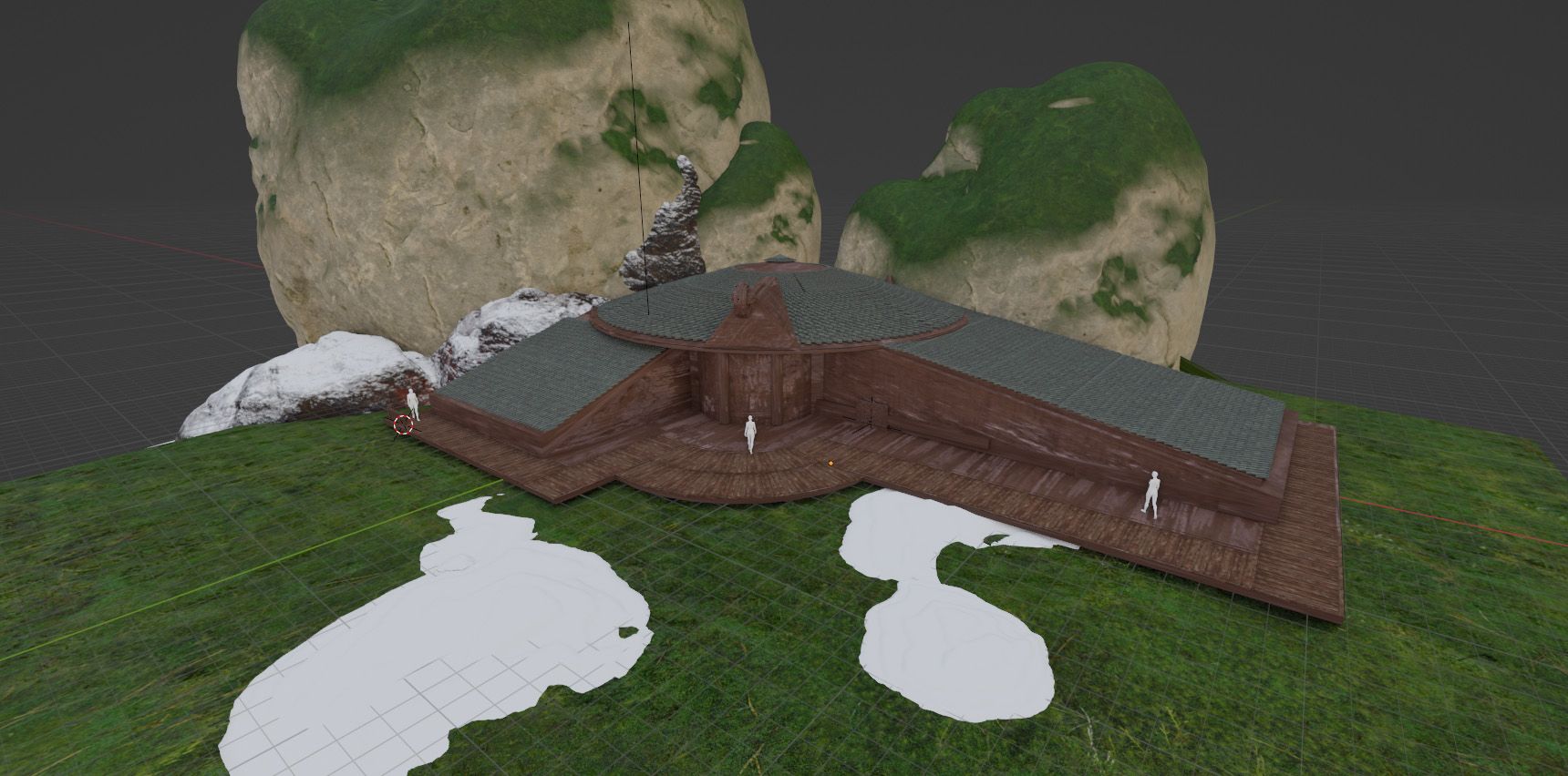
The first important step is to get the proportions and scale right. Then we can add our first materials to match our sketch’s value breakdown. We can also start adding some placeholders for the environment.
Initial Blockout of the Scene
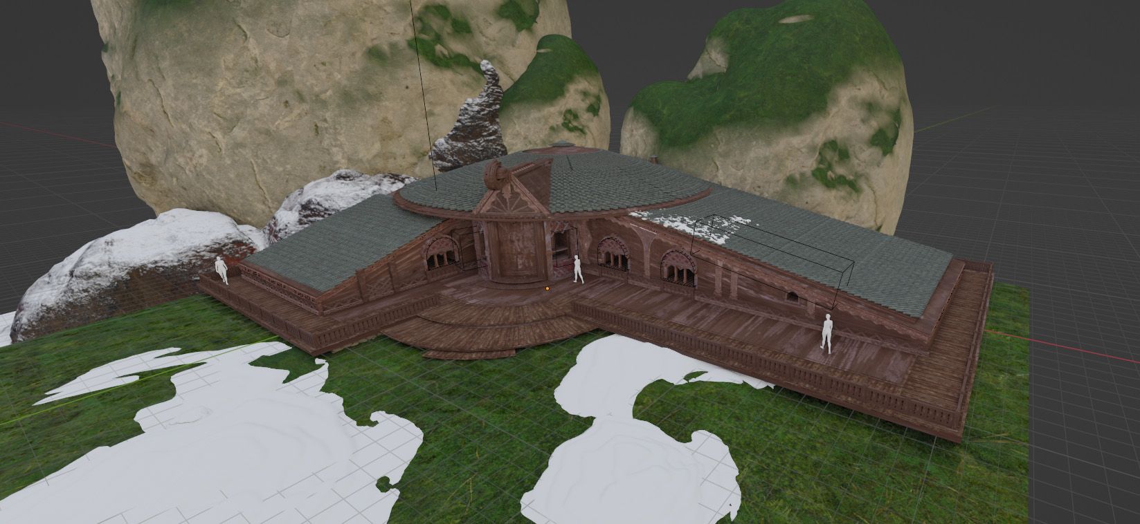
Once we have our base, let’s add our windows with booleans and start modeling our ornaments. The goal is always to match the value structure of our sketch, so we have to use materials accordingly. For instance make some of the wood lighter so we can clearly see the value breakdown.
Adding Booleans and Value Breakups
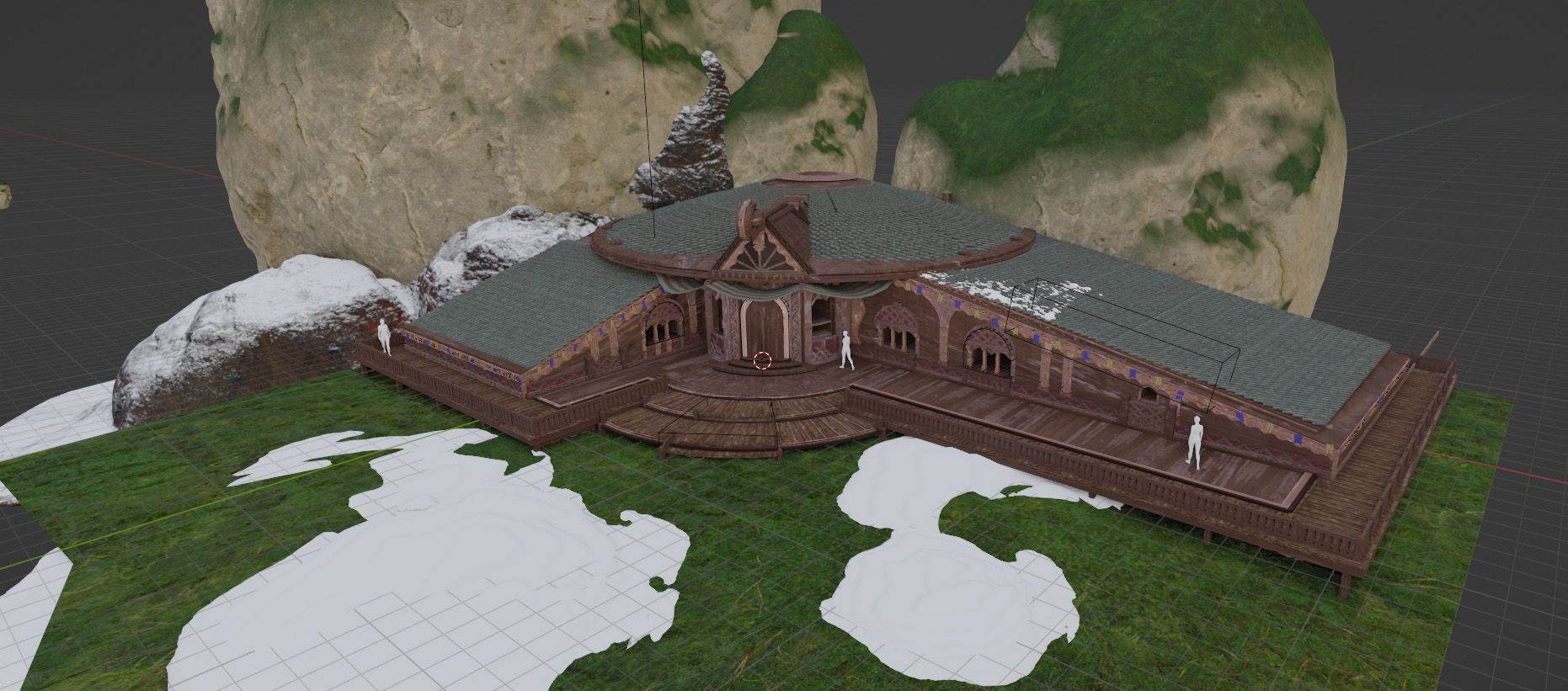
We continue the same process, adding the details and matching the values of the sketch as close as possible.
Adding more Details and Matching Values
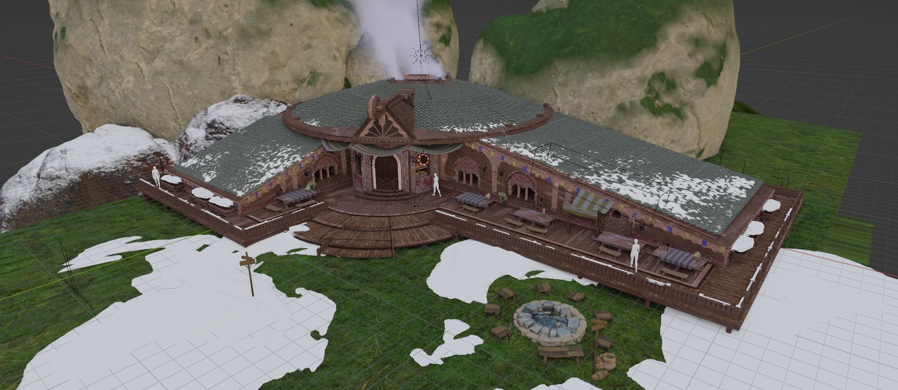
At this stage we’re almost done with the modeling and texturing of the building itself. We just need to add some set dressing to make it feel lived in and believable.
Adding Set Dressing
It can be helpful to check Sketchfab or other similar websites so you don’t have to model all the little details. For example I found a free 3D scan of the bonfire and some stools and tables. It can save a lot of time and you can always keep them for future projects.
Let’s also add some trees with the Botaniq addon to make it feel more like an actual place. And while we’re at it let’s throw an overcast light to see what we have for now.
Adding Trees and Overcast Lighting
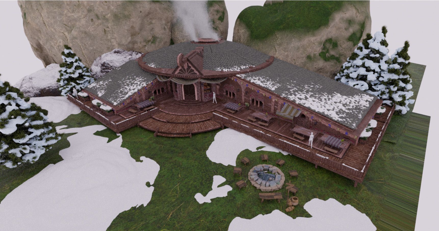
Our building already looks pretty good in overcast lighting, which is a good sign. However, to properly satisfy what was asked in the brief, we need to go back to our mood board for reference.
Mood References from the Brief
When we look again at our mood board we can see that we have an environment that’s mostly blue and very saturated. While the buildings are lit with a saturated orange light.
It creates a very nice contrast, and really pushes the cozy feeling we’re looking for in our final image.
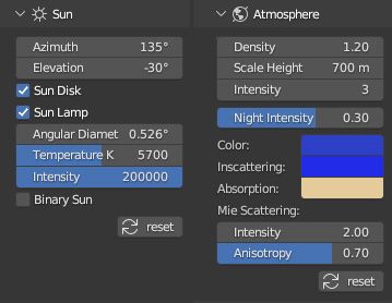
Let’s use the Physical Starlight and Atmosphere plugin to match this mood.
Physical Starlight and Atmosphere Settings
Then we can start adding our artificial lighting to match the references, and we get this render. It’s not great for now but we can easily make it way better with paintover.
Inital Render with Mood and Artificial Lights
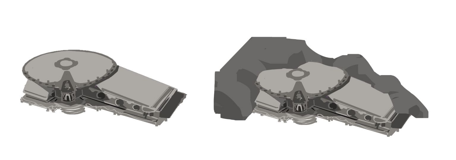
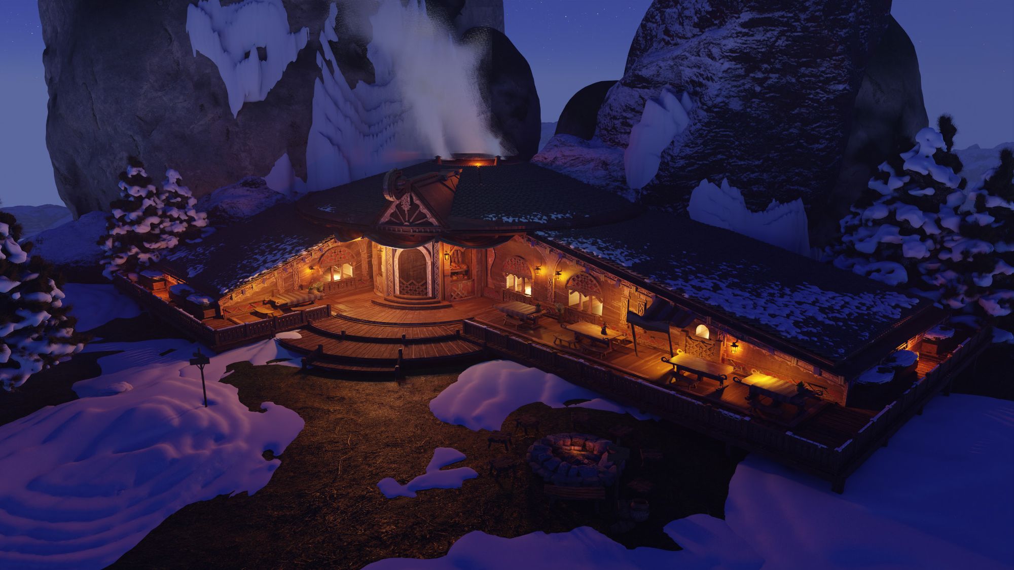
However, it doesn’t feel as secluded and hard to reach as we’d like. So let’s move some of the rocks and add some more trees to see how it goes.
Adding some Trees and Mountains
Now that we have a render we can work with, let’s export some useful passes from Blender before jumping into Photoshop.
We’ll need:
The combined, which is our base render.
The mist pass, to add fog and atmosphere easily.
The id pass or clown pass, to be able to select elements in Photoshop.
It’s also possible to use the normal, the glossy direct, or other passes to enhance lighting or make changes more easily. But let’s just stay simple here and export those three.
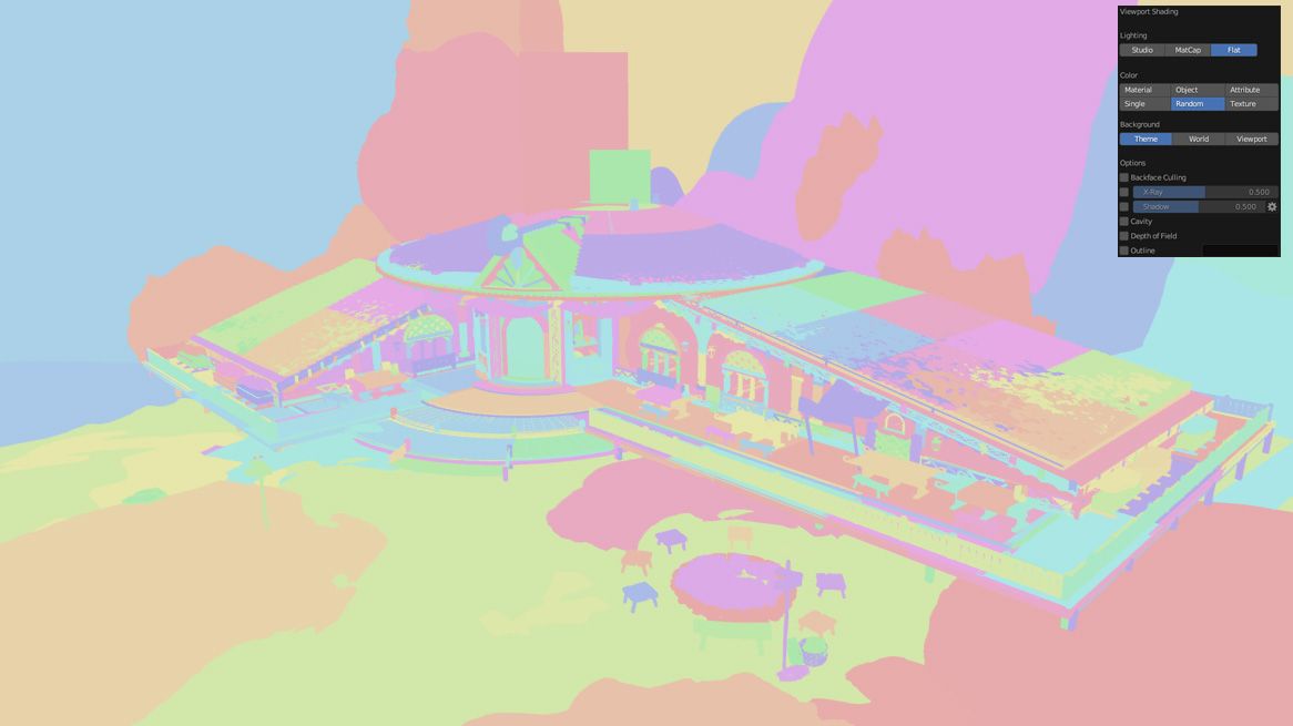
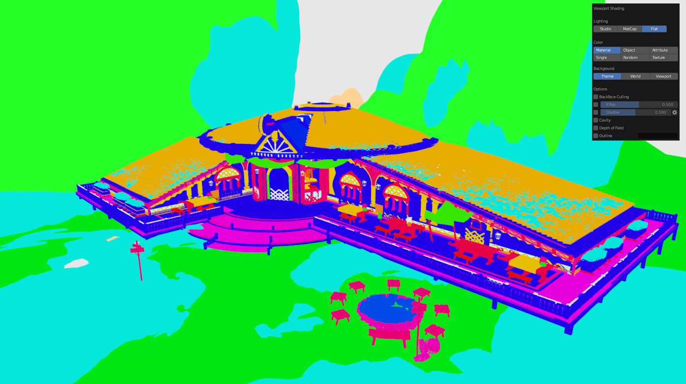
For the id pass we could use Blender’s random viewport shading but it makes it pretty hard to select in Photoshop. So let’s use the material viewport shading instead. And we’ll set our main materials to the colours we want to have something more workable.
Comparison between Random Viewport Shading and Manual Viewport Shading using Materials
With this out of the way, it’s now time to leave Blender and do some painting in Photoshop to finalise our key shot of the building.
Overpainting
Alright, we’re mostly down with 3D now and it’s time to do some painting. We have all the passes we need and a good render base to paint on, but how do we go about it? It looks very 3D and not very appealing, so let’s see which systematic steps we can take to enhance our design.
But before making any brushstroke, we have some tidying up to do. In the same way we made clean folders and subfolders in the sketching part, we’re going to do the same here. This will allow us to make changes quickly if our art director or client requests it. And it’ll help a lot if we need to give our file to one of our colleagues.
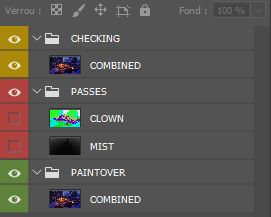
Initial Layer Setup
Here’s the initial setup we’ll use for our file. Our clown and mist pass are in their own folder, and we have a folder at the top containing our raw combined render.
When you’re in the process of painting over, it’s sometimes hard to keep track of where you’ve come from since the beginning. So it’s helpful to toggle it on and off to see if you’re actually making your design better or not. And seeing the progress you make is also a big confidence boost.
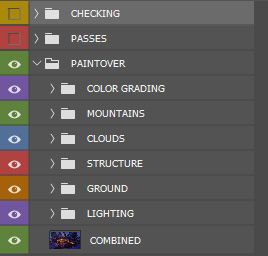
Now that we have a clean base, we’ll be able to add subfolders into the PAINTOVER folder. At the end of the process we should have something like this:
Final Layer Stack
It’s clean and easy to work with, and we won’t have trouble making changes or finding our layers.
I’m not saying we should also name all of our individual layers, as it can take a lot of time. But our main layers or subfolders should be labeled just in case we have to hand our file to one of our colleagues.
I won’t go in depth about each of these folders as I think it wouldn’t be very useful. But let’s go over how the base render can be improved, and what are the systematic steps we can take to do it efficiently. These steps can be used on most of the 3D renders you’ll do for your designs. So I think it’s better that we spend time on this, to have a clear process that’ll help us on our future projects as well.
Also before we start, make sure you have your Finishing Quality/Style references from the beginning. We need to have a benchmark of quality we want to hit to make sure we do things with intent.
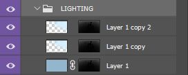
Lighting
The first thing we need to do to enhance our image is to improve our lighting. We’ve already done the heavy lifting in Blender, it’s just a matter of doing a few adjustments.
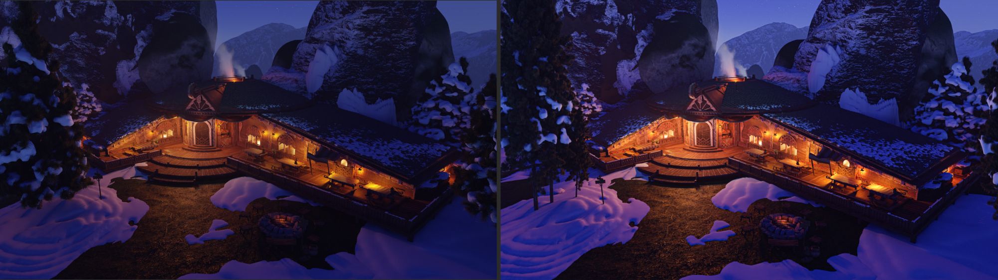
Let’s duplicate our base layer and we’ll use the Camera Raw Filter of Photoshop to do the first set of adjustments. You can play around with the settings, but doing global adjustments of contrast, exposition and color will already go a long way. Let’s also save our Camera Raw Filter settings when we’re done. If you have to do some changes and render some parts of the image again, you’ll already have the right settings.
Before/After the Camera Raw Filter
Here’s how it looks after a few adjustments. It still looks very 3D of course. But the lighting is more appealing and already much closer to our moodboard’s references.
Our lighting journey is not complete though, let’s use the mist pass we exported from Blender. We can use it as a mask to add more atmosphere to our scene without worrying about doing lasso selections.
Layers using the Mist Pass
In our case it’s not very useful, because our environment is quite small and we don’t have foreground elements. But I think it’s a very useful step to do for bigger environments like vistas, which often have a lot more atmosphere and fog.
Now that we have improved our lighting, it’s time to start breaking the 3D look of the image. Let’s start with some filters before painting anything.
Filters
We could just start to paint over our render to simplify shapes and break edges. But let’s make our lives a bit easier by using some filters.
Let’s turn off our LIGHTING folder and go back to our base layer. What I’d recommend is duplicating our base layer and using the Radial Blur with a very small value. Then put a mask on to decide where you want it, and use the opacity to decide how strong you want it.
After this is done we can merge our visible layers with CTRL+ALT+SHIFT+E, and use the Dry Brush filter on the resulting layer. Once again, let’s create a mask and change the opacity so it’s not too strong.
Now we have a base that’s looking a bit less 3D, and it will be easier to paint over it since the edges are already a bit broken up. Let’s toggle back on our LIGHTING folder and continue.
Painting
It’s finally time to paint some brushstrokes. But before diving in, let's see what needs to be done so we don’t noodle mindlessly.
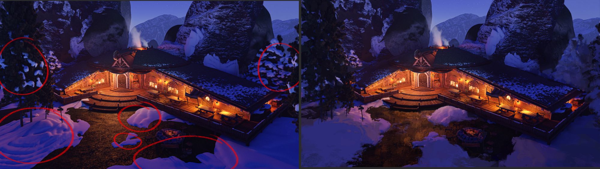
The shape of the snow patches looks very fake and 3D, we need to address that. We don’t want to make it super photorealistic but we need to make the silhouette look sharp and realistic. It’ll help suggest the illusion of realism.
The snow covered trees are also very 3D and have too much contrast, let’s tone them down a bit so they don’t distract the eye.
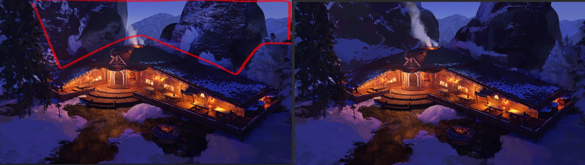
The big rocks behind our building are very noisy. So we’ll have to simplify their silhouettes and the shapes inside of their silhouette. It’s also a good opportunity to create leading lines to put some more emphasis on the building.
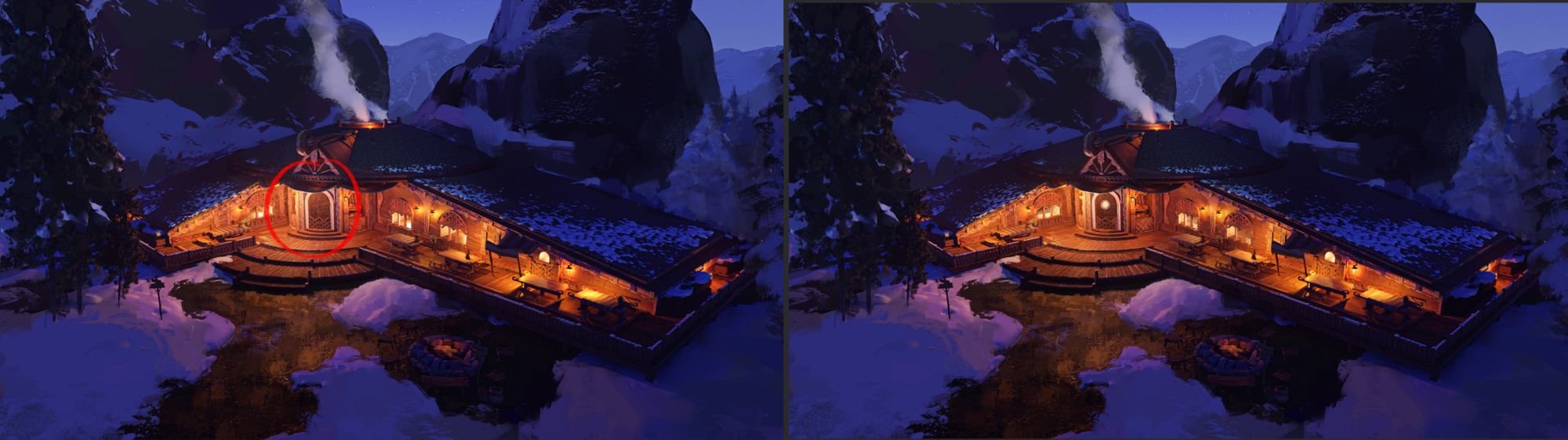
Lastly our building is missing a focal element on its door. We are usually drawn towards doors and exits when we discover new buildings. So let’s give this door an extra bit of interest, and clean up some edges on the whole building.
Let’s start with our first two points, the snow patches and the trees. It already looks a lot better without having to paint for hours or use photos. Focusing on the silhouettes and big shapes helps a lot. You can also use some custom shapes if you so desire.
Before/After Painting Snow and the Trees
Then let’s address those big rocks behind. We have two main values, the actual rock and the snow on top of it. As you can see right now it’s really noisy and messy. But having these two distinct values is a good opportunity to create leading shapes and a better Big/Medium/Small distribution. It’ll help with clarity and put even more focus on our building. Let’s also change a bit the smoke coming out of the chimney to make it pop more against the new silhouette of the rock.
Before/After Painting the Rocks and Mountains
Lastly, we need to address our building itself and the focal on the door. Now we have some payoff when we look at the focal area of our building.
Before/After Painting the Building
We could of course go further and make it look even better with more time. But I think we already have everything we need for this key shot of the building. And remember we also have to show the design more clearly for our second deliverable. So let’s not waste time and do that.
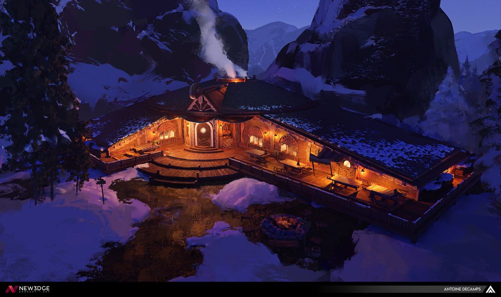
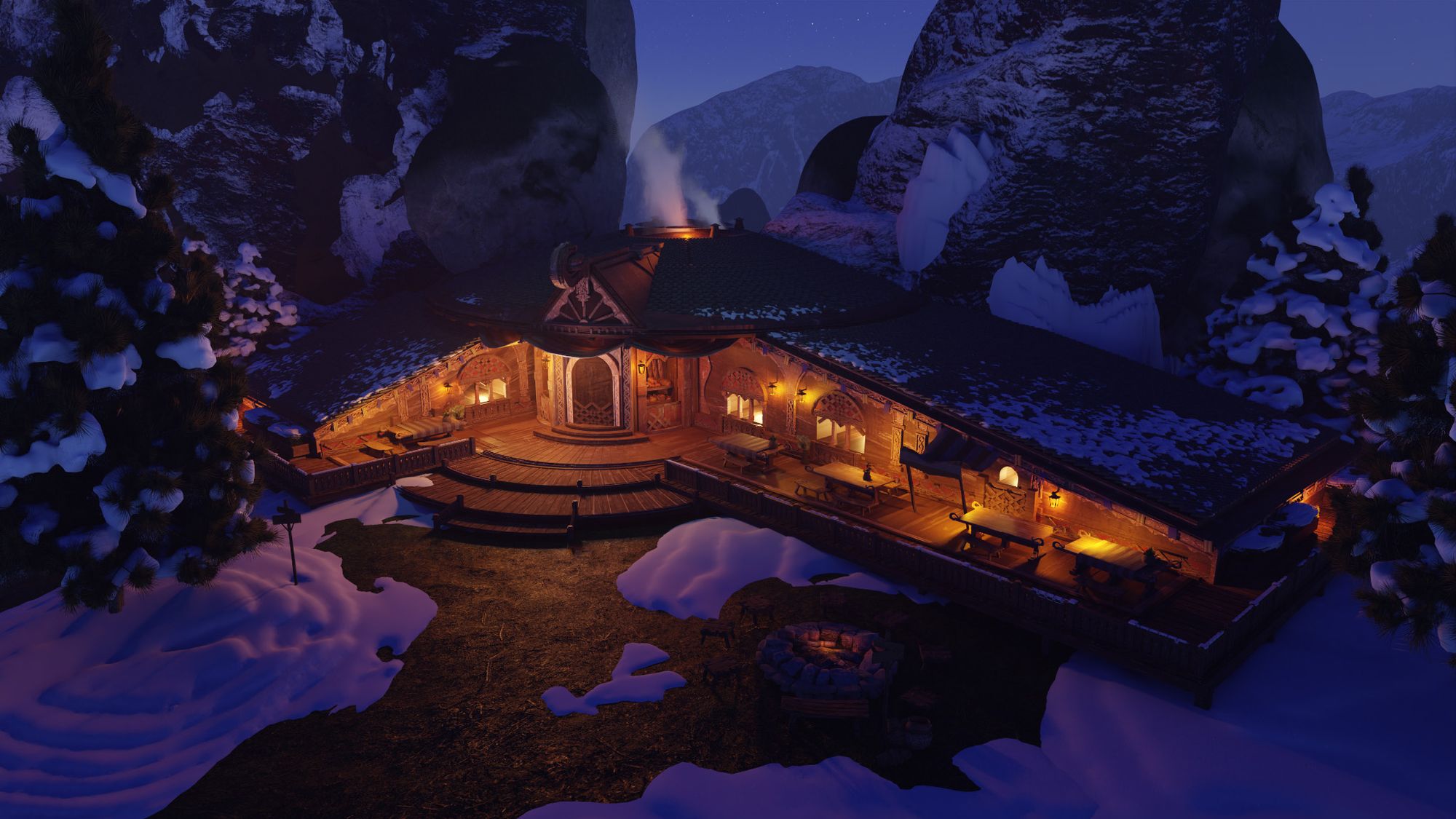
Final Result for the Key Shot of the Building
Design Callouts
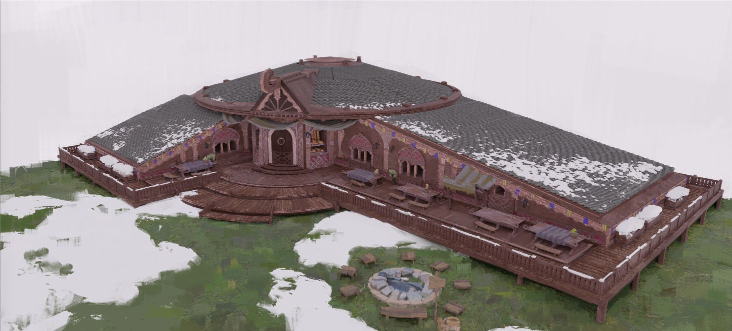
Since most of the heavy lifting was done in Blender, doing a callout sheet for our design will be fairly easy. Let’s jump back into Blender and put back an overcast lighting.
We want to show our design of the building as clearly as possible for the 3d modelers of the game. So let’s remove the background and just keep our building. With the overcast lighting we can see the actual local colors and values of our materials. Which was not very obvious on the key shot of the building because of the mood.
Overcast Render with some Paintover
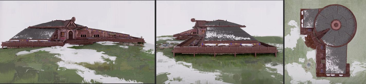
Let’s paint over a bit to make the snow look more realistic and clean up some stuff. This could be enough since we have an angle that shows almost everything. But since we have everything in 3D let’s throw in some more angles to be as clear as possible.
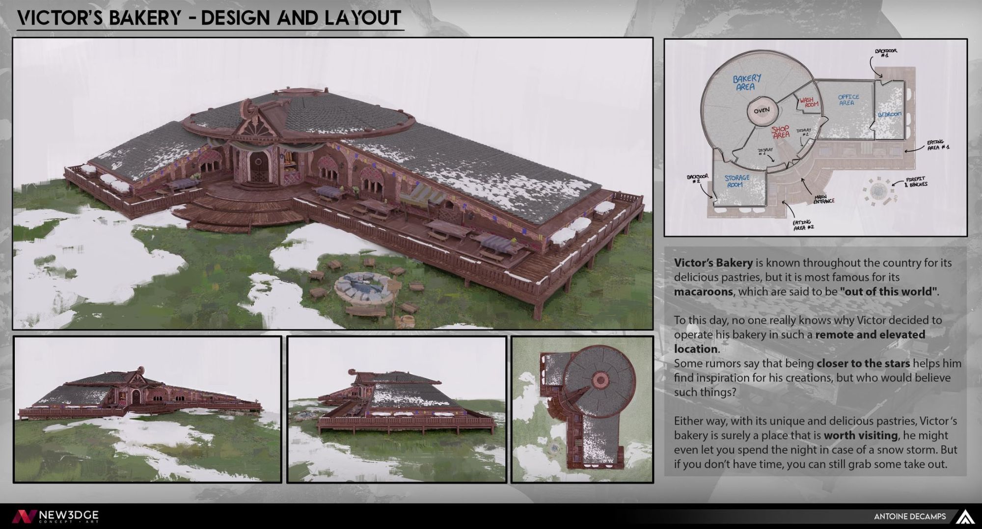
Different Angles of the Building and Diagram of the Interior
We can also add a little diagram of the different rooms inside of the building. It’ll help the team get more ideas about the place. And it already gives us something to go off of if we need to do the concepts of the interior in the future.
And with these we can do a little presentation to have a clean and presentable callout sheet.
Final Result for the Design Callout Sheet
Conclusion
Alright, we’re finally at the end, we survived and we’ve delivered our first work as a concept artist! Congratulations for making it this far. I really appreciate you taking the time to read this guide, and I hope it will benefit you in your future projects.
I wanted to use this modest project as a base for this guide, as it made it easier for me to illustrate all the concepts and processes I wanted to talk about. But of course, it is a scalable process and you can basically do any architecture design with this method. Whether it is a huge fantasy palace or a sci-fi power plant, the concepts and design thinking stay exactly the same.
Everything you found of value in this guide you should credit to the many teachers I’ve had over the last few years. And I would also like to thank Paul Riebe who taught us during this project at New3dge. It was an amazing learning experience.
If you have any questions, please feel free to reach out via my Rookies profile and also check out my entry for this year’s contest here.