
Marstopia was an architecture competition from Eleven magazine. They gave us the task to come together in groups of three to imagine what colonization of Mars could look like.
Our group consist of Jess Wang, Shawdi Dou and myself. My task was to do an establishing shot painting that would illustrate our idea for the project.
At the start, one of our team members was still on holiday so we hadn’t had our first meeting to merge any plans yet. So I decided to gather some reference and have a go at coming up with something hoping to spark and idea or a direction.
Since anything goes at the moment I created a little brief for myself to create a large scale research base. It holds roughly 500 people in total. It needs to have solar panels for power, windows for crops to grow and a communication structures. Mars have frequent storms, high winds and half gravity then that of earth. Because of this I would need to make the architecture shapes flat and low to the ground.
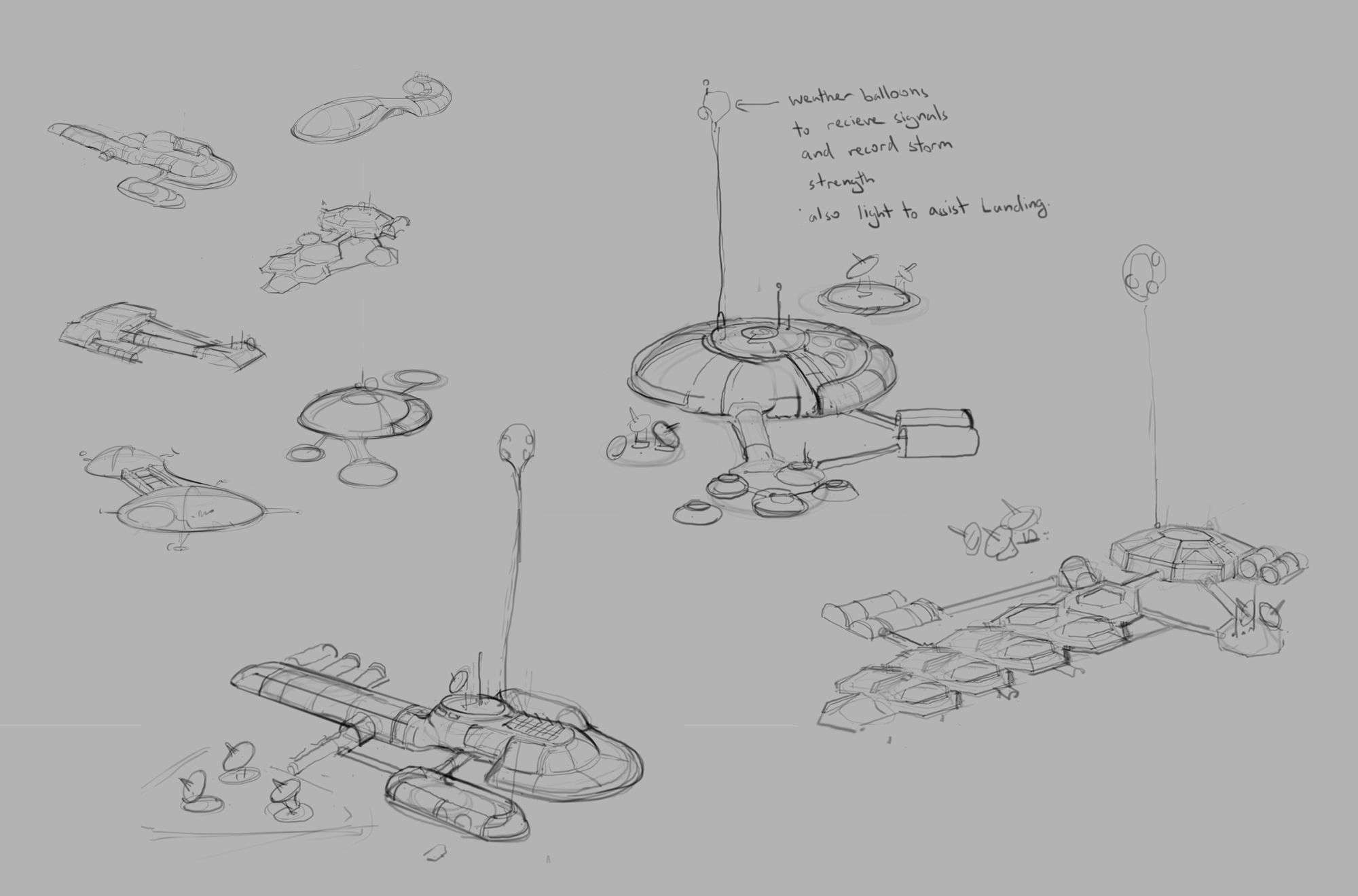
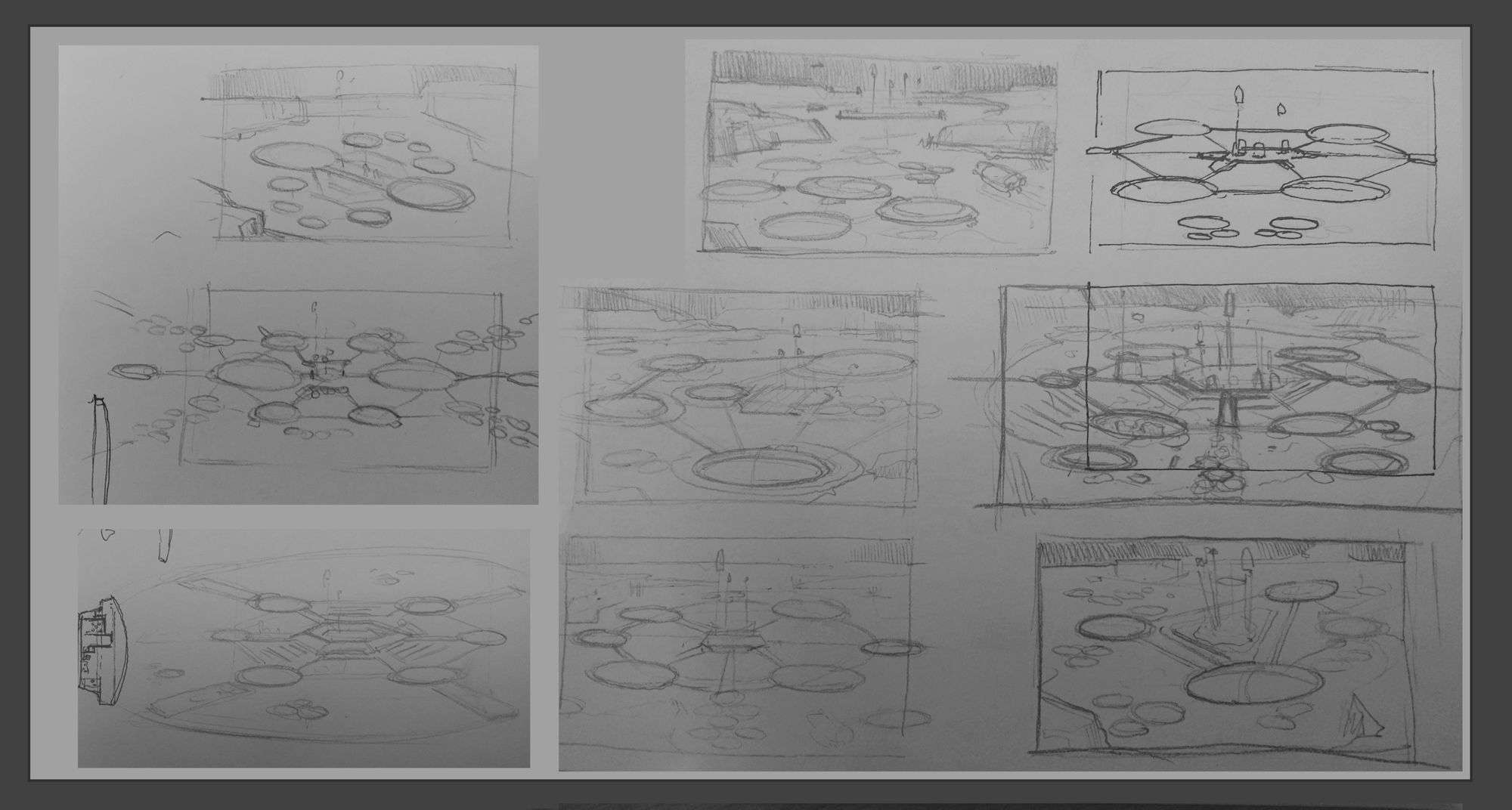
These were the idea sketches I did while keeping to my brief. The smaller thumbnails on the top left were my initial sketches. In those small thumbnails I was trying to find a beautiful shape or arrangement of shapes.
Afterwards I picked three of my favorites to take further. When working these up, it is important to consider what purpose the architecture have. This will help me decide what size or shape they need to be to suggest that purpose.
So even if I don’t tell the audience exactly what they are they can will still feel a sense of functionality to it.
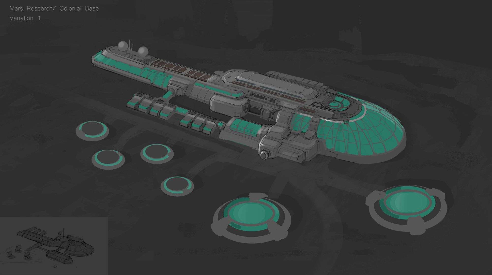
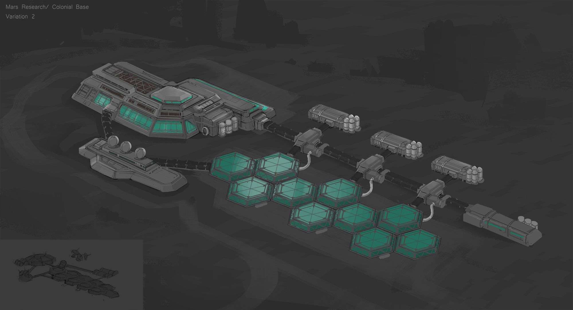
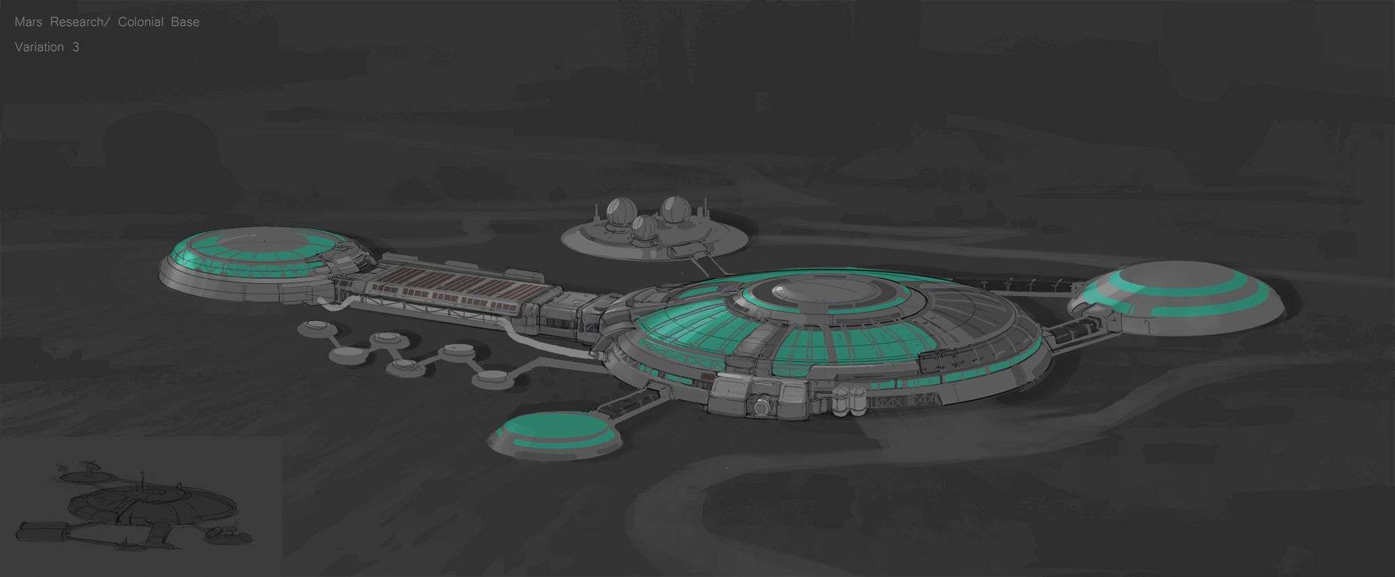
Since there was still time before our first meeting, I refined the three ideas up and kept it in grey scale. This lets me to focus on the form of the architecture because this is the main idea that I am trying to pitch to the team. I only used color such as green and brown as a way to show where the windows and solar panels would be.
I showed these three variations in our first meeting and explained what I wanted to go for. Unfortunately, this was not what they wanted.
They wanted to make a big scale settlement on Mars and wanted the dome shape architecture. This was bit upsetting because my ideas got scraped. But that’s part of the game, at least I got out of my system what I wanted to do.
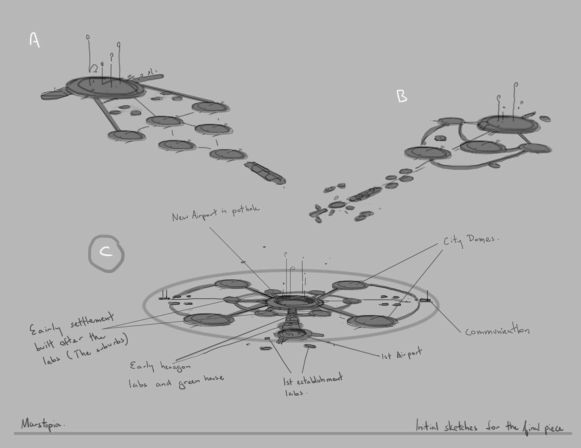
During our last meeting, a team member suggested that we could have a Mars terminal. This could allow citizens to travel freely to a nearby space station. Here are the early sketches of that idea.
I started drawing on paper and then took parts that I liked and came up with 3 options in Photoshop to show the team. We deciding to with option C.
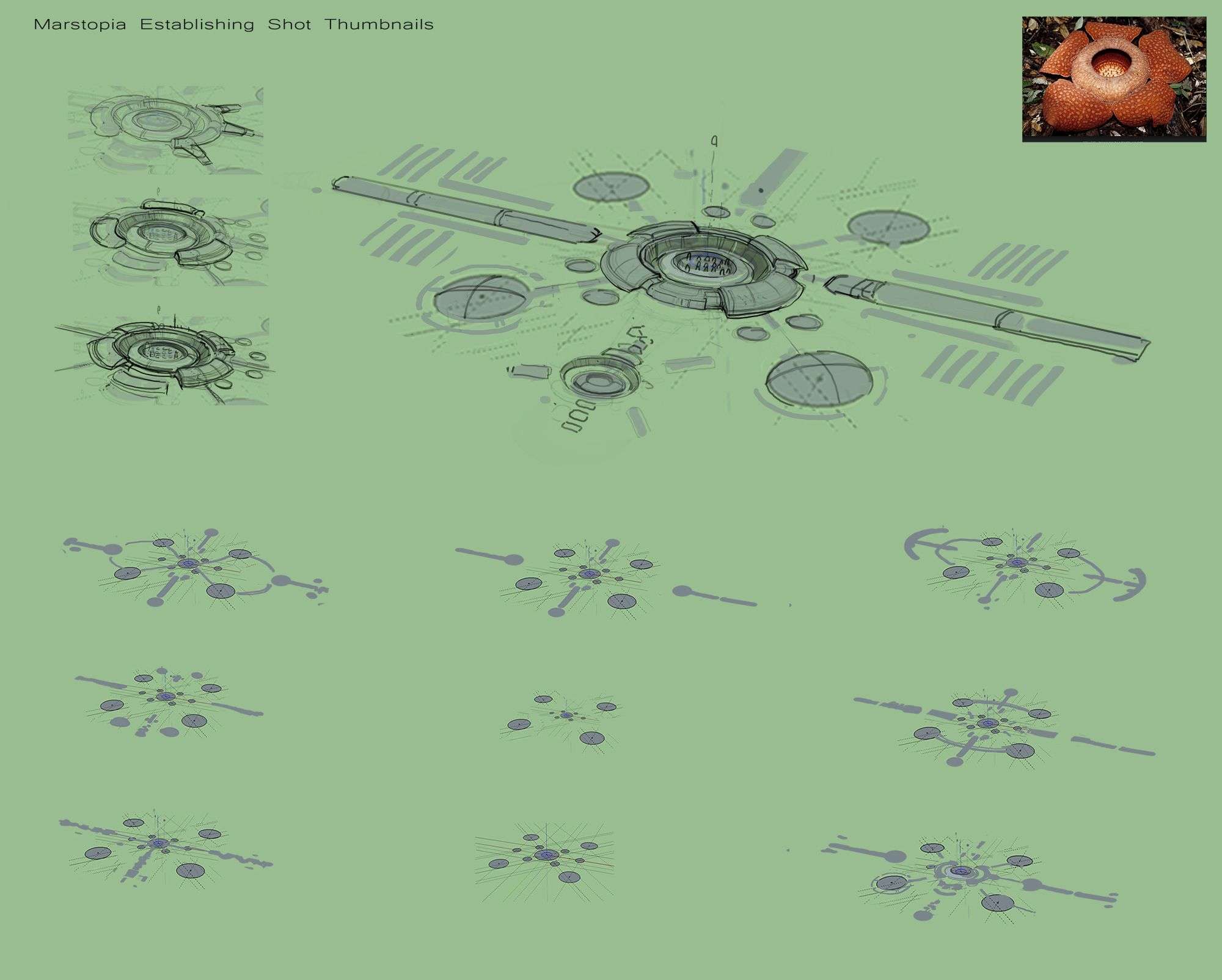
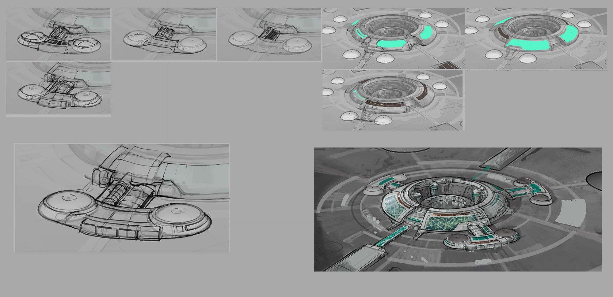
I went into the program Sketch Up to model a few 2D circles on the ground plane following what I had in the thumbnail. I then took a screenshot and pasted the image into Photoshop where I painted on top. Here I design the arrangement of patterns and spacing of the dome structures.
I put my attention to composing a pleasing abstract pattern that I can build my structure on top. It is important to make sure that there is size variation in the domes. I was also playing with slight variation in some areas so it is not symmetrical on all sides. This will give a bit of visual interest so the pattern is not totally repetitive.
When I find one that I like, I would enlarge it to start drawing on top. This is where I draw on top to make it into 3D architectural form, as I have done so on the top right. I was drawing inspiration from the flower image on the top right. I imagine that in the center of the dome structure would sink in like the flower does.
This would be where all the space shuttles are launch from. I did this because the soil and the structure around it could serve as a protection from the strong winds on Mars. So when the shuttles launch, the initial launch phase would be protected from the wind and dust. I admit, I also did this because it looks cool.
Before I moved on, I created a few more thumbnails on the top left, I was trying out other solutions before committing to what I have.
I went back into SketchUp to model a little more following the drawing that I did. I kept the model very rough, I wanted enough primary form to help push start me with the drawing later on.
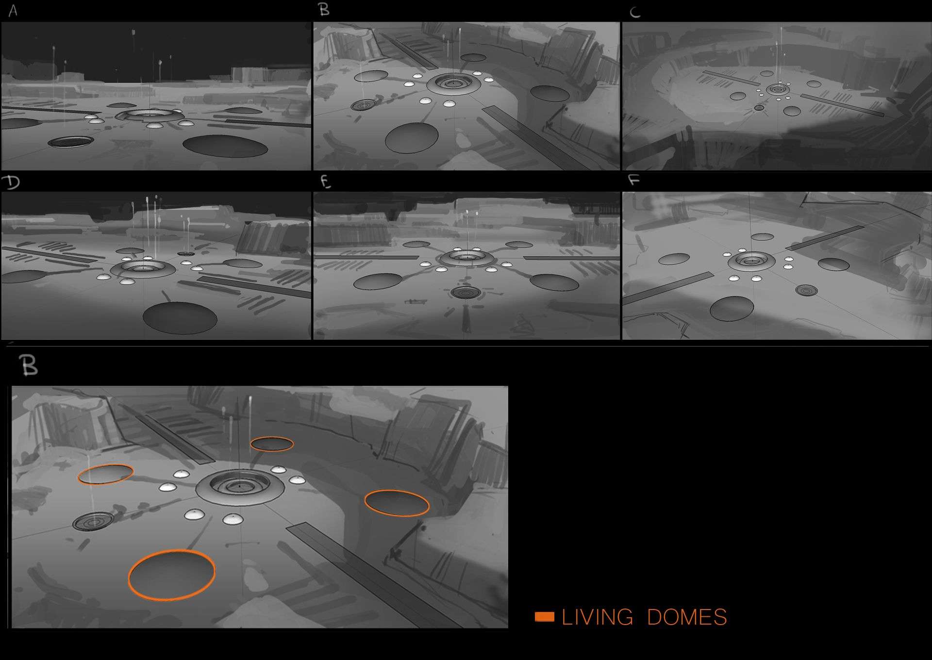
After modeling, I rotated around to take a few screenshots in search of a cool angle for the final painting. I took these screenshots back into Photoshop and started painting on top. I kept these thumbnails in grey scale because composition is my main concern at this stage.
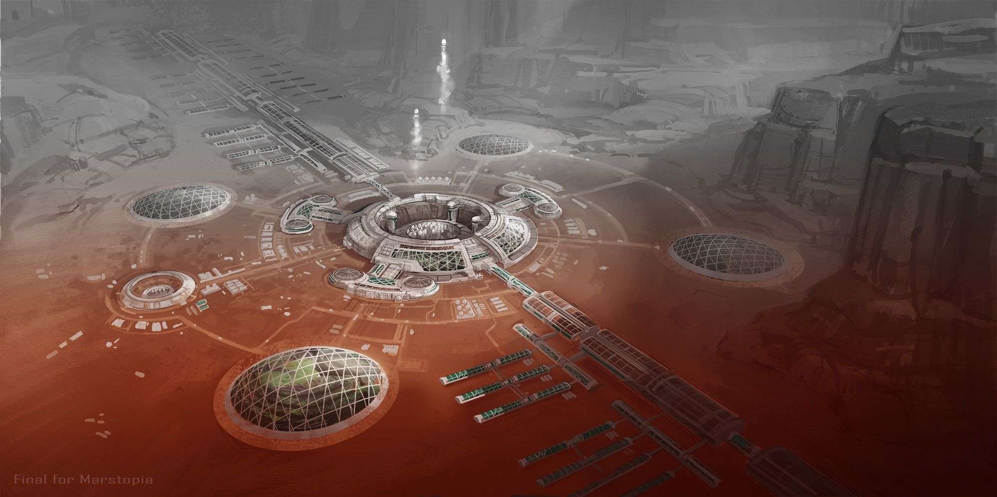
I use the shadows that the mountains make as an excuse for me to make a dramatic lighting pattern. I made sure that the shadows don’t cover the main architecture in the middle because it’s the focal point of the piece. Rather I use shadows as an excuse to darken less important areas so the main focus would pop.
I picked option B to take further because the shadows from the cliff frames the space port in the middle. At the same time it also break up the symmetrical pattern of the city by covering two of the living domes in the dark. By having two living domes in the dark, I can focus on detailing the living domes that are in the light.
Then with minimal details I can suggest that they are the same kind of architecture. By doing this, I can avoid the repetitive nature of the city design. This is more interesting as a painting compared to having everything the same and equal lit.
The shadows from the cliffs also serves as a dark back drop for the white space shuttles. Because of this contrast we are drawn to this focus point. Finally, I picked this option because of the angle. This shot has the most clarity showing the embedded living areas and the space port.
Here are some thumbnails I did when I was stuck trying to figure out the architecture. These are just thumbnails to help me solve the problem so please excuse the poor presentation.
I took a screen shot of a small area that I am working on, and pasted the screen shot in a new canvas. I then lowered the opacity a little so I can draw or paint on top. I do this because it allows me to focus on that specific area. It also allows me to try out different solutions quickly so I can compare it next to other options.
On the left set of thumbnails I have used line work to find my solution because it is more of a structure problem. I couldn’t find smooth way to connect the outer two circles with the main dome structure. I needed the forms to come together in a believable way while keeping a good balance of shapes.
For it to look good, It should have a variation of big medium and small shapes, and areas of detail and rest. When drawing, I kept some of these options very rough, a lot of times rough line work of an idea would be enough judge.
This way I don’t need to spend much time on cleaning up line work for solutions that are not working well. I would rather save that time to spend it on trying out more solutions. That way I might find a design that works even better. Once I find something I like, I would enlarge it to clean up the line work and add the details.
To the right set of thumbnails, I was trying to figure out what shape would work well as the windows and solar panels. I had already figured out the structure of the architecture. Since this is more of a shape based problem, I switched to painting shapes to find my solution.
Below the thumbnails on the bottom right is the space port at a further refined state. I detailed the architecture up with lines. Once I finished drawing the architecture, I started a new layer beneath the line work.
I use this layer to paint and render the forms according what I have drawn. For the windows I simply refined the shape so it wraps well around the form. I then found a photo of some trees shot in a similar angle, and used a clopping mask to key the photo into the window shape.
Then I came over the top to paint the window pattern in. To make it look like the forest is seen inside of the architecture through the patterned glass.
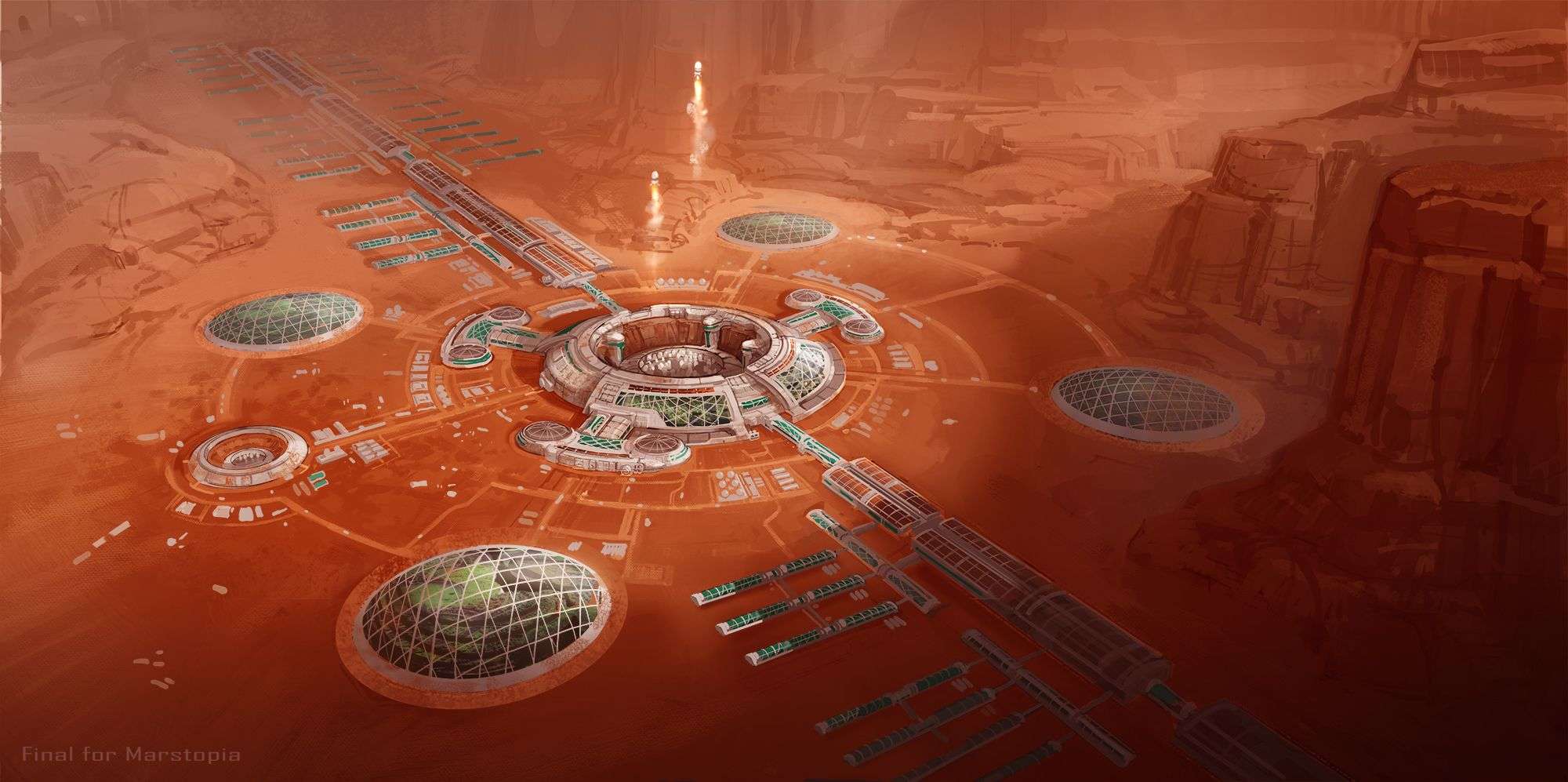
After finishing the architecture, I painted the surrounding cliffs to a higher detail. I used an overlay layer to color in the terrain then painted a bit more to make the architecture gel with the color. I also played around with the contrast curve to help me harmonize the image.
A color dodge layer helped me to add in highlights to the architecture and the shuttles. I also used a multiply layer to darken the bottom of the canvas. So it gradates and gets lighter and less saturated as it goes back, giving the illusion depth. This is the finished painting that the team approved on and this ends my part in the project.
This is not a fixed process, I solve different problems each step of the way. I choose a certain method because I find that I can solve the problem best using that particular method. Although some bias might be involved because I love to draw and paint, and it is the method I am most comfortable in.
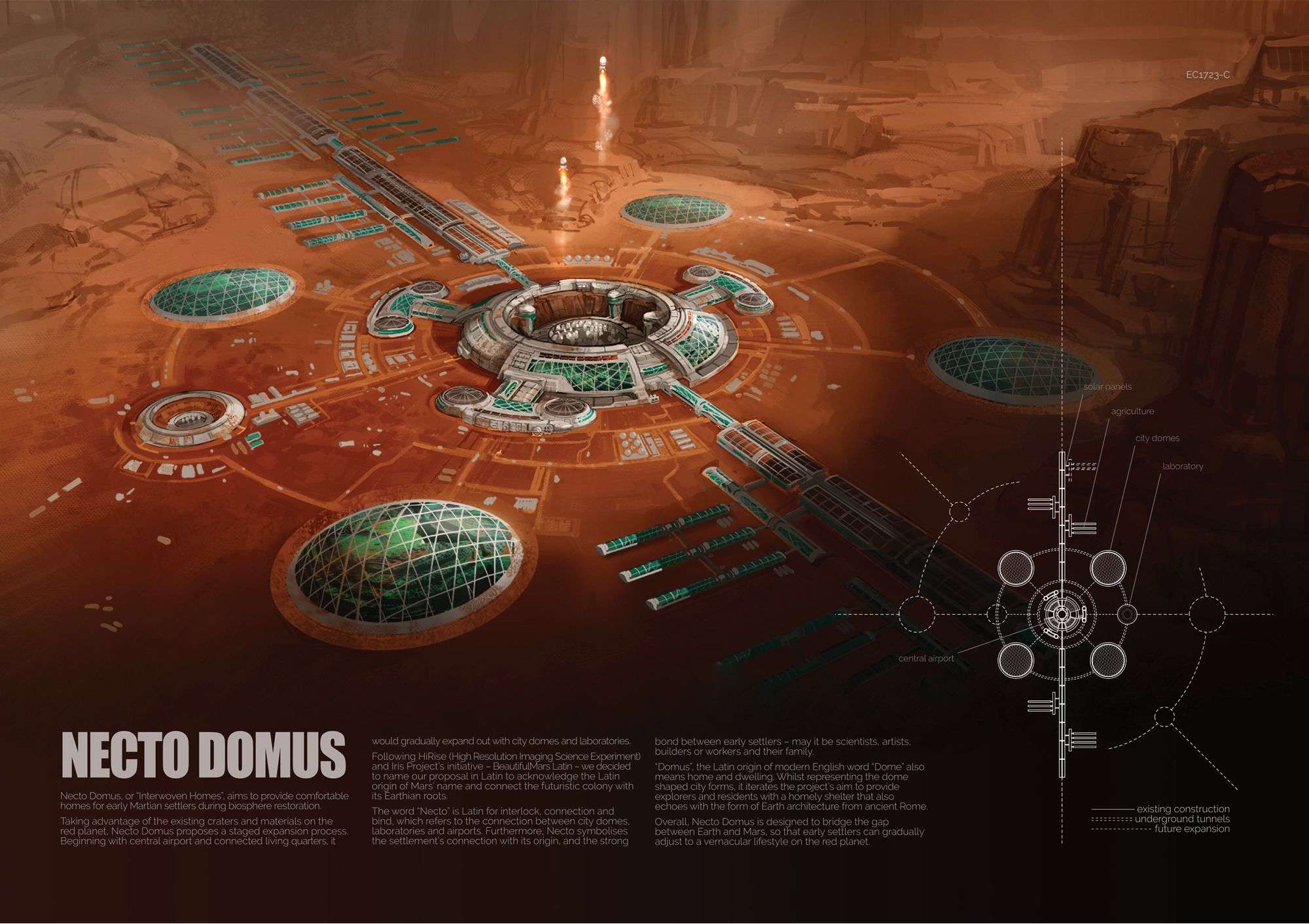
Here is the finished project from the whole team. Jess Wang made the explanatory diagrams and wrote the text. While Shawdi Dou put everything together and did the graphic layout of the two pages.