Research
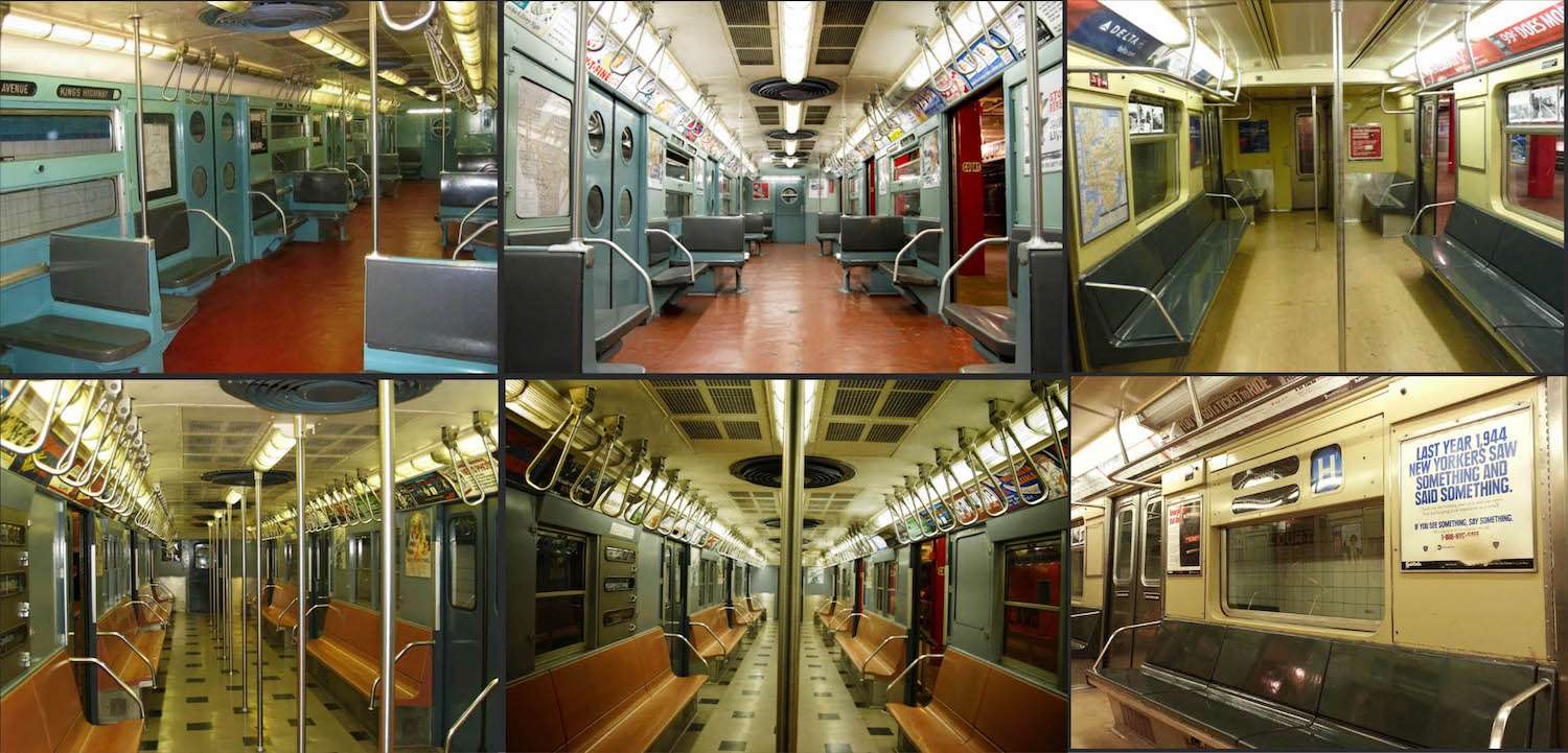
I was first inspired to create the subway from a trip I took to New York in 2016, however, I was also inspired by various TV series, such as Mad Men which inspired me to create something using a 1960’s aesthetic.
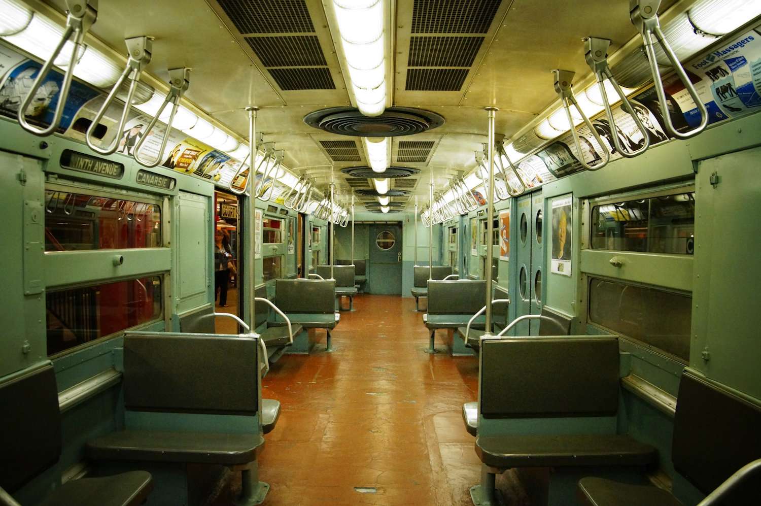
I initially spent a lot of time gathering general references/resources, looking at areas such as the materials, colours, compositions and 1960’s advertising. However, I choose a key image that I aimed to reproduce, to give me a good foundation.
In Substance Painter, I just used simple dirt and edge wear mask and altered the parameters until I got to my desired outcome. It may not look like much, but It makes a huge difference overall! In this image, I also added extra detail to the roughness map.
Project Management
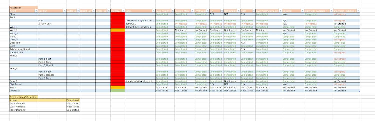
As I created each modular piece I put it into a spreadsheet which helped me to greater organise my project, understand my progression and decide what was my next priority.
Modelling
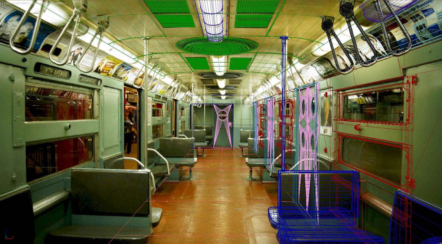
As I aimed to get my subway looking as accurate as possible I set up perspective match within 3DS Max. This allowed me to model very precisely. Making the subway modular was rather instinctive as the components were simply repeated several times down the carriage.
Below shows my wireframe, and how it is matched to my main reference image, the wireframe colour also shows the different modular pieces.
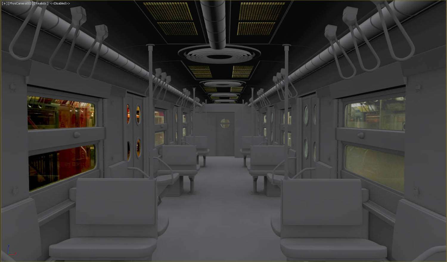
My general modelling pipeline was to create a mid-poly, then deriving a high and low poly from that, I then baked the high poly down using Marmoset Toolbag 3. I then evaluated if extra normal map detail was needed such as screws, bolts etc, and add them in NDO.
Texturing
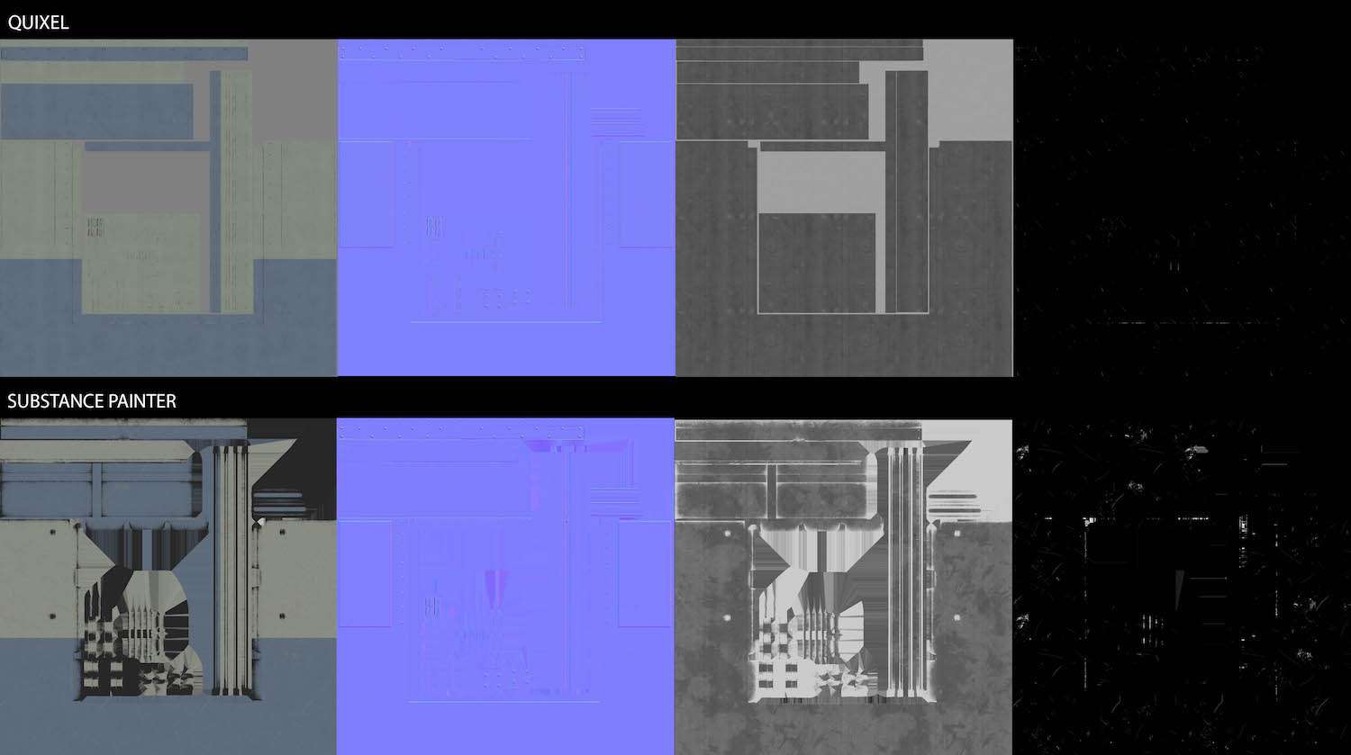
I used PBR for all my textures and they were mostly made with a mixture of Quixel Suite and Substance Painter.
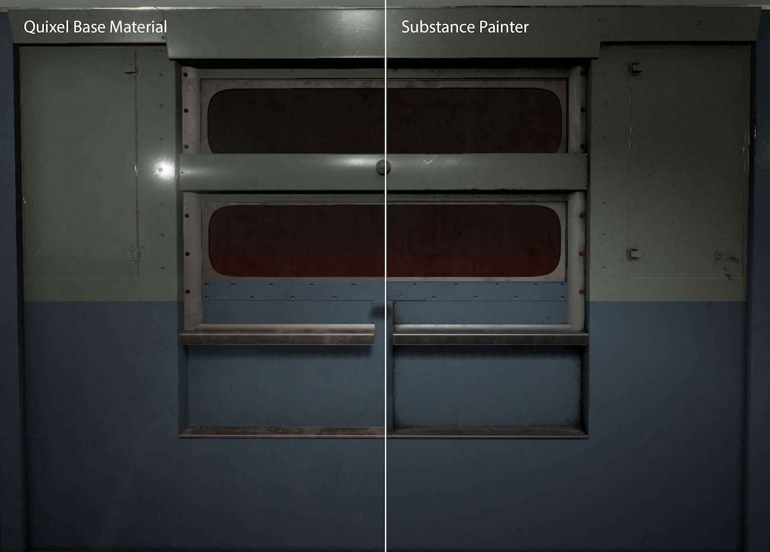
I really like how in depth Quixel’s materials are, especially the metals, however, I find it is more efficient in substance painter to add greater levels of grime and dirt. Therefore, I would start with the ‘base material’ in Quixel and then import it into substance painter, if needed to add more wear and tear.
In Substance Painter, I just used simple dirt and edge wear mask and altered the parameters until I got to my desired outcome. It may not look like much, but It makes a huge difference overall! In this image, I also added extra detail to the roughness map.
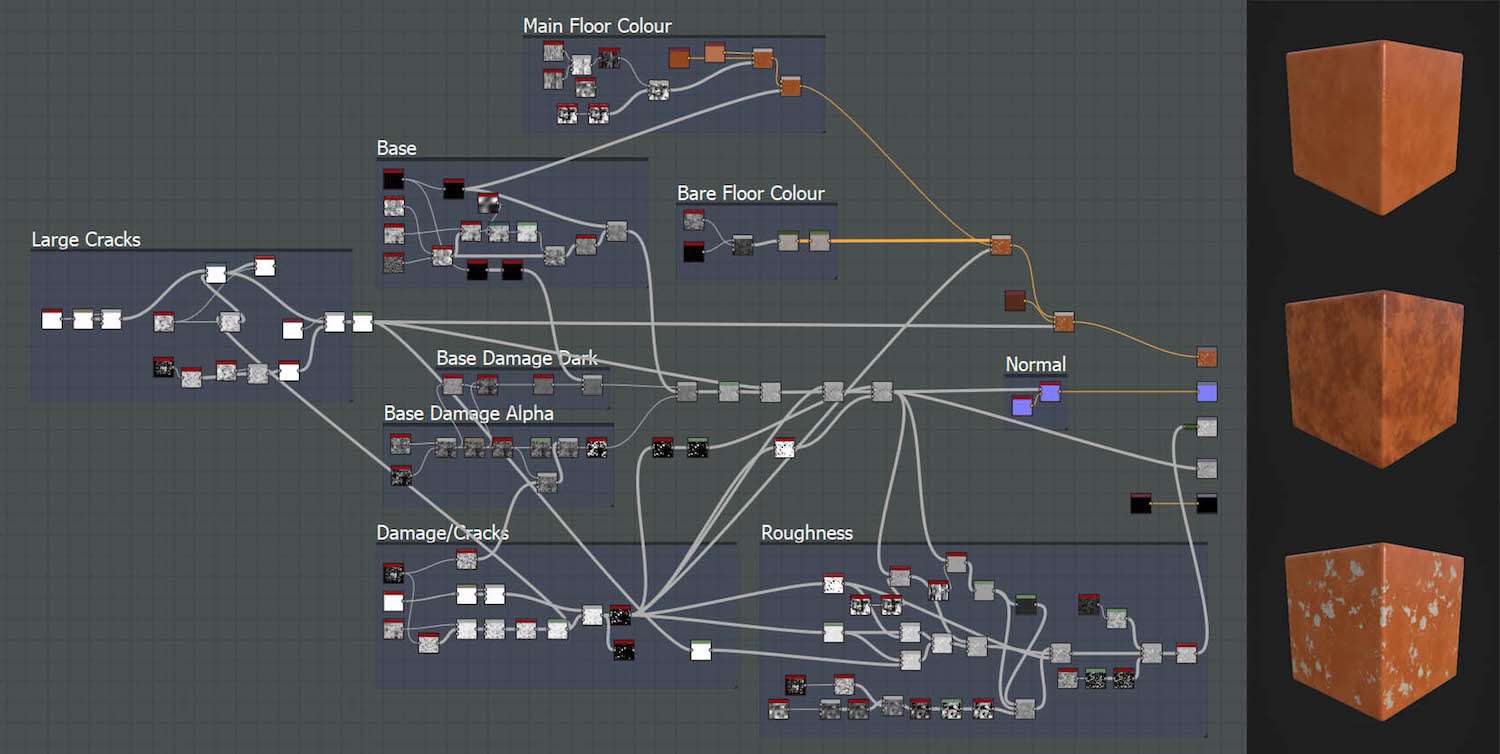
The floor material was made slightly different using substance designer, I ended up doing various iterations based on feedback from friends and online, and it was one the most challenging materials to get right. I found it best to create a clean version, to begin with, and then create a damaged/cracked version, which I then vertex painted in the engine.
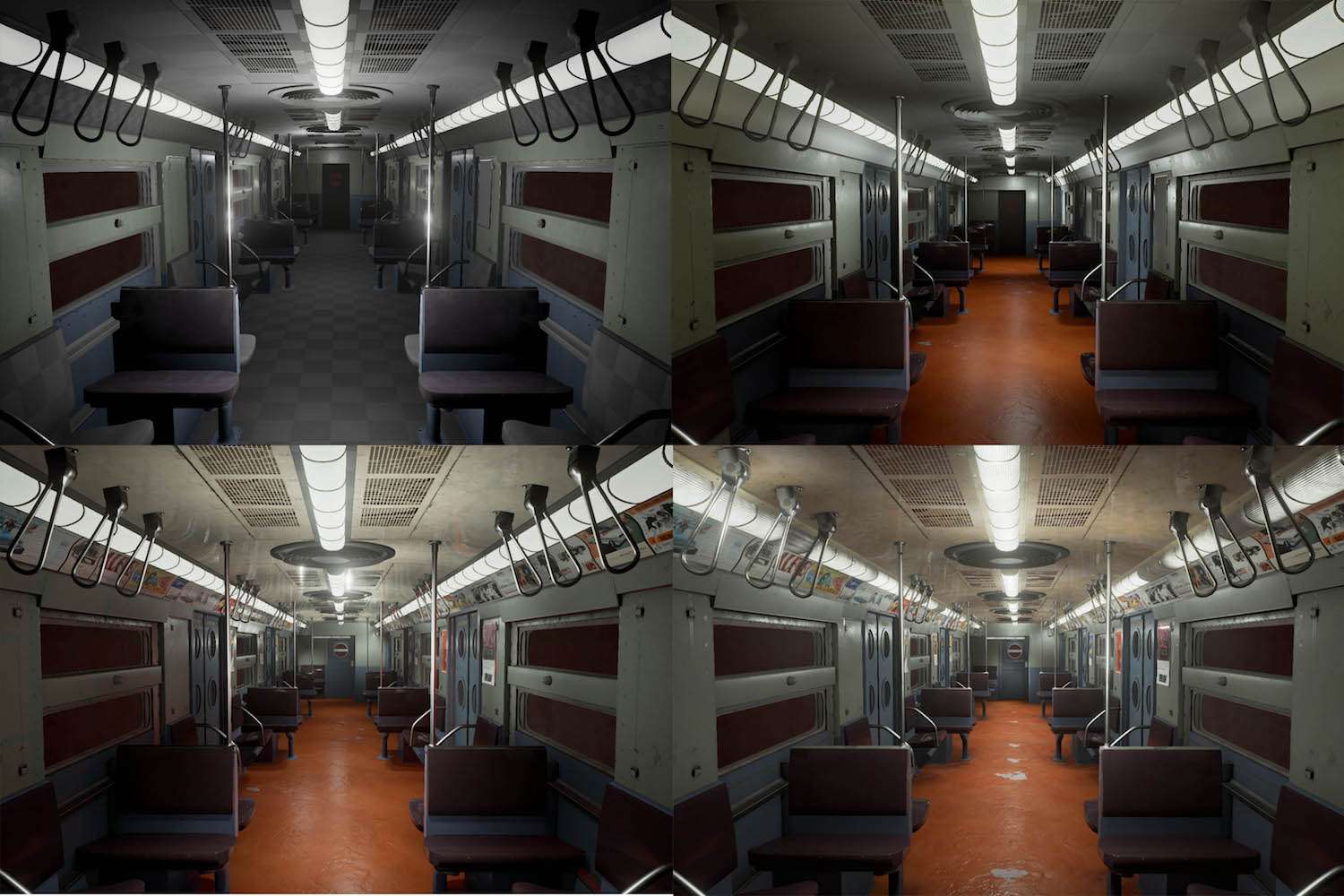
This was the progression of texture passes throughout the project, which took a lot of iterating to get it right.
One my favourite parts of the project was adding all the advertising posters, I ended up having around 30 different posters because I loved how much life and interest is added to the scene, as well as breaking up the modularity.

Master Materials
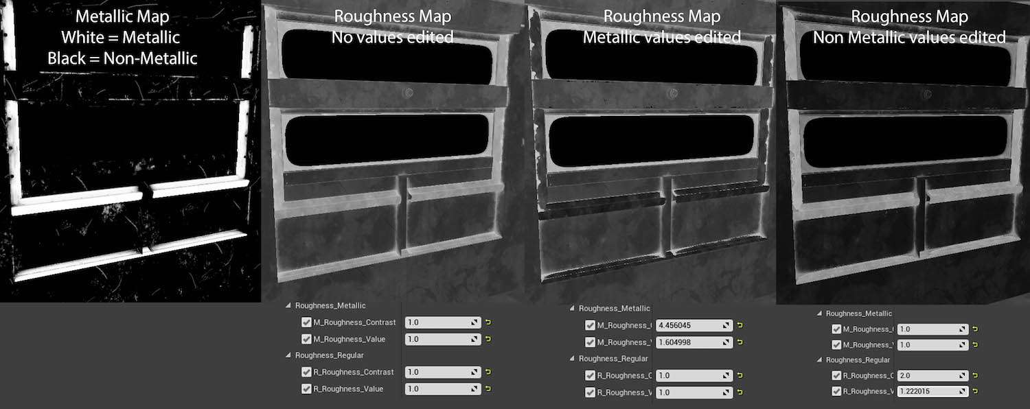
To really push my materials further and save time I created a master material, this meant I could make simple adjustments in the engine to aspects such as the albedo hue and saturation, roughness and metallic values.
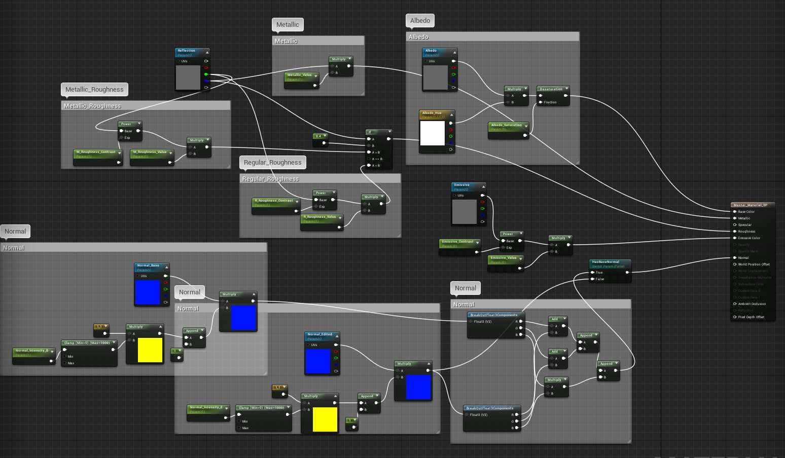
My master material also allowed me to separate my textures into metallic and non-metallic parts, and edit each of the roughness separately, which was extremely helpful and time-saving.
I also set up to my master material to change the intensity in select parts on the normal by running it through a mask, however, I didn’t really use this in the end.
Lighting
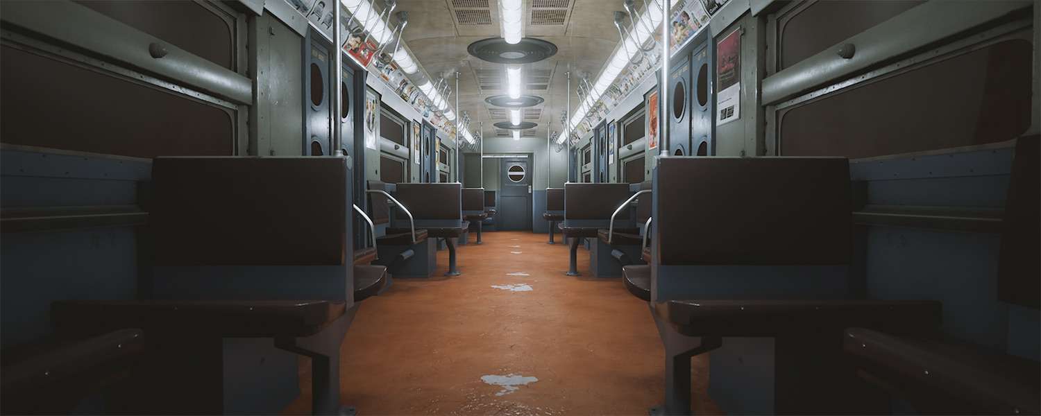
My first initial lighting was rather messy, I would just simply add lights as I went along to try and match it to the image. Later in the project, I did a secondary lighting pass where I relit the scene, reduced the number of lights I used, and ensured they were more organised.
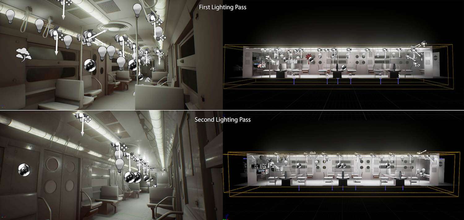
In the end, I only used two lights in my scene a low fill light and a spotlight, which were duplicated around the scene where needed. The two major settings that I used were;
- Making sure inverse squared was turned off, so I had a more precise control over light intensity.
- Using an IES Texture on the spotlights, this helped to create a more realistic falloff.

To really ensure my lighting was correct I turned my scene and reference image to greyscale, this meant that I had no areas of complete black or white, which can wash out areas of an environment. In addition, I used a couple of reflection captures for adding extra realism.
Post Processing
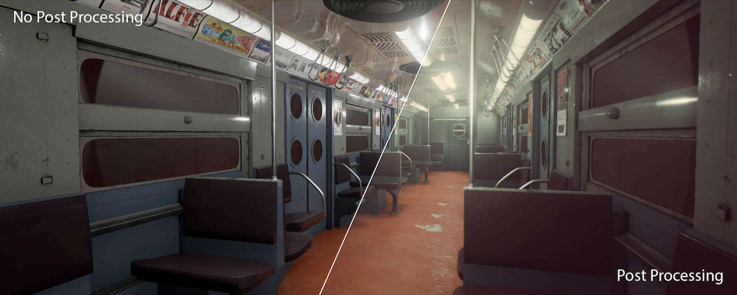
I really enjoy experimenting a lot with post processing, as it can completely change the look and feel of any environment and can be very rewarding.

I also took time to create various LUT tables to look at how I could change the colours and atmosphere of my scene, I would recommend this tutorial for a quick overview of how to set it up.
Final Thoughts
I defiantly feel that I accomplished what I initially set out to do with this project and creating my own master material saved a huge amount of time. However, I did still find the texturing really challenging, and I still feel it needs some tweaks around the floor area. Furthermore, I would have loved to have created some more props for the scene such as a briefcase or child’s toy to embed some narrative.
In conclusion, I would defiantly recommend spending some time setting up a master material with the parameters that would benefit your scene the most, as well as taking the time to experiment with various post-processing values, which really helps to improve on reference material and the make the scene your own.