
In this “Making of Article”, I’ll be discussing some of the lessons I have learned during the development of two of my more recent scenes in Unreal Engine 4. “Apartment”, my latest environment, was mostly completed in a 5-6 week period while finishing up my master’s degree and working on Enderal.
I’m Colin Wagner, a recent graduate of the Savannah College of Art and Design. I have been creating 3D art for six years and have worked in the PC mod community for eight years. I’m currently working with SureAI on the soon to be released Skyrim total conversion mod Enderal: The Shards of Order.
On entering college, I knew I wanted to work in games, but I wasn’t quite sure where I would fit. I had dabbled in numerous areas of development, but never found something that clicked. However, once I took my first modeling and scene development class, I fell in love with creating digital environments and have been doing so ever since.
Having such a tight schedule required me to take a heavy look at my workflow and try to optimize it as much as possible. I’m here to share some of what I learned.

Concept & Design Phase:
The idea of this scene was to tell the story of a techno shut-in in the near future. I wanted to give the sense that this individual rarely leaves his apartment, even to take out the trash. He lives in front of his computers, experiences life through them, and his connection to friends and family is almost non-existent. Is he in hiding? Is he working on something he wants to keep a secret?
There are two main ways spaces can be themed, through a unified design, or through a disparate design. Unified designs are very common, especially in Sci-fi. Unified designs are where every aspect of a space or area follows the same design trends. They often look like they are all designed within the same timeframe, culture, and perhaps even by the same person. A great example of a space with unified design is an Apple store. Just about everything within an Apple store was designed and approved by the same group of people, and each aspect was designed to complement the design of their products and evoke a specific impression from their customers. Disparate spaces, however, often look more like a diverse cluster of differing design ideas.
There often are often unified groups within disparate spaces, usually groups of items that share a similar purpose (furniture, technological items, food, etc.) but each group is very different. Disparate spaces include most cities (areas of rapid development like Shanghai are much more unified than areas of slower more consistent development like London), and most living spaces. Take a look around your home. It’s likely, though not inevitable that your coffeemaker and blender have similar design styles, and your nightstand and bedframe also share similar styles.
However, it’s also likely that your coffeemaker and nightstand are not stylistically similar. This is an example of disparate objects within a space. Often various objects share stylistic trends based on their design purpose or era of design. Here are a couple of rules I’ve come up with when it comes to these concepts (though like all rules, they are meant to be broken at times):

Unified or Disparate?
Spaces and locales that were developed and constructed rapidly and recently tend to be stylistically unified. Higher budget, larger, and more professionally designed spaces (such as office buildings, stores, and even churches) are also often unified. Spaces that were constructed or developed over a longer period tend to be disparate as are spaces that are more personal or created on a lower budget.
If you spend some time planning and mapping out everything beforehand, you won’t have any questions to ask later, and you’ll be able to build at a faster pace.
An example of where this gets hazy is in homes. Expensive homes with high interior design budgets and professional designers are often unified on a per-room or per-house basis, whereas middle-class homes are often disparate. Disparate spaces are often lived-in and have a history, story, or character to them. It tells about the current and past occupants.

Classic or Contemporary Design?
Objects that are more expensive, are designed to last a longer time or personal spaces often follow classic design trends. Furniture and houses are examples of this. Objects that are designed to last a much shorter time are less expensive or purchased more frequently often follow more contemporary design trends. Examples of these items include technology, cars, appliances, and corporate buildings.
In my Apartment project, I chose to create a disparate space. The space is an older apartment that still uses radiator heat, a way to convey to the viewer the age of the space, while taking place in the near future. The three main groups of items by design type are the structural elements of the apartment (floors, walls, doors, permanent lighting fixtures, etc.), the technological/less expensive items (computers, monitors, cables, lamps), and the furniture (bed, desks, bookshelves, etc.). The furniture and the structural elements of the apartment both share a more classic design style. There are clues to the futuristic time period here and there, but it’s all kept rather conservative.
The technological items, however, feature very extreme design elements. I did this to capitalize on the contrast of the design between the apartment space with the high-technology items within. When designing the future tech, I decided not to imagine the future from the perspective of the current year, but rather as someone from the 1980’s. This allowed me to go a little wilder with designs of technological items. I based the computers on racks of analog synthesizers all working together as one whole.
Thinking about the small details, history, and functionality of what you are making is vital to creating a deeply believable item
A good portion of this article is spent on the conceptual design of the space because I consider it very important. Whenever I am designing a space or an item, I always try to answer every question about the item before constructing it. Thinking about the small details, history, and functionality of what you are making is vital to creating a deeply believable item, whether it’s a character, space, or prop. It’s also important when trying to create spaces rapidly. If you spend some time planning and mapping out everything beforehand, you won’t have any questions to ask later, and you’ll be able to build at a faster pace.

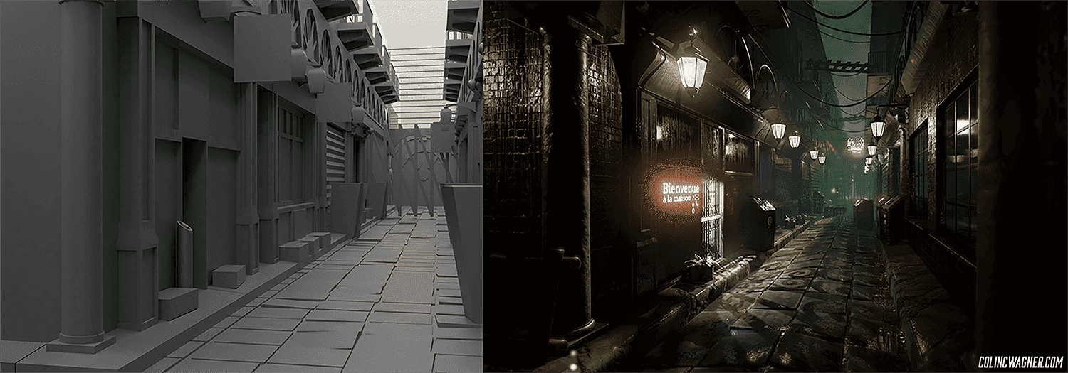
Blockout:
Blockouts are a quick 3D sketch to give you an idea of space, placement, and playability. They tell you what needs to be changed before you’ve invested dozens or hundreds of hours into a scene. For blockouts, my preferred method is creating the basic shape of the space using BSP’s to make sure that the scale of the space feels correct when playing inside it. I then convert the BSP’s to static meshes and export them to my modeling program of choice (Modo), making sure the scale matches with Unreal units.
I then build the blockouts of all of my items in Modo, while importing objects into Unreal to check visual scale. This Modo scene file then becomes the scene file where I create everything. I take significant advantage of mesh layers and mesh folders to organize everything including blockouts, highpoly meshes, and lowpoly meshes. This allows me to compare scale and work all within the same scene file, which can be very helpful. With certain modeling programs there are worries of stability, so for those who aren’t too confident in their modeling program’s stability, I would recommend breaking it up by room if you can.

Modelling:
Early in development, I decided I wanted to take advantage of smart materials, which meant I would need to create highpoly versions of almost all of my assets for baking purposes. To speed this process up, I used the edge weighting (AKA creasing) method of subdivision modeling rather than the traditional supporting loop method. The creasing method was originally mostly limited to Modo, but with the introduction of OpenSubdiv, the workflow can be used in any program that supports OpenSubdivs.
The creasing method is using a creasing or edge weighting tool to tell an edge how much to crease, and what the shape of the crease should be like. The benefits of this method are that it’s much faster than supporting edge modeling, less complicated (fewer areas of complex polyflow), more consistent, and the fact that once you’re done your highpoly model, the first subdivision level is an almost finished lowpoly model. Toss some bevels in and you’re done!
The only major downside I can think of is that often edge weighted highpoly models need to be at a higher subdivision level than supporting edge models to maintain the same level of edge smoothness. During the latter half of the development period, I had a goal to create at least one item from blockout phase to a finished textured in engine asset per day. Taking advantage of the crease method allowed me to stick to my goal while also being able to create highpoly versions of almost all assets to maintain quality.
There are a million little specialized programs that will save you so much time if you’re willing to dedicate an hour or two to learning them.
When UVing the models, I use Headus UV Layout. I highly recommend using a specialized UV program like Headus over integrated UV tools like Maya or Modo’s UV tools. There are a million little-specialized programs that will save you so much time if you’re willing to dedicate an hour or two to learning them. During school is the perfect time to learn as many programs as you can, as you have free access to full licenses of numerous programs. If your school doesn’t have a program you want to learn, take advantage of free trials or student discounts.

Cloth Simulation:
Marvelous Designer is another example of a great specialized program that can save you a ton of time. Marvelous Designer is a clothing design and cloth simulation software and is excellent for creating both clothing and other assets that require cloth simulation. In my “Apartment” scene, I used Marvelous Designer for the bed sheets and curtains. The basic idea of Marvelous is that you import an avatar (what the cloth will be simulating on), create pattern pieces, sew said pieces together, and simulate against the avatar. After a little playing, I figured out an effective and quick way to go from simulated highpoly to a good looking in-game mesh. I simulate at a high density, and when exporting I have Marvelous set up the patterns as UV islands, this removes the need for me to UV the objects.
I then bring the highpoly into**ZBrush**and use decimation master to convert them to a lowpoly mesh with retained UV’s. Decimated meshes cannot be used with deformed objects; the polyflow is a mess. I’m normally pretty picky about my polyflow, but I found it acceptable after considering my timeframe and options. Sometimes you have to be able to make concessions to get your work finished on time. The cloth was not going to be simulated or deformed in-engine, and in the end the cloth turned out surprisingly well. Before decimating, I tested two other ZBrush tools: Dynamesh and zRemesher.
Related link: How to create a game ready character
Dynamesh does not work with thin or single plane objects like my cloth. Also, it doesn’t perfectly retain silhouette or form. ZRemesher does work on single plane objects and provides okay results for things like cloth. However, it has silhouette issues, and the edges of the cloth gained a “sawtooth” shape. Decimation master, on the other hand, perfectly retained the shape of the folds and silhouette, did so with fewer polygons, and allowed me to retain the UV’s I exported from Marvelous Designer.
The workflow of Marvelous to decimation master is excellent for static cloth items, but would not be effective for cloth that would deform in any way in-engine. There is a fourth option I didn’t mention before, which is to simply export a lower poly mesh from Marvelous. This is a common option, and I think it works well for certain objects that are simulated in-engine such as a flag blowing in the wind.
However, on static items, you lose fold detail and often run into a visual artifact where fold edges have a “sawtooth” shape rather than a smooth straight fold. This is related to the way marvelous handles its polyflow. It works very well at high resolutions but begins to fall apart at game resolutions. If your cloth item is static, I highly recommend taking the extra time to simulate a highpoly and bring it into Zbrush’s decimation master.

Texturing:
For texturing in this project, I chose to use the Quixel Suite for the majority of my texturing, with Substance Designer for any materials not in my Quixel library. The Quixel Suite is excellent for creating lifelike textures very quickly, but it’s important to try to keep from slapping on some default textures and considering it finished.
It’s good to layer multiple materials, change parameters, and do everything possible to introduce both variation and believability in your textures. Quixel Suite is fast enough that the difference in time needed is very small compared to the difference in visual impact. This is especially important for hero assets or major props. Texturing an asset requires just as much thought as designing and creating a whole scene. The best textures take into account age, history, use, damage, and other variables that would alter the look of an object over time.
In the above image, the areas in which the axe would be held are worn. Parts of the varnish and stain have worn away, and the leather has become darker and damaged where dirt, sweat, and body oil have been absorbed by microtears in the leathers surface over many years. This level of detail and thought creates textures that add an extra level of believability to an asset.

Materials & Lighting:
The new PBR workflow has made materials and lighting more important than ever. Not only are both more important, but they rely on each other! Quality lighting takes your materials to the next level, and quality materials take your lighting to the next level. I experimented a lot with lighting in my Apartment scene. I used a combination of static lighting, standard dynamic lighting, and dynamic ray traced distance field soft shadow lighting.
The majority of the lighting is from distance field lighting, as getting a handle around the technology was one of my personal goals for the project, as I’m a huge fan of the look of shadows with soft penumbras. I used different types of lighting depending on my needs, but one of the main reasons I used multiple types of lighting is because I wanted to fake a basic light linking system into Unreal 4. Light linking is a system that allows an artist to choose which objects specific lights do not affect for a specific aesthetic reason.
Learning is always worth the effort, and there are countless hours of resources out there to help” quote=”Learning is always worth the effort, and there are countless hours of resources out there to help
I did this by using a specific type of lighting for each light, and turning off the ability for certain objects to be affected by that kind of lighting. It was a makeshift method that I wouldn’t recommend. It worked for my needs but creates issues that can be annoying to fix. Plus, Unreal 4.11 now has some basic light linking functionality (light channels), so this method is now not needed. For light color, I used three different colors of primary lighting. A sunlight source at 7000k (a slightly exaggerated daylight blue), a 3000k for older fixtures to represent the warm look of older light bulbs, and a middle ground 4000k for more modern light fixtures. I’m a huge fan of 4000k color. It’s most similar to the color of moonlight.
I wanted to feature multiple shades of standard light to add lighting variation to the scene. I find having everything uniform can look unrealistic, including in lighting, so I always try to add variation. When lighting, I highly recommend going into your “Post-Process Volume” and setting the Min and Max Brightness to 1.0. This removes any auto-exposure effects and makes lighting your scene significantly easier.

 I did some experimenting with materials as well, most notably with subsurface scattering, which is a great way to give an extra level of realism to specific materials. In my scene, I used it with the curtains, the cloth lights, and the “wax” on the wall lights. Unfortunately, point lights do not affect subsurface scattering materials, so on lights that needed point lights, I used both a point light for the primary lighting and small spot lights for the subsurface scattering effect.
For larger tiled wall materials I used a method I use to prevent visible tiling. In the material graph, I have two versions of the same material, both tiled at different rates. I then lerp (linear interpolate) the two materials together using a cloud or smoke texture tiled at a different rate to both other materials. This removes any visible tiling from less structured tiled materials. I’ve included an image that shows a graph of a basic version of this method. When working with brick materials, it becomes a bit more complicated.
For all other materials, I highly recommend trying to tweak everything, tailor it to your needs and to exactly how you want it to look. An example of this is if the details of your normal map aren’t visible enough, reducing the roughness a bit can create specular highlights that make them more visible. It’s good to use lighting to better your materials, and use materials to better the lighting.

Post Processing:
Post processing and effects are vital to developing a mood in your scene and work excellently with lighting to create a cohesive scene. A huge percentage of the color and mood in my scenes come from lighting and post effects. Post effects may be the last thing you work on in your scene, but that last part is the difference between an okay scene and a great scene. With post processing, what you use and how you use it heavily relates to what mood you’re looking to create. It helps to experiment, and if you don’t know what something does, try it and see what happens, or look up the documentation.
One thing I often do to add visual variation and interest is to use Exponential Height Fog to create a subtle colored fog in my scene in a way that creates a visual color gradient based on depth in the scene. This adds another element of variety and visual interest to the scene and accentuates the space of the scene. What’s even better, is it works as the player is playing, and doesn’t rely on them being only in one specific location. If the color gradient were done with lights instead of a fog effect, this wouldn’t be the case.
Above are two examples of this effect. Notice there’s also a lighting gradient in both scenes where the lighting becomes brighter as you get closer to the middle of the image.
I can’t stress enough the importance of continued learning.
Conclusion:
Creating my Apartment scene in the timeframe I had was far from easy, but I learned a lot from creating it. At times, going beyond your limit leads to valuable learning opportunities. One of the biggest lessons I learned was mirrored in Jane Ng’s amazing GDC talk; even when it seems like everything is falling apart with a project, things have a habit of working themselves out as long as you don’t give up. I hated my Apartment scene up until two days before it was due, and in those two days, everything clicked.
I** can’t stress enough the importance of continued learning. Learn new software, learn new workflows, do everything you can to optimize your work and you will save so much time down the road.** Time you can use to learn and create. Learning is always worth the effort, and there are countless hours of resources out there to help you.
But, don’t only work on developing your hard skills, develop your eye as well. Composition, color, lighting, material, detail, etc. are all absolutely necessary. Observe and learn from the world around you. And don’t let yourself become discouraged, we are all our own harshest critics. To end, I’ll show the difference just two years makes.
I would like to thank The Rookies editors for giving me the opportunity to write this article. You guys rock!